Welcome to our Friday guest day and we have the most amazing lady and post for you with her wonderful crazy cats. Now I have to admit they are not the most endearing of creatures to me but Karen makes them look fun, adorable, enchanting and downright cheeky in the way she colours and displays them. You are just gonna be amazed at this wonderful project and post so pick up a cuppa and take a look.
*********************
Hi
there lovely friends Kassa Hayselden here, joining you on a journey!
(think you'll need a cuppa tea as tis a tutorial on how I colorise these
darn cute Crazy Cats that Tim holtz has brought into our lives)
So a little bit about me - I'm from Yorkshire (UK)
I
live with my hubby, beautiful 16 year old daughter Chloe (who is my
world btw - and she knows it hahaha - I'm a soft touch!) And what we
call our babies, the furry gang of 3 dogs, 1 oh soooo sweet and ruined
pug called Sammy and 2 giant breed Leonbergers, Leo and Ruby. Ruby has
to always help me create, shes forever gotten bright acrylic paint on
her tail and especially her big wet nose!!!
Creative wise, I have
no boundaries, I'm a free bird, organic and spontaneous, my desk is
always messy whilst creating but I have to tidy up in between for sure
or I'd go mad! And on the mad note yup thats me, creating sends me hyper
so the tv has to be on to level me out, I'm currently watching
'Breaking Bad' whilst creating with copious amounts of Yorkshire tea and
a lot of movement hahaha! need to loose some of the winter pounds I've
piled back on! And my hands, nails are forever plastered in paint, I
hate how it feels, tis a means to an end, I go thro' millions of wet
wipes!!!
What
I created to share with you all is this long, long, long hanging, they
are never easy to capture on camera because of the length , so I've
added a few close-up shots. My inspiration, well the Crazy Cats and as
soon as I saw them I knew I had to do a wobbly mischievous stack of
cats. too funny and as the Quote Band aptly says 'unimaginable'
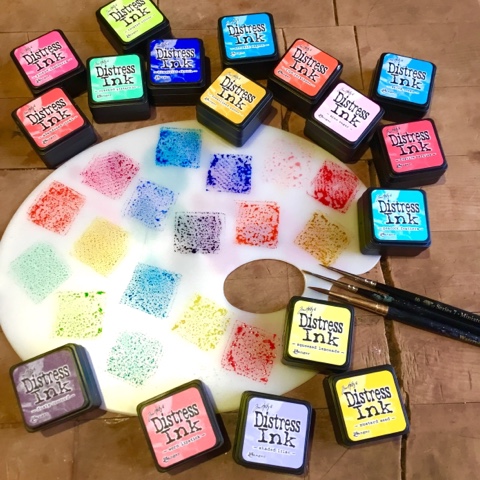
As
you can see here I choose many of Tim's oh so bright inks to work with,
the brighter the better (I also use distress markers to do this
technique)
I
stamp out the cat with Ranger Ink Black Archival ink onto the smooth
side of a Watercolor paper. Let the ink totally dry then proceed to wet
the cat down with water in the area I'm about to start to ink!
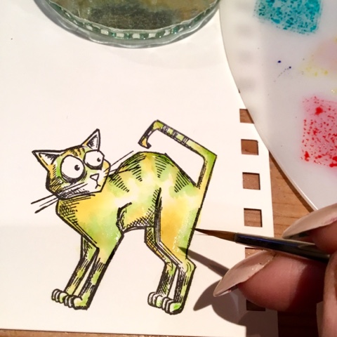
Here
I've used a light base color to start to build the layers of my cat,
always start from light to dark with inks as the lights allow layering
of colors over them and lets the other various colours shine through. I
went for Mustard Seed, Squeezed Lemonade and Fossilised Amber and in
turn starting with the lightest ink (Squeezed Lemonade) I repeatedly dab
a little ink int the pre-damped paper.
As I fill an area, I damp
the next and repeat, as you get faster you can basically dampen the
whole cat, just dampening again where necessary. If you get too many
puddles of water the corner of a kitchen roll soaks up the excess, you
can also use kitchen roll to soak up a color of ink that's just not
doing it for you! You can see I leave white space -
'Spectacular/Primary Light, where I can I like to leave spectacular
white space for my hi-lights cos nothing beats it, not a white marker
pen or paint but they come a close 2nd! And I always leave a bigger
area than I think I need as it always disappears somehow! The eyes,
toes, nose, inner ears etc will be a different color therefore leave as
spectacular too.
Now
If necessary I dampen down where I'm about to dab the Twisted Citron
ink, if it's spreading into an area you don't want it to go - remember
the corner of the kitchen roll trick, soak it up quick.
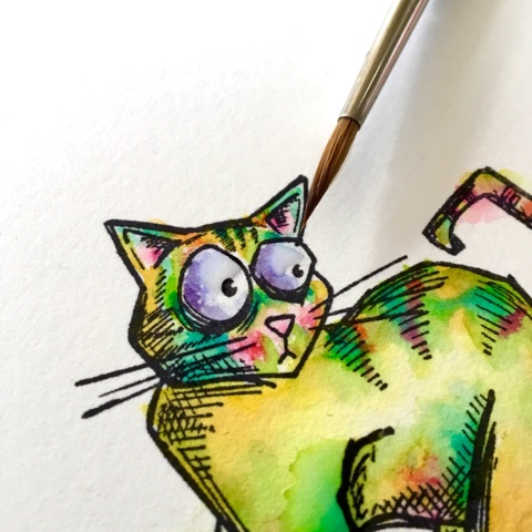
Here
you can see the color Mermaid Lagoon making the cat come to life, but
be careful to only add a little as this vibrant color will cover over
all the yellows and greens if you are not careful - little and often is
best, it's easy to add but harder to takeaway with the stronger and more
vibrant colours, this applies to the darker shades too.
Worn
Lipstick, Picked Raspberry make for great rosy cheeky cheeks, I'm
careful that I only dampen down the ear/cheek are slightly and only
where I want the color, I basically am very precise! The belly area is
colorised on the 'yellow' part as as we all know if you mix the red and
green you get that beautiful shade of 'mud'.
The eyes are colored with Shaded Lilac, remember to leave white/spectacular space.
Here
I'm topping up the various pinky areas, again hardly if any at all
pre-damping down required. The shades of Worn Lipstick, Picked
Raspberry are used again alongside Abandoned Coral and Ripe Persimmon
always remembering not to go mad with the bright colors, little and
often!
To
create 'puddle like' stains within your inks all you have to do is drop
a few droplets of clean water into various areas on your cat and watch
the water spread out and work it's magic (kitchen roll at the ready if
necessary) Let the puddles dry and you will see the 'puddle marks'
I even puddle the eyes - carefully of course.
You
can see the various puddle marks, base of the tail, below the neck etc.
When these puddles are fully dry start the whole process of laying
down more ink creating layers of ink which in turn create the most
wonderful effect as the various layers shine through, I usually lay down
3 maybe 4 layers, not necessarily all over the cat but on areas I feel
need more depth, more vibrancy, need to be darker or simply need more of
the magical movement that the layering of inks produces as they dry -
basically when the layers dry they leave what I can only describe as
'tide mark lines!'
More
layers! When everything is totally dry, grab a dry brush and pick up a
minute amount of ink, wipe most of the ink off on kitchen roll, then as
I am here with the Worn Lipstick shade dry brush the ink on your cat,
this leaves a lovely 'f'uzzy' look!
Heeheehee
splatter or as I call it 'Splatoon' time. Cover up that precious face,
add clean water to your inks and in turn pick up the watered down ink
(I always practise first to see if the brush I'm using is giving me the
kinda splats i want and that the colour isn't too watered down) The
tapping of the end of the brush is great if you want more control or
simply aim your brush at the cat and move your hand in a 'whip like'
manner - again practise makes perfect heeheehee! I actually use both
these methods.Let each splattered color dry before starting on the next
and as before you need less of the vibrant etc. colors.
The color variations are endless with Tim's amazing colorwheel of distress inks - eeeeek!
An 'unimaginable' kaleidoscope of stacked crazy cats!
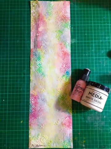
Now
for the Hanger, gesso was painted onto card stock, I randomly applied
the new 'Dapper' design tape and oh so glittery deco tape, then clear
gesso'd everything to seal the tape securely. Tim's mini stencils are a
fav of mine as they give the tiny detail I always crave, swoon! Ranger
Ink's texture paste has a super soft, smooth 'marshmallowy' feel,
glides like butter over Tim's stencils, if you ever struggle with
texture paste, this is your answer, tis not gritty and gets into all the
nooks and crannies!
So
here's the distress paint line-up hahaha - Spun Sugar, Picked
Raspberry, Spiced Marmalade, Abandoned Coral, Mermaid lagoon, Shaded
Lilac, Twisted Citron, Cracked Pistachio, Squeezed Lemonade and Mustard
Seed.
Spritz
the hanger till its fully wet but not puddling with water, and start to
dab on the colors either with the dabber or your fingertips, where the
colors start to meet they will merge into each other, be careful where
opposite colors meet as they turn a nasty shade of 'mud' if this happens
simply wipe off the mud with a wet wipe!
Once
everything is dry Tone down and blend the colors with Spun Sugar and
Gesso - fingertips are best for this and a wet wipe helps too!
Once
dry I can add these new magical Distress Crayons eeeeek! They add more
depth and layer perfectly over paint, distress heaven, with water they
spread out and move more, you can journal over the top of them, stamp
over the top of them, they are just LUSH! And lol wipe off your
fingertips straight away!
So
I added extra laters with the crayons round the edges, just take the
crayon scribble a little of the color you want to build up over your
paint, then with your fingertip quickly blend into the paint, you can
layer your colours too and if you don't like wot you see wipe away with a
wet wipe!
How lush do Tim's Distress Crayons look over his Distress Paints!
I
even scribbled some crayon direct onto my palette, picked the color up
with the end of a dry firm/springy headed paint brush and stippled
through a layering stencil for a subtle end result.
Ha!
one of my fav bits! When ever I can I try to get this Tim Holtz
Splatter Brush out - makes me so very happy and is always a big hit in
my workshops. Here I have used thick white gesso so you get thick blobs
and splats and even great streaks of gesso - such FUN!
I coat the Display Hanger with gesso a couple of times. How cute are these hangers!
And
can you spy I've gotten my old Singer sewing machine out, leaving the
loose end hanging after stitching around the edges a couple of times
with various stitches.
So
when it comes to adhering the cats I do a trial run to get them sat
where I want them, I use 3d glue so they sit proud of the background.
I
told you I was organic and spontaneous didn't I - here's an example of
it, the background was just too busy for the cats, I kept looking at it
and thinking how/what? I went to bed to sleep on it and with a fresh
pair of eyes the next morning the answer was to gesso in an around the
cats, only use a little gesso pulling the gesso softly out towards the
edges (approx 1cm of the edges peeped through) When dry I repeat the
gessoing but only the middle areas.
Now
when everything is dry add more of the distress ink splats, cover them
faces again, I even used Black Soot for a few splats - only a few black
spots but they make a huge difference, thay make everything 'PoP' ansd
sing!
Pick
up a tiny amount of the watered down Black Soot with a dry toothbrush,
flick your finger across the bristles and watch the fine spray of minute
splats drop onto your hanger another treat for a mixed media gal
(practice before hand to see how your medium will spread)
Tis
now time to add any more of your Distress Crayons before adding
scribbles and doodles around the edges, Ranger Inks Fude Ball pen was
perfect. (And I added a couple or three more gesso splats around the
edges with Tim's Splatter Brush)
I
stamped and cut out the fish and ball of wool, colorised with the
crayons and adhered to fun places ie the tails or paws - I love it when
the cats eyes look longingly at them teehee!
I also chose one of
the quotes from Tim's new Idea-ology Small Talk Occasions pad, I like to
cut the words up seperate and all different sizes.
I used a black
Stabilo All Pencil to shade in/under/around the right hand side of the
cats for extra definition and make them jump off the hanger.
I
lightly gesso'd a Quote Band and after it dried I added the Distress
crayons, rubbing in with my fingertips, I kept layering the colors and
blending, the hanger was colorised like this too. I attached the Quote
Band with white wire and colorised the wire too - this crayon business
is addictive!!!
Ta- Da!!!
The cat I finally decided on for the bottom of the stack was simply cos his eyes said it all!!!
So
I hope you enjoyed my visit - I sure did, i would loooooves to see any
of your creations that I may have inspired you to create - go pop them
on my fb page - I looooooves it when we all share our art - I call my
art 'HAPPY ART' I hope this crazy cat inspired piece has made you smile
and happy!
Mwah Kassa
You can find me over on:
Facebook - https://www.facebook.com/kassa.hayselden
Instagram - https://www.instagram.com/karen.hayselden/
Pinterest - https://uk.pinterest.com/kxoxoh/
Blog - http://kassadh.blogspot.co.uk/
...............................................
Well what did I tell you? Aren't you just so fired up you want to get out those inks and get going? Don't you want to stamp and colour and play to your hearts content? I know I do. Wow what a fabulous tutorial and beautiful photos every step of the way Karen. You have done an amazing job of sharing your inimitable talent and taken us to a place of wanting to see more and more and to have a go for ourselves. This post will be pinned on our Pinterest Guest board but I know I will be pinning it and bookmarking it so I can keep coming back to refresh my memory and learn how to colour these crazy animals. Thank you so much for haring a part of our Vintage Journey with us with these delightful animals.
We have one more Destination Inspiration post coming up next Monday and then the following Friday will be our 2nd birthday and just to let you know things are a'changing. So please visit us to find out more.
In the mean time let's get some colouring in and enjoy the weekend.
Take care.
hugs Brenda and the Creative guides. xxx