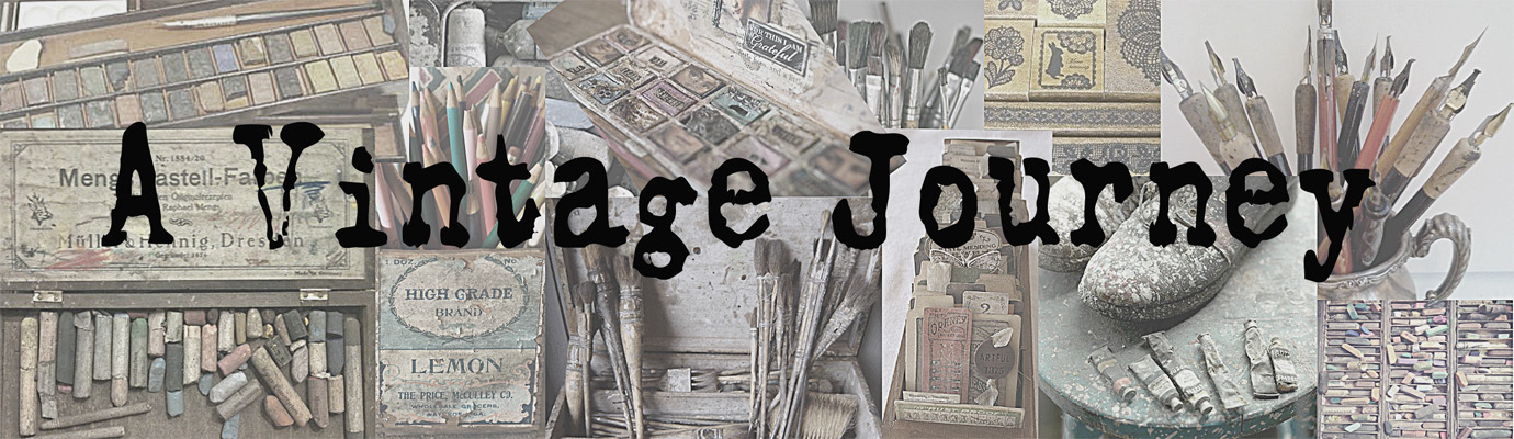
Just as a reminder, this is what's in the suitcase:
Product - Paint
Substrate - Tag
Colour - Smoky Grey Blue (think Stormy Sky and Weathered Wood)
Technique - Resist (paint, embossing or mediums)

I started with a jumbo manilla tag, trimmed on each side to fit a DL card base. Smearing it with Weathered Wood Distress Paint using my finger gave a nice uneven coverage which acted as a resist to the Brushed Corduroy Distress Ink blended over the top.

A little 'spritz and flick' with water allowed the Distress Ink to do it's magic and I added a little Walnut Stain to the edges to create a more distinct edge.

One of my new Patchwork Pieces borders was ideal for creating a border around the tag. Simply remove the gold embossing powder from the corners where you overlap the design before heating and the joins are seamless!
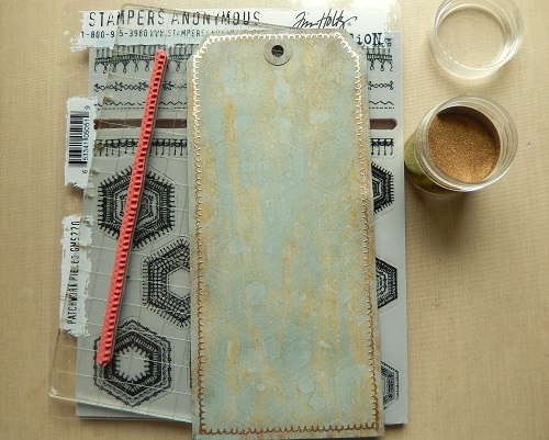
The whole thing needed a little va-va-voom so I used Tumbled Glass Distress Paint on the larger of the Patchwork backgrounds and covered the entire tag.

From the same Patchwork set I used the smaller design on a piece of black card, stamping with Picket Fence Distress Paint.

I HAD to play with the new Distress Crayons that have just arrived in the craft room courtesy of Tim and Mario, and reached for my all time favourite, Tumbled Glass, to coordinate with the tag. If you add a little to the uncovered areas of the Wildflower stencil and blend through with your finger you get a fabulous translucent effect with a distinct opaque border.

With the two main layers created I combined them, using a strip of Textile Surfaces, Linen Ribbon, some Idea-Ology Ephemera and stitching. To make the Wildflower die cut less one dimensional I blended a little of the Frayed Burlap Distress Crayon with water and painted it on. And as this is going in my card stash a die cut sentiment provided the finishing touch.
Here are some close ups of the completed tag...


As this is our final stop on this month's Destination Inspiration journey, let's take a look back at the wonderful projects created by my fellow Creative Guides.


Once again a simple travel bag of ingredients has resulted in such varied and wonderful creations from my uber-talented fellow Creative Guides. They never fail to amaze and inspire me and I'm sure that's true for you too.
Thanks so much for travelling along with us this month. September will bring a new travel bag and another amazing Destination Inspiration journey. And remember, there are still a few days left to join in the fun with the August challenge 'Stencil It!'
Have a wonderful week and whatever you're up to, take care of yourselves.
Jenny xxx