Creative Guide Call Update
Many thanks to everyone who has expressed an interest in becoming a new Creative Guide at A Vintage Journey. The call is now CLOSED. We will be in contact very soon with everyone who has applied.
Hello fellow travelers,
It's S@ndy here with you today to share a card making tutorial. I have decided to stay in the Neutral Zone for this one as that is our theme for the month.
So let's get started!
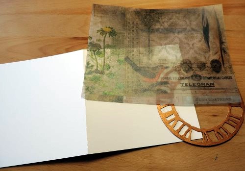
This card measures 5.5" square so I started with a base of manila cardstock cut 5.5" X 11" with a crease in the center. Using the Tim Holtz Printed Vellum paper pad, the piece with the bird was selected. From copper paper a clock face was cut using the Weathered Clock die.
Next comes some color and for that the card front was masked off with some Tissue Tape and then Forest Moss, Walnut Stain and Wild Honey Oxide Inks were applied using a blending tool.
A little water was spritzed on and then dabbed off making some lovely splates on the paper. To add even more texture the front of the card was embossed using this circle embossing folder. The card is actually wider than the folder so the embossing was joined in the center by running it through the die cutting machine twice. The seam will never show once all the other elements are added. Finally the entire front was edged using Walnut Stain Oxide Ink.
For a nice trim, a piece of lace was added and then topped with ribbon. In order to hide the ends of the lace and ribbon an opening was cut in the fold of the card and the trims were pushed through (shown by the arrow above) and then secured. The other end was wrapped around the edge of the card front and secured on the back. In order to make the inside of the card look clean and neat, an additional (slightly smaller) panel was placed on the back of the front panel as shown below.
Card front

Next the clock was cut again using Grunge Board, you could use any thicker material for this part, giving added texture once the card front is assembled.

Next the clock was cut again using Grunge Board, you could use any thicker material for this part, giving added texture once the card front is assembled.
The copper piece and Grunge Board piece were stacked and glued together and placed on the card front. Next the vellum piece with the bird was stacked and attached to the inside panel. A little fussy cutting was done around the piece and it was placed and glued in the clock.
It was at this point that I realized that I had made an OOPS! I wanted to add a word band on the ribbon but the ribbon was already on the card. Instead of taking it apart, I simply put the word band on another piece of ribbon and glued it over the first piece on top of the clock piece.
Now that the oops was corrected it's time to move on to the decorating.
Making these little flowers are a bit fiddley but worth the effort on the finished card.
I made a few Baby's Breath using a die from Elizabeth Craft Designs.
I had some vines from a Karen Burniston die with Nuvo Drops in my stash - so used them. I cut some extra ferns and made two Shasta Daisies.
There was a yellow Helenium sitting on my work table so used it as well. I arranged all the pieces in a way I thought they looked best and glued them in place.
On the inside of the card another piece of vellum from the same paper pad was used. It has dotted lines in the pattern which will be nice for writing a personal message.

To find out more about the products I used - please visit my blog here where I have provided links.
I hope you have enjoyed yet another journey to the Neutral Zone,
S@ndy

To find out more about the products I used - please visit my blog here where I have provided links.
I hope you have enjoyed yet another journey to the Neutral Zone,
S@ndy


Oh my gosh, how beautiful!!! LOVE so much this vintage card!!! Any detail is adorable and the whole composition looks so sweet and impressive!
ReplyDeleteYour card is gorgeous , Sandy. Lovely layering of all your elements and your floral arrangement with those pops of colour compliment the background tones wonderfully . A great tutorial too . Tfs x
ReplyDeleteWallflower is still my favorite paper from Tim and you used it to great advantage. Love how all the layers come together so nicely. thanks as always for sharing,
ReplyDeleteYour card is so beautiful Sandy, you have created some wonderful layers and the vintage colour tones are beautiful. Excellent tutorial too! Hugs, Anne xx
ReplyDeleteThat's a great card, Sandy - brilliant use of the TH papers, and the clock and the flowers work beautifully to frame the bird image. Perfect composition!
ReplyDeleteAlison x
This is beautiful
ReplyDeleteA fabulous card Sandy, the paper, flowers, clock and bird all go together beautifully. I also love the textured background and the lace elements, this is a great card to case. xxx
ReplyDeleteA stunning card Sandy and a great step by step too x what a treasure x
ReplyDeleteTFS and hugs
Annie xx
Lovely card, Sandy. I so admire artists who can envision such little beauties.
ReplyDelete