This is a unique challenge blog where we are inspired by and focus on the Vintage; shabby; mixed-media; art journaling; industrial, timeworn and steampunk genres and encompass the talent, flair, expertise and ideas of many artists that we are inspired by. We welcome all types of projects - cards, journaling, assemblage, layouts, albums, atcs, altered art in fact whatever you want to share (as long as it is in good taste).

Monday, 19 January 2015

Tag Monday

Sadly we couldn't get a guest designer today (that's what happens when the email system falls down), but our wonderful team of Creative Guides have pulled out all the stops to contribute to a Tag Monday post. You will have seen Tag Fridays before and this is the same format. The brief was - a tag, any tag including Tim's tags for January. So let's not waste any time and take a look at what they have created.


I have decided to share my take on Tim's January tag which is very different to his! 2015 for us here in the north has been very windy, snowy, thundery and cold, so I have tried to recreate this in my tag. The snowflake was a bit of an experiment but I really love the resulting effect, so if you would like to know how I achieved this then hop on over to my blog for the details.


I always enjoy doing Tim's Tags, it is fun just to play around with the techniques and I always learn something new. I pretty much stuck to the instructions and only had to modify here and there. If you would like to see more, please visit me here.


Tag Monday is lovely - a chance to play Tim-style, no pressure, no theme, no nothing! I took the opportunity to ink up this lovely skeleton leaf from the Daydream plate. The other stamps have been out to play, but the two leaves had never been inked, so that needed dealing with! I layered the background with stencils and stamping, and added some book page Frameworks and a favourite quote - and that's pretty much that. Hop over to Words and Pictures if you want the lowdown!


I decided to create a tag specially for this post today and chose a #10 tag. I had great fun with different texture pastes, stamps and other bits and pieces. This tag may well become part of a journal spread at some point. Meanwhile if you want to see how I put it together, there is a step by step on my blog


I decided my New Year Resolution for 2015 is to make the complete set of Tim's Tags for the year. So it's lovely to share my first one with you all. I mainly stuck to his design on this one but had to improvise on a few items I didn't have. Please pop over HERE to my blog to see how I did this.


It's not often I use my alcohol inks, leastways not often enough. When I DO get them out, I love using Tim's 'alcohol ink splatter' technique and that is exactly what I've used for this tag. It also includes his dies and stamps too, of course. Details can be found HERE. Chris xxx


I have made my own version of Tim's January tag using his techniques and created a similar layout taking his as my inspiration. As Tim's fabulous tutorial is on his blog I haven't given any explanations as how I put this together but there are more photos for you to see at Bumblebees and Butterflies.


It's always a treat to follow someone else's creative process for once and Tim has a clever knack of putting together a tag to get those ideas flowing each month. I loved that wrinkled tissue look with it's splatters and collection of Chit Chat words, but preferred to adapt it a little.
Find out how this came togther over on my blog.


Jools
I've long admired the Brett Weldel stamps and have finally started to acquire them, so I was keen to use this rather dapper chap from Music Man with lots of texture and distress techniques and products.
Please click here to see more.


Not often I create a tag or project literally without any stamps, but in this case, the background was created using Tim's Distress Paints and Inks. For more details please visit me HERE.


My huge thanks to the girls for creating such a wonderful array of inspiration for you and a massive thanks to you for stopping by and supporting us.

There is still time to join in our current challenge to use a portrait and if you can't manage to join in there is still some amazing inspiration from the Creative Guides and the entries so far, still worth a hop across.

Thanks for joining us and have a great week.

hugs Brenda and the team xxx

Friday, 16 January 2015

Friday Winners Post

Hi Everyone, thanks for joining us today. Unfortunately we do not have a guest post for you to read but I am here to announce the winner and pinworthy mentions for the last challenge.

I chose the 'Ring out the old, Ring in the new' challenge to fit in with the days leading up to the end of 2014 and the lead into 2015, as it just seemed a very apt theme for the time of year but also gave scope for wider options to be considered. So it was a great privilege to travel to all the entries and see what the inspiration had been and for so many the poem had been the stimulus and starting point of your projects and it has, as always, been very difficult to whittle a long list down to one winner. There is one project though that came up in every single list that the Creative Guides gave me and I have to say was also one of my firm favourites.  So for the beauty of the finished product, the vintage appeal, the Tim inspiration and the link to the theme the winner this week is........


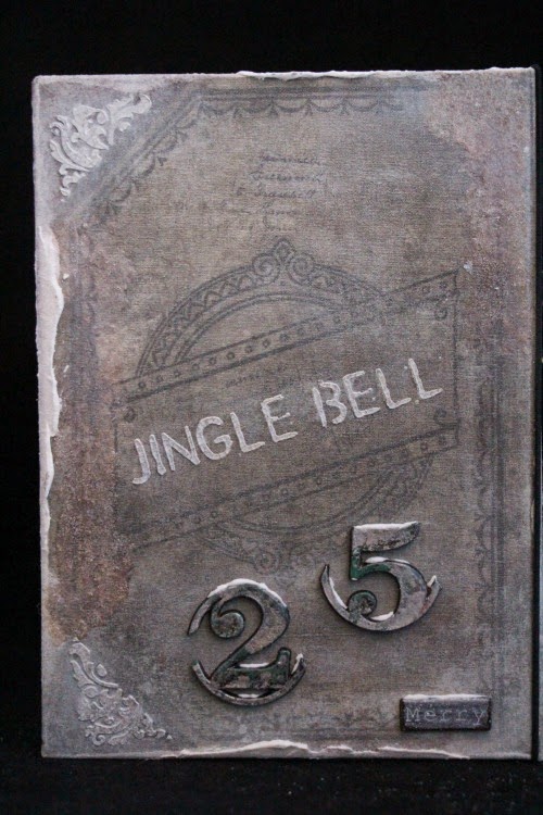
Don't you just love those bells with the numbers attached? A fabulous piece of art and if you follow the link above you get a great step x step post too. Thanks Vicki for such a wonderful project. Your badge and voucher to Country View Crafts online shop will be with you very soon.

Congratulations also go to the Pinworthy Mentions  who are -


Thank you ladies for sharing your creativity and inspiration too, your very worthy projects will be pinned to our new 2015 Pinworthies Pinterest board and a badge will be winging its way in the email to you over the next few days.

*********************************************************

In a few weeks time we will be celebrating our first anniversary and this coupled with the new year has got us thinking about any changes that could be made to improve our blog. The Creative Guides have been coming up with some good points and exciting alternatives, but what would you our readers like to see that is different? I'm leaving it as an open question but are there any changes that we could make that you think would enhance the challenge experience for you? Please leave us a helpful comment below, all recommendations will be read and considered in our quest to ensure we are providing the sorts of challenges and information that is useful and relevant to crafters today. We don't want to lose our Tim influence but we do want to widen our audience and hear what you have to say.

Thank you to all of you who come to see our inspiration projects and those of you who join in the challenges. We very much appreciate your being part of our Vintage Journey.

hugs Brenda and the Team xx

Monday, 12 January 2015

Destination Inspiration- faux rust

Good morning one and all it's Brenda here, I hope you are up for some serious metal work today. I've had it in my mind for ages to do this particular Destination Inspiration post because I love corroded metals and their wonderful colours. I also like to create faux metal effects, but I have a very limited number of techniques that can be used without spending lots of money on specialist supplies. So I thought I would experiment with distress products and ranger products to see what I could come up with. During my experiments I researched quite a bit about rusting and patinas and ended up focusing totally on using the products on my shelves to achieve different rusting effects. I hope you like the selection.


Rusted wooden shapes

Using distress paints and alcohol inks
Dab vintage photo distress paint onto shape and heat dry (if you get the gun close enough it will create texture bubbles which look cool for this effect).

In layers, drying between, dab on random splodges of aged mahogany, walnut stain and spiced marmalade DPs.

Using an embossing ink pen add splatters of distress powders in rusty colours I used spiced marmalade, fired brick, vintage photo and walnut stain.


Drip over a little butterscotch, honeycomb, teakwood and sunset orange (or any other rusty colours you have) alcohol inks.


These turned out a bit too shiny for me so after a quick chat with CG Jenny who has shown us metallic techniques herself I sponged over a little matt medium and dabbed over the anti static bag after it had almost dried which has given it a more muted look.


I suppose you could call this next one an out-take photo as this is the underside of the circular wooden shape above and I really like the effects of that too.


Using distress paints and cinnamon
Dab over with spiced marmalade, vintage photo and black soot distress paints. Whilst wet sprinkle over some cinnamon. (Yes ground cinnamon from the spice rack).

With a paint brush stipple the colours and cinnamon together


and finish off by dipping the cog in the left over cinnamon.

Leave to dry and if you're anything like me you will help it along with your heat gun - oh boy the workroom did smell nice.


When cool I rubbed off some of the excess powder and I think I will buy a spray matte varnish to seal it.


Using re-inkers and sprays (or stains).
Use gesso with wild honey, barn door, vintage photo and walnut stain re-inkers. With a palette knife 'splodge' colours over the shape and heat dry.


Repeat the process again to get more texture layered  again heat drying and getting some of those texture bubbles.


To finish spray spiced marmalade, vintage photo and walnut stain in separate layers drying between each until desired effect is achieved.


Using distress embossing powders.
Stain the cog with vintage photo, spiced marmalade, barn door and walnut stain sprays or stains – dry.


Add layers of vintage photo, mustard seed, spiced marmalade, fired brick, aged mahogany and walnut stain distress powders and bake them in together really well.


Add more if needed until you are happy with the effects.


Using distress paints, sprays and sand
Paint the cog with any brown, red and orange distress paints you have - I used walnut stain, aged mahogany and spiced marmalade (I now want to try with other colours in those hues).
Paint the colours on thickly and then dip the shape into ordinary fine sand and heat dry.


When cool rub off excess sand and you are left with some great texture.
Spray with vintage photo, spiced marmalade and barn door sprays. and heat dry.


With your craft knife cut a few bits of the surface away and paint the gaps with the leftover spray inks.


Now I have a whole collection to use in projects. Can you see there is a rogue cog here.


 Yes this one ......


It was one of my practice ones that came out too shiny and I added watery gesso to it and although it didn't get me the look I wanted I do like it for it's shabby appeal.


So now I have a nice little collection to use in future projects and it just goes to show you can experiment with any supplies you have in the craft room to see what works for you. I have used Tim Holtz products here, but there are lots more paints on my shelves that I can experiment with. What about you?

Have fun.

hugs Brenda xxx


Friday, 9 January 2015

Challenge 23 - Use A Portrait


Hi Vintage Journey Travelers, S@ndy here as your host for our latest challenge:

Use A Portrait

Tim has provided us with some very good samples in his "Found Relatives" and you are certainly welcome to use them for this challenge.  Or you may, as I did, use your own relatives. 

We'd love to see what you create. It can be a card, a tag, a scrapbook layout, a journal page, altered art, home decor or anything else as long as it meets our THEME and
 you follow our RULES.

Our winner receives a £10 shop voucher from our wonderful sponsor, Country View Crafts as well as a blog badge and the opportunity to join us here as a guest for a future month's challenge. We also award 'Pinworthy' badges to 3 runners up.
My fabulous team mates have out done themselves once again with some fantastic samples to inspire you - so lets take a look.


This time around I did a mixed media project using a portrait of one
of our beautiful granddaughters, Megan.

I used lots of Tim's grunge board punch out pieces on this project and the frame around the photo is his Postage Stamp Frame Die.   I used plenty of Distress Paint and Stains also.  Please stop over at my blog here to see the steps I took along the way.

Nikki
 

I had to use Tim's 'Found Relatives' for this challenge and then added lots of inked, stencilled and stamped layers and ideology elements to make my two tags. I added in some non Tim stuff too - my scrunched butterflies and flowers. Lots more to see over at Addicted to Art today, be lovely to see you there.

Julia
 

S@ndy's challenge inspired me  to take some photos of my adorable grand-nephews and nieces, resize and print them, and using Tim Holtz technique for Tinted Fragments,  I created some Portrait Jewelry with Idea-ology Facets!  You will find lots of pictures and details on my blog post here.


I went in all sorts of directions before deciding a Found Relative was the way to go for S@ndy's great challenge.  I added lots of other Idea-ology ephemera and metal to celebrate this young man's journey westward, seeking his fortune.  The whole thing is built on a chipboard icon, with a weathered crackle background.  Come over to Words and Pictures to see all the details.

 Anne


I know that Christmas is now a distant memory but it is still winter and I wanted to use one of Tim's Found Relative portraits, the boy with skates to make a 3D piece for S@ndy's wonderful challenge.  You can find more details over on my blog.

Julie

I had the idea of making a Vintage Travel Photo Frame and came across an image of an Antique one on the Internet and was now totally inspired.  Using a variety of Tim's products and techniques I was able to replicate this in my own interpretation. Hope to see you over at my blog to see the full 360 degrees of my project.


Jennie


 I have used a school photograph of my mother for my canvas project and used Distress colours which I know she would have loved. I tried to create a different effect with my handmade flowers for this project and have blended coloured Distress Inks on my Tattered Florals roses instead of the usual Vintage Photo. Hop on over to my blog if you want more details and a tutorial for the roses.

Jools


With so many fabulous Vintage Portraits within the Tim Holtz product lines I was spoilt for choice
One of my favourites is the lovely little dog from Tim’s Found Relatives
So a pet portrait was a must and here's how I made my frame using a variety of techniques and products, please click here for more details.

Jenny


So this is my take on 'new fangled' 19th Century portraits; in times gone by the rich and famous would be recorded for posterity in a painting, but with the advent of photograph it became possible to capture those faces on film and make as many copies as you liked. Now we take our own portraits, or 'selfies', but back then you had to take a trip to the local photography studio (unless of course you could afford the photographer to come to you)! Step forward my self-made man and famous US industrialist "Gordon H. Booth"... find out how I captured his likeness over at my blog.

 Brenda

I have used a Worn Cover for my project and kept the front 'less is more' because there are lots of details and portraits inside. Using Tim's Idea-Ology range and other bits and pieces this has become a special family piece showing five generations of  girls from my grandmother (that's her on the front cover) to my grandchildren. Click my name above the photo to see what is revealed when the book is opened.


 I wanted to create a 'memories box' to hold some of my pictures and memorabilia of Mum and Dad whom we lost a few years ago, I decided upon this little drawer.  The portrait is actually a picture of them in a special little Christmas tree hanger although encompassing it as part of the box/drawer became a tad more thought provoking, lol.  My 'Tim inspiration' is the pinecone rose, there are several of them decorating the top and I chose these as Mum adored her garden and roses were one of her favourite flowers.  More pictures and a step x step can be found here.  Chris xxx

What a great job of inspiration from the team - I know I certainly feel the love for this challenge.  We can't wait for you to join us with your creation.


Monday, 5 January 2015

Welcome Karen as Guest Creative Guide

We are starting 2015 with a fabulous Guest Creative Guide - Karen Garrard. Karen 'lives' at Winton Rose Paper Creations and is a lover of all things vintage and the Tim Holtz style. She creates some of the most amazing projects and her blog posts are so full of the details of her creations. If you haven't seen Karen's work I thoroughly recommend you pop over and take a look.


Hello every-one, Karen here. I am so pleased to be your Guest Creative Guide today. This challenge is hosted by the very talented Brenda ‘Ring out the old, ring in the new’. In the description it says to focus on the key words in the poem ..old, new, bells, snow, year etc. I have decided to create a Christmas card album from one of Tim’s worn covers. Each year another Christmas finishes and another new batch of cards is created. You will see I have focused on lots of snow and bells. This is my interpretation of out with the old in with the new.

My Tim influence was to use one of my favourite techniques of his being the Layering Stencil: Embossing which I have used on the inside cover and on my Christmas cards. I have also used another technique 'Altered Surfaces' on the numerals you can find the back cover. Of course any excuse for me to alter a piece to make it look really old, I am there, and as you know Tim is a master at this. You can find both of these techniques in Compendium of Curiosities 3. 

I live in Australia and have been paper crafting as long as I can remember. I do find myself sneaking of to my studio at least every second day, Yey! I really enjoy entering challenges as it encourages me to think outside the box and try new techniques like some of Tim’s that I now use over and over again. This year I purchased Tim’s Creative Chemistry 101 & 102 and I have to say they are so full of interesting information. Even though I am yet to complete 102 I can highly recommend it to anyone. I have also purchased all 3 of the Compendium of Curiosities too so I have a wealth of information at my fingertips. One would think with all the Tim items I have been purchasing I would be happy but no I’m just like most of you out there and I too have to have most his products. I am in a wonderful place right now in my studio with all the amazing tools available. I hope you enjoy my creation for today. For more photos you can visit me at wintonrosepapercreations.blogspot.com.


On my front cover I have used Tim’s Found Relative. I have heat embossed some gold embossing powder around the torn edges. I have added a metal clip which I have added alcohol ink and glitter snow. Behind the found relative I have added another piece of cardstock that has been stamped onto and had the edges torn and inked. Finally I have added a wide cream ribbon for my closure. 


I have used the back off some of the found relative images. I think they are way to pretty to hide, so I gently removed some to use on the inside of this piece. The remaining image will be quite thin of course so you may want to add some cardstock behind them for your next project. 


Here is the inside cover. I have used Tim’s Layering Stencil: Embossing technique with Walnut Stain Distress Ink. Previous to this I have added some text rolling the stamp onto my piece. Then I have added some more stamping from various stamp sets. 

Now you can see I have added the back pieces from the found relatives. I have also added some more stamping of pen nibs with black archival ink.


Here I have added some heat embossing black and gold embossing powders. I have also added Aleene’s Glitter snow around the edges and black elastic to hold the cards.


Here I have added the last of my Christmas cards. There would have been heaps more but they had been posted out. 


Here on the spine I have used a metal button I found at a bead shop. To this I have added metal chain at different lengths with my charms. I have also used Alcohol inks to colour the charms, then added Aleene’s Glitter Snow. The metal button has been attached using pop up foam with E6000. 


The back of the folder. I have used stencils with texture paste. Again, Aleene’s Glitter Snow. The numerals have had Tim’s Altered Surface Technique applied to them. 

I would now like to thank Brenda for inviting me here today. I truly appreciate this opportunity. Thanks so much for all the hard work you and the Creative Guides put into this blog each and every month. You are all a true inspiration. Karen.x


Thank you Karen not only for your kind words but this wonderful altered worn cover, it's a fantastic example of the wonderful things you create and I'm so pleased you made it just for us at AVJ. I am sure gonna take note of that tip about removing the backs of the found relatives, I agree I think it's a shame to cover them up and stick them to the project so they can't be seen. Thanks again and I am looking forward to seeing what else you make as we start the new year.

*************************************

There are still a few more days to enter our challenge for the new year - don't forget 'Ring out the old, Ring in the new' - what have you made that has a Tim Holtz link and would fit in with the theme?

Have a wonderful week and see you Friday with another new challenge.

hugs Brenda and the Team xxx