This is a unique challenge blog where we are inspired by and focus on the Vintage; shabby; mixed-media; art journaling; industrial, timeworn and steampunk genres and encompass the talent, flair, expertise and ideas of many artists that we are inspired by. We welcome all types of projects - cards, journaling, assemblage, layouts, albums, atcs, altered art in fact whatever you want to share (as long as it is in good taste).

Monday 29 September 2014

Guest Creative Guide – welcome Joy Kennedy

 
clip_image002


Hello! My name is Joy Kennedy and I am very honored to be a guest designer for A Vintage Journey. I love that there is a place to be inspired by others sharing their creative journey. Like many others, I am totally inspired by Tim Holtz. I was a perfectionist when it came to my projects... but he has taught me to embrace my imperfections and I now feel so liberated when crafting. My crafting style is more of a simple style… my family calls it “dirty cute”. 

When I found out the theme was “The Colours of Autumn”, I was so excited because I love these colors. Living in Southern California, we do not get the beautiful colors on our leaves like I have seen in other states. So, I live vicariously through the cards and projects created. 

One thing I love about Tim Holtz is the innovative products he creates. The new Distress Stain Sprays are so amazing! I sprayed a few of the gorgeous greens for the background and then added some tarnished brass.

clip_image004
 
I took some chipboard and cut it out of Tim’s Sizzix Leaves. I applied Crackle Paint all over the leaves and then sprayed Autumn Colored Distress Stain Sprays. I added some Perfect Copper Perfect Pearls to the leaves. It sat perfectly in the cracks and I love the extra shimmer.

clip_image006
 
I used the crinkle ribbon to wipe up the extra ink that was on my craft sheet. After the background dried, I ran it through a Tim Holtz Texture fade for extra dimension.
I realized I did not have any pretty “autumn colored” card bases, so I ran the Rusty Hinge distress stains around the edges of a while card base. You do not need to stain the entire piece, since only the outside edges will show.

clip_image008
 
Here is the final project assembled.

clip_image010

clip_image012

clip_image014
Thank you so much for being a part of my journey.
~joy

Joy it is a sheer delight to have you with us at A Vintage Journey today and to see this beautiful autumn leaf card. The crackle on the card looks amazing and I can just hear the crisp crunch of leaves as they are being trodden on in the woods.

I think many of us can empathise with embracing our imperfections Tim has obviously taught us well. Another of his sayings I say often to myself is ‘it’s only a background you are going to cover most of it up’, that has also helped me to not worry so much if my work doesn’t look perfect.

Thanks everyone for popping in today on this leg of our journey with Joy. If you haven’t see our latest challenge you can find it here and it will be great to see you there with your own project if you haven’t already jumped aboard and maybe Joy’s gorgeous crackly leaves will inspire you to share a first or even second piece with us.

Enjoy the week and hopefully some creative time.

hugs Brenda and the team xxx


Friday 26 September 2014

Winners announced today and a guest spot


We welcome Janna today who was the winner of Chris’s Time Flies challenge. It's lovely to have you with us Janna to see both your lovely project and to learn more about you.
clip_image002
Hi, my name is Janna Gay & yes I was christened Janna and no, its not Italian, European, etc etc etc, its just Joanna with out the ‘O’ so my mother said!
That out the way, I am tickled pink to be a guest designer on A Vintage Journey, I love all things Tim Holtz, vintage, distressed and inky. I was asked by some new crafting friends if I wanted to go on a weekend crafting retreat with Tim Holtz, this was 2006 and I had no idea who he was, now looking back I think wow wasn’t I lucky to have met him and got some great tuition. I think it was called Away with the Fairies retreat and was great fun. So of course I have been hooked since then!
I am a mother of one daughter who decided to have 4 children to make all things equal in the genes pool. I have a lovely husband who is struggling with several operations on his back (degenerative scoliosis) and so I am always busy helping him and my daughter who has a tattoo shop and is hoping soon to open another. Arty Genes! I have had many jobs along the way and its too boring to list all, but a lot involved art and design.
IMAGE_1805
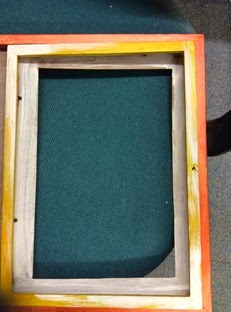
I was thrilled and excited when I won a challenge at A Vintage Journey. This gave me the chance to be their Guest Designer. I decided to make something with mixed media and also for it to be a gift for my daughters new tattoo shop, so she has a photo of her babies and a mirror for herself. The frame was a cheap one from a local Butlers shop, they have all sorts in there that looks good for altering, I have to run past the shop with blinkers on.  It had an extra swing back frame, but I realised quite soon that in order to embellish it as I wanted to, then I would have to keep it as just a double frame.

The theme is Autumn and that’s cool with me, all my favourite colours. I used to be ginger before I went grey or strawberry blonde as my mother used to say. So I always gravitate to these colours.
It's mixed media altered art, distressed and inked into submission. I apologize that there is a photo of the side of my gate on the mirror side, really tricky to photograph a mirror with out getting me taking the photo in it & the glass on the photo side reflects. 

I took the glass and mirror out of the frame to begin my painting.
IMAGE_1776 IMAGE_1806
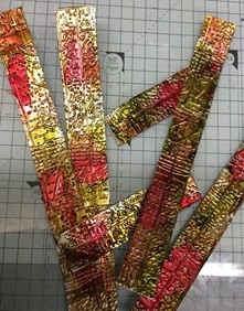
This is the left side painted in Fresco pumpkin soup acrylic & then I dry brushed Some TH picket fence in places to lift it a bit. On the part with the photo frames I used a much loved paint I have had for years called Stewart Gill Byzantine with some distress dry brushing with Hey Pesto fresco paint. I used a Tim Holtz technique to add texture by using one of his stencils with embossing paste in red and some stamping with a black pad for more interest. I added bakers twine, a Tim metal 'family tag' & a tiny cross as my daughter is religious. The next was the fun bit, I used metal to do the painted industrial technique, but I used distress inks as I wanted them to be like jewel colours, see below, great I think, these are going on the sides of the mirror frame, the next photo is the embossing folder I used on them before the inks
IMAGE_1808 IMAGE_1773
Below I have just added some close up details of all the additions, die cut TH tattered flowers and leaves, French Flight butterflies and one of the twins, Isaac, 2yrs old, looking cute in a vintage frame and Maia, the eldest at 7, well away from the insects as she hates them, her mother has to spray the bedroom with special moth spray before she goes to bed each night, (furniture polish !) hee hee
IMAGE_1779 IMAGE_1780
    Also see above the cute TH key lock over the little fan (Dragons Lair designs).
IMAGE_1782
Below is little Eden Rose who is the other twin and very adorable too, and not bothered about the creepy crawlies near her photo and Florence who is 4 and is a pickle !
IMAGE_1783 IMAGE_1809
I hope you like my project, thanks for looking.
 
Thank you Janna for sharing your creativity and your very special frame, I am sure your daughter loves that it has been made specially for her with the lovely photos of the children. There are so many autumn colours on the leaves and the flowers and it fits our challenge theme perfectly. How lucky you were to do a Tim workshop when you didn't know who he was at the time. He has obviously inspired you in your art.
 
………………………………………………………….
 
On to our last challenge Winner and Pinworthy mentions. It was Jennie’s turn to host and choose the winners with the other Creative Guides adding their suggestions too. It is never an easy job but this is what Jennie says -

Thank you all for travelling with us on our With A Flourish challenge and what a great array of "flourish" projects you came up with. One of the hardest things for us Creative Guides is to choose a winner, but I think you will agree that our choice for this challenge is a very worthy winner.

Our Winner is Pamellia (No. 7)
edit-DSC_0073
Pamellia's wonderful "stacked" card with so many wonderful layers, fabulous choice of colours and incorporating so many of Tim's techniques and details, including the flourish stencil and stamp, was very much the favourite of the Creative Guides. If you haven't seen it yet you need to! Thank you Pamellia for sharing such a wonderful autumnal project with us for our challenge. Your voucher and badge will be on their way soon and this lovely card will be pinned to the Winners board on our Pinterest site.


The Pinworthies (in no particular order) will have their project pinned to our Pinworthies board and they are -
Julie (23)

Great job everyone, thanks to you all for your continued support and entries to our challenges. The current one is Astrid’s ‘Colours of Autumn’ which runs to the 2nd October. We already have had lots of beautiful entries and are looking forward to seeing more.

Have a great weekend.

hugs Brenda and the Team


Monday 22 September 2014

Destination Inspiration - Shabby autumnal leaves

Welcome to another Destination Inspiration post at A Vintage Journey. I have a step-by-step for you today which is linked to my post on Bumblebees and Butterflies last Friday introducing Astrid’s new challenge ‘Colours of Autumn’. I made a mixed media canvas with a pumpkin and leaves theme and while playing with the leaves I tried to show the veins that stand out so prominently at this time of year.

This photo of the canvas shows the light shine through it from the back, I just like the take, but do you think the leaves look realistic enough?
P1180645
I found a wonderful photo on the internet as inspiration and to keep me focussed.
Autumn leaves
I began by die cutting a selection of tattered leaves in fairly thick card and then, here’s the tip, with a sharp knife cut the veins into the surface before you do anything else. Carefully ‘open’ the veins by bending the card in different directions along the lines.
P1180591
Next use a distress marker or a very fine brush and a mix of black and walnut distress ink, spritzed very lightly with water, and lightly draw or paint over the cut lines to make the veins show up.
P1180592
The next stage is misting the leaf with water, here you can see the ink beginning to disperse a bit.
P1180595
Then scrunch the leaf up to break the fibres down and gently unfold it.
P1180597
Next mix a couple of stains on your craft mat and spritz with water.
P1180598
Now dip the damp leaf into the colours
P1180599
I also had some walnut stain on my mat and I rubbed the leaf into that too. When you are happy with the colours, leave them to dry.
P1180601
If you find that your veins disappear somewhat …..
P1180605
… take a black distress marker and re-mark the lines …….
P1180606
……  and spritz with water …..
P1180607
Here is another example where the lines faded with heat drying, so out came the marker again ….
P1180609
another spritz of water ……
P1180610
…. and watch the ink spread out through the veins and the leaf.
P1180611
Watch out for the heat drying though as it can make your leaves look more faded.
P1180612
I also sprayed Biscotti perfect pearls on one leaf and it looks very wintry, perfect for later in the year.
P1180656
Well I hope this helps for any autumn projects that you are intending to make with leaves.

Have fun and thanks for looking.

hugs Brenda xxxxx

Friday 19 September 2014

Challenge 15 - The Colours of Autumn

Hello everyone this is Astrid , your host this fortnight and I would like the extend a warm welcome to you for our latest challenge. Can you believe we are up to challenge 15 now? How time flies!

Our theme these next two weeks is "The Colours of Autumn", but before giving you more details, thank you to all of you who have played in our previous challenges. We all hope you will join in the fun this time round again.
As many of you will know, our challenge runs for two weeks and then a winner will be chosen by the team. The winner will receive a £10 shopping voucher from our host Country View Crafts on-line shop. We shall also be choosing three blog badge winners, our "Pinworthies" who will be pinned to our special winners Pinterest Board.

Autumn is my favourite time of the year, I love the colours and all that this season has to offer! For this challenge you can make whatever project you like, large or small, as long as it includes the Colours of Autumn, red, oranges, yellows, greens and the numerous browns you can find everywhere around you in nature here in the Northern Hemisphere. Of course players from the Southern Hemisphere where it is now Spring can play too!!! Tim has the most fantastic Autumn Colour choices in his ever growing line of Distress products, so what are you waiting for? Just remember though, we are a Tim Holtz inspired challenge blog, so we will need to see a strong Tim influence.
If you are unfamiliar with our rules, or need to remind yourself, you can find them HERE in our 'Travelling Instructions'. Or if you are not sure of our interpretation of Tim's style, you can check HERE.

But now to the inspiration the team have provided for you:


Autumn is my favourite time of year, I just love the gorgeous warm hues in nature and the first smells of decay, - the season of mist and mellow fruitfulness so beautifully described by John Keats. I made a mini with the Eileen Hull mini book die using all of my favourite Tim techniques and autumnal images. To see more details, please visit my blog


I wanted to use my new layered butterfly (Bigz die and texture fade) for this project and started to play with it to make a card! In the end my 4 butterflies turned 3 dimensional and I added an ATB for them to sit on with some autumnal leaves. Lots more piccies and details over at Addicted to Art.


A mixture of stamping, embossing, die cutting and a mixture of brands too but the overriding focus is upon Tim's techniques. With misty days and autumn raindrops in mind these muted colours and imagery have been put together to show the gentler side to shabby. More details and pictures can be found HERE.


I have used some of my favourite Distress colours (Wild Honey, Rusty Hinge and Aged Mahogany) to create this wallet from a Ranger Giant Tag. There are lots more details on my blog including how I made the flowers using the Tattered Florals Die.


Autumn Colors always bring thoughts of Thanksgiving to me and being thankful for the simpler things in life. I decided to use Tim's Distress inks and stains to create a background of falling autumn leaves and of course a few Frenzy Butterflies and keeping it simple. For more details you can visit my BLOG.


For those of you who saw my Destination Inspiration 'Faux Rusted Metal Effects tutorial' you'll remember I promised to use the first of the backgrounds on a future project, so, true to my word, the rusted iron has become the backdrop for the autumnal offering over at my blog today.

Like Astrid, and probably most people, I adore the Autumn and the wonderful changes that take place. The amazing variation of colours are what I have tried to recreate here and of course I just had to use  my Tim Holtz New Leaf die and embossing folder, which just happened to drop through my letterbox :-)  To view the process/techniques pop over to  my blog by clicking my name above. I hope you have as much fun with this fabulous challenge theme as I have. xx


I love Autumn my favourite time of year, such a beautiful season with an amazing array of colours, oranges, reds, rusts, browns through to pinks and purples, a bountiful time for many creatures preparing for winter, my Butterfly is preparing for hibernation in the Autumnal leaves
For more details on my project please visit my blog 


I loved working with the autumn colours and chose to depict the wonderful time of harvest whilst at the same time imagining myself wandering through a forest with those incredible dried out leaves we find crunching underfoot. I have a step-by step on my blog today showing how I made the background and elements I used but please come back on Monday for our Destination Inspiration post where I show you how I have made the leaves.


Like the rest of the team, I adore autumnal colours in crafting.  I've used stencilling, resist techniques and crackle along with my stamping to create this tag - with a quote that's all about autumnal colours too.  Come and see more over at Words and Pictures.


Well I hope you have enjoyed the inspiration here, but before I sign off, I have a very important message to share:
We are excited to announce that we are looking for a new Creative Guide to come aboard and share our vintage journey with us. Please take a look at our invitation on the side-bar and contact us if you are interested. We have a large team compared to many challenges but that's because there is a great deal of flexibility for the Creative Guides. We are looking forward to hearing from you if you think it's right for you.


You have until 18.00 BST on Thursday  the 2nd of October to play along and we are all looking forward to seeing what you create.

We will be back on Monday with another Destination Inspiration and in the meantime

Stay inky!!


Monday 15 September 2014

Welcome Elly as a Guest Designer

If you are someone who knows Elly’s work then you know we are in for a treat, if you don’t then please pop over to ‘Mixed Media and More’ for a treat. You might like to take a cuppa with you whilst you rattle along getting more and more engrossed in the posts and projects.

Elly

My name is Elly and I joined the crafting world via YouTube with my first creations of mini books in 2010. I started as a paper crafter and discovered the the world of mixed media as I found Michael DeMeng and Andy Skinner. After my first online workshop with Andy Skinner, I was infected creating art with acrylic paints and all the unlimited possibilities with upcycling and altered art. I love to create art any style with whatever I can get my hands on.

---------------------------------------------------------------------


01

Well, the first time I stumbled across Master Tim happened nearly 4 years ago, as I was trying to create a wedding album for a friend. Searching the world wide web for ideas, I ended up on YouTube and never left it since. At the beginning I wasn't focused on Master Tim's techniques, just because it wasn't that easy to buy his stuff and the first paperline I've bought was lying around for weeks because I wouldn't waste it. Now, looking at my first project again, where I used the Lost and Found paperline but also acrylic paint and a gloss medium, I guess I already started on a mixed media path.

02

According to my first steps in blogland I've created a little mini album from corrugated cardboard. The best part of *all things Tim* is....that it doesn't matter what you're using, you can never fail to create something with a vintage - grunge look. Everything mixes and matches somehow. You only have to start 

03

The pages are roughly distressed and sprayed with my favorite colours of inks in blue and brown.

04

As a lover of acrylic paint, I'm an old fashioned user of the acrylic paint dabbers and I used gold, pitch black and aqua. The butterflies from acetate had a treatment with alcohol inks in pool and caramel. The grungeboard flourish is coloured with the dabbers and Distress Crackle Paint clear rock candy. I love the new Sizzix Alterations *French Flights* which fits my favorite stamp sets Stampers Anonymous *Papillion* and *Paris to London*

05

As I mentioned before, everything mixes and matches. Burlap, Sizzix Alterations *Frameworks* and some cool Idea - ology *Alpha Parts - framed* If you're interested, you'll find more details and a step by step of *the tag on the cover* on my blog: www.ellypirally.blogspot.de


Wow Elly how lovely that you have re-visited your first steps in blogland and made this amazing little album, complete with flourishes. It’s full of wonderful vintage distressed images, fabulous layers and lots of techniques and grungy goodness. This is one of those inspirational projects that people love to look at and we are so pleased you have shared it with us today. I am also fascinated with the first project you made with Tim’s papers, the box is perfect for keeping that fabulous album in. They both look so tactile and interesting.
 
Thanks everyone for popping in today on this leg of our journey with Elly. If you haven’t see our latest challenge you can find it here and it will be great to see you there with your own project if you haven’t already jumped aboard.
 
Enjoy the week and hopefully some creative time.
 
hugs Brenda and the team xxx