This is a unique challenge blog where we are inspired by and focus on the Vintage; shabby; mixed-media; art journaling; industrial, timeworn and steampunk genres and encompass the talent, flair, expertise and ideas of many artists that we are inspired by. We welcome all types of projects - cards, journaling, assemblage, layouts, albums, atcs, altered art in fact whatever you want to share (as long as it is in good taste).

Showing posts with label canvas. Show all posts

Monday, 26 September 2016

Destination Inspiration - Terminal Four

Hi everyone and welcome! Well we've already had some fantastic projects from Nikki, Jennie and Sandy. Now it's Jenny here reporting for duty. So here we are, arriving at our fourth terminal for this month's Destination Inspiration and it's my turn to create with the contents of the travel bag this month.

Just as a reminder, this is what's in the suitcase:

Product - Texture or Modelling Paste
Substrate - Fabric/Burlap
Colour - Autumnal / Fall colours - orange, brown, rust
Technique - Collage

And here's the canvas I came up with...
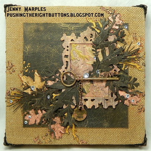

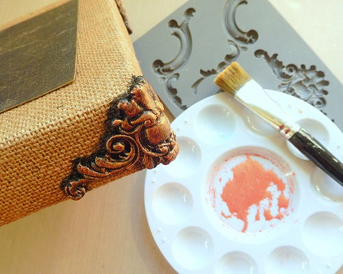
This is an 8x8 canvas and I had to start by covering it in a piece of burlap. Anyone who has tried covering a deep sided canvas will know that the corners are the tricky bit,especially when the fabric used is thick and I decided to make mine more presentable by using Prima paper clay and an IOD mould to create bespoke trims. Painted with black gesso and dry brushed with IndigoBlu gold and coral Luscious pigment powders they worked a treat.


I adhered an old piece of Prima 6x6 paper with glue to the centre of the canvas and used Tim Holtz new Autumn Layering Stencil (in it's mini version) to add black embossing paste foliage across the top and down the sides. The Luscious pigment powders were used to colour them, this time with the addition of the bronze option, to add a gentle Fall palette and a touch of shimmer.


Now for a spot of collage - I added a die cut Ornate Frame and centre covered with more of the coordinating Prima paper and a brush of Luscious. You'll notice I repeated the stencilling/colouring with more Autumn foliage in the centre of the frame. Yet more Autumn Foliage was die cut and embossed with Tim Holtz Thinlits set and layered on top of the stencilled leaves. This really helped to bring the design to life and add a sense of depth.


The canvas was completed with the addition of some metal embellishments and crystal drops in keeping with the soft Fall look and colour palette. Here are some close up photos so you can see more of the detail;


So now you've had four creations using this month's travel bag. Make sure you come back next week to see the final Destination Inspiration from another of the Creative Guides and in the meantime there's still time for you to enter our current challenge 'Create Within a Frame'.

Have a fantastic week ahead and take care of yourselves.
Jenny xxx

Monday, 13 April 2015

Destination Inspiration - April Route 2 - A Collection of Three

Hi, it's Brenda here with my DI piece for you today. The lovely Anne started us off last week with her interpretation of combining the four chosen components together for a project and of course I've used the same four - 
Product - Distress Paint
Substrate - Canvas
Technique - Grungepaper flowers (Vol 1 of Tim's CC3C Book, page 65)
Colour  -  Picket Fence


I have chosen to reverse my canvas and work on the back of it as it is more like a shadowbox and I love the depth it creates.


My canvas is 25 x 30 cms and I cut a piece of prepared canvas material (to fit in the reverse side) on which to create my background. (I buy canvas pads to do this). 
Sand over the surface of the canvas mat with a sanding block to distress the background area. 
Apply distress paints to your craft mat – dried marigold, victorian velvet & evergreen bough and spritz with water. Also spritz your piece of canvas and dip it into the paints to create a marbled effect. Heat dry. 
Take picket fence distress paint, apply it to your craft mat and again spritz with water, dip the canvas in to create some mottled patches and dry. Later you will see the lovely mottled effects that are created by starting with a base layer of the paints first.


Use light modelling paste and apply through a stencil to create a design. Leave to dry. 
Spritz with distress spays – tea dye, evergreen bough & tattered rose. Heat dry. You can see the mottled white showing through as the picket fence paint has acted as a resist. 


Place the stencil over the design again and dab picket fence distress paint over some of the texture paste pattern to bring it back to pure white again and leaving some with the colour absorbed. This gives another great mottled effect on the texture. 


Take the canvas and paint the wood that is showing with white gesso and then cover the edges with Tim’s tissue wrap. 


Layered Butterfly 
Die-cut and emboss Tim’s layered butterfly. Take your colour of choice from a set of oil pastels and colour all the embossed (raised) parts. (I even got into blending colours using a cotton bud). 


Dip it into a wash of dried marigold distress paint, blot and dry it and then spray with tea dye distress spray. When dry take the evergreen bough and spray a small amount onto your craft mat and spritze it quite heavily with water to get a more watery tone, then dip the wings into it and dry it. 


Finish by inking the edges lightly with walnut stain and then spraying with a gloss sealer to give the colours more pop and shine.


Cut two smaller butterflies from Tim's butterfly duo die and give them the same treatment, strange how the darker one looks so different in style.


Grungepaper Flowers 
I followed Tim’s instructions on P.65 of the CoC 1 to make the petals and then of course I followed my own route. 
When you have made up the flowers dip the petals in spritzed picket fence distress paint and dry. 


To get some colour on them I dipped them in both mustard seed and evergreen bough stains that had been spritzed with water and left them to dry. Next I dipped them in dried marigold distress paint – again spritzed with water on my craft mat. 
Then sand the edges and blend in walnut stain distress ink. 


Put the petal layers together with Tim brads or metal flowers with distress paints daubed over them. 


18. Dab picket fence distress paint onto a word band and gently wipe the paint off with your fingers leaving the colour to remain in the recessed letters. Dab the edges with potting soil archival ink pad.


19. Now start to assemble the canvas – dab picket fence distress paint over the tissue wrapped frame, spritz it and wipe some away from the words and adhere the background into the recess.


20. Gather some elements together to create some interest and dimension on the background collage and adhere these to the back. I added some shapes from die-cuts of the trellis frameworks die and I took a metal number 3 painted it with gesso and when dry gave it a thick coat of picket fence distress crackle paint. I don't think I made the gesso coat thick enough as the crackle began to flake away but I added some evergreen bough distress paint and then some gathered twigs distress stain, spritzed it with water and dried it off, then gave it two coats of thick clear embossing powder. This has sealed it and will now prevent the crackle paint coming off any more. I rather like the distressed fell to the finish.


21. I took a small wooden bird and a chipboard frame from my box, painted them with white gesso and blended tea dye and walnut stain distress ink over them and I also stamped some text onto them. 


The frame is going to help hold the flowers. (I wired it so the flowers can sit over it easily).


Some rafia .......


.....  the die-cut shapes .....


.... add some remnant rubs ..... 


.... and some wired paper to the flower collection.


.... and the reverse canvas has come together.


Look how neat the flowers sit over the corner raised up on the frame I added.


Well done if you've managed to read this far .....


.... I hope you have enjoyed seeing my interpretation of the four chosen components coming together.


Thanks for stopping by.

Have a great week.

hugs Brenda xxx


Monday, 22 September 2014

Destination Inspiration - Shabby autumnal leaves

Welcome to another Destination Inspiration post at A Vintage Journey. I have a step-by-step for you today which is linked to my post on Bumblebees and Butterflies last Friday introducing Astrid’s new challenge ‘Colours of Autumn’. I made a mixed media canvas with a pumpkin and leaves theme and while playing with the leaves I tried to show the veins that stand out so prominently at this time of year.

This photo of the canvas shows the light shine through it from the back, I just like the take, but do you think the leaves look realistic enough?
P1180645
I found a wonderful photo on the internet as inspiration and to keep me focussed.
Autumn leaves
I began by die cutting a selection of tattered leaves in fairly thick card and then, here’s the tip, with a sharp knife cut the veins into the surface before you do anything else. Carefully ‘open’ the veins by bending the card in different directions along the lines.
P1180591
Next use a distress marker or a very fine brush and a mix of black and walnut distress ink, spritzed very lightly with water, and lightly draw or paint over the cut lines to make the veins show up.
P1180592
The next stage is misting the leaf with water, here you can see the ink beginning to disperse a bit.
P1180595
Then scrunch the leaf up to break the fibres down and gently unfold it.
P1180597
Next mix a couple of stains on your craft mat and spritz with water.
P1180598
Now dip the damp leaf into the colours
P1180599
I also had some walnut stain on my mat and I rubbed the leaf into that too. When you are happy with the colours, leave them to dry.
P1180601
If you find that your veins disappear somewhat …..
P1180605
… take a black distress marker and re-mark the lines …….
P1180606
……  and spritz with water …..
P1180607
Here is another example where the lines faded with heat drying, so out came the marker again ….
P1180609
another spritz of water ……
P1180610
…. and watch the ink spread out through the veins and the leaf.
P1180611
Watch out for the heat drying though as it can make your leaves look more faded.
P1180612
I also sprayed Biscotti perfect pearls on one leaf and it looks very wintry, perfect for later in the year.
P1180656
Well I hope this helps for any autumn projects that you are intending to make with leaves.

Have fun and thanks for looking.

hugs Brenda xxxxx