Hello everyone and thank you for visiting here. This is
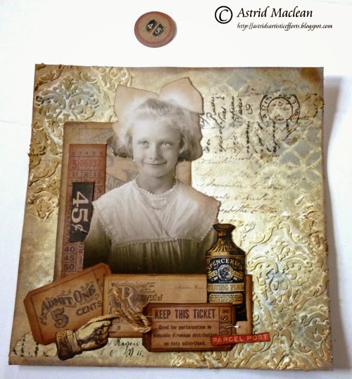
Astrid sharing a project with you that will hopefully give you some inspiration to work with multiple layers and collage. The finished project is a large (8 x 8) pocket card and tag.
What I am hoping to show you is how to build up a layered collage step by step, but to be honest, I am feeling quite nervous about it, because the truth is, I normally do my artwork like my cooking, - I never follow a recipe and just go with the flow. But as several of my blog friends have specifically asked me, to do a step by step on how I create my layered pieces, I'll try my best and hope I can take you along on the journey.
The base layer is a folded piece of Kraft card with a small spine to give room for the pocket. I am lucky enough to have some A3 Kraftcard which was just the right size, but you could easily create a spine with a separate piece of card. However, for this post I will concentrate on how I built up the main part.
I started with a piece of square Manila card stock and inked all around the edges with a mix of Vintage Photo and Walnut Stain Distress Inks.
As the centre is going to be covered with the next layer, there is no need to do the inner part, but to add a bit more interest to this layer I did some water stamping with a little background stamp, below is a close up:
The next layer started with a piece of smooth white card stock, cut slightly smaller than the first bit. I added texture with Wendy Vecchi Embossing Paste through my favourite layering stencil of the moment, the new Gothic Stencil by Tim Holtz of course.
When building up a design it is important to keep the eventual balance of the piece in mind, so in fact I turned the paper the other way round when I built up the next layers, as it usually works better to have darker and heavier elements towards the bottom of your finished piece.
When the texture paste had dried, I added some colour with three different colours of Distress Paint: Antique Linen, Weather Wood and Frayed Burlap. I used a brush, my fingers and most importantly a baby wipe and a water spritzer to blend the colours until I was happy with the effect.
To echo the textures of the paste I used the baby wipe, pouncing it in the wet paint to add some further textures.
Doing something like that, helps to tie the different parts of the piece together, - I just love the subtle effect of this process.
Time to slowly start to build up further layers:
First I added some more stenciling, this time using just Distress Inks in the same colours, Weathered Wood and Frayed Burlap, using the Lattice work Stencil this time, another favourite. I also added some tissue tape and background stamping, again, trying to keep a balance in the overall effect.
So far so good on the background, - now to the collage:
Most importantly, a vocal image, this could be a stamp, a photo or whatever you choose. For the front of my piece I decided to use the sweet girl from the Found Relatives and then I collected various bits and pieces, some tickets, stamped and fussy cut images, some bits of various paper stashes etc. I inked and coloured them to fit in with my overall colour theme:
Here you can see them but at this point I am not sure yet whether I will use them all or not, or will add additional pieces still.
Before committing to anything definite, it is always a good idea to play around a bit and see how things might work out, below is a picture where I am just playing like that, as you will see, there will be various changes still along the way...
Nothing is glued down yet, so all is possible still, just play around with your pieces until you feel the design looks good and balanced. Some things to keep in mind are:
- vertical and horizontal lines
- arranging elements so the eye can move easily around the page
- balance between darker and lighter elements etc.
Right, time to start gluing down, I always like to have my vocal image with some layers behind and some on top, so this is what I landed up with first of all:
I have put the ticket at an angle to break up the stark vertical and horizontal lines. The dark 45c piece definitely needs to be balanced out as does the heavy Received ticket:
Getting a bit better already, but there are still a few funny gaps, the whole piece is also a bit bottom heavy, so what next?
I have this round piece left, useful to break up the blockiness, but where to put it? Top right? Bottom right? where? So many possibilities....
Which one is better, - the left or the right? Neither quite does it for me, or am I starting to over think?
I know, - no collage Tim Holtz style is quite complete without some Ideaology, so in the end I land up with this:
A stencilled Number, this time in Black to balance out the heavier elements in the bottom left corner, a type-charm and rusted pen-nib to help the eye move around the page and finally (though I am not totally sure about this) the bit of measuring tape ribbon, to balance out the vertical lines on the left. It looks a bit forlorn there, but I have just thought of a solution for that, but you will see that in a moment.
Are you still with me? Onto the inside of the card, I'll go a bit quicker this time round as this post is pretty endless already.
A basic sideways pocket created with bits from the French Industrial paper stash. As you can see, I stitched both the front and the back to the base card with some messy stitching.
A central panel done in the same way as the front, but this time without the texture paste.
Some stencilling, done just with inks and then the collage, going through the same process, playing around with elements until some balance is achieved, - this time the vocal image is a freebie from the net, it can be found
here. This wonderful lady posts freebies every Friday.
On this photo the design is still a bit bottom heavy, but that will be balanced with the clip and heart that will be showing on both the front and the back, all rusted up with rusting powder for the vintage look:
Now all that is left to do is the tag:
However, as this post is so long already, I will do a separate post on that on my blog in a few days time.
So here you can see the tag in the pocket:
And here you can see the full inside:
If you are still with me, congratulations on being so patient. I hope you have enjoyed this project and that I have given you some inspiration to have a go at multiple layers and collage yourself. One final bit I have not mentioned is that it makes all the difference if you add some shadow to your vocal image. You can use a Distress marker, a coloured pencil or some charcoal, the possibilities are endless.
All the principles of this tutorial can be followed on both large and small projects, so why not join in our ATC challenge and give it a go?.
Almost all of the products used in this project are available from
Countryview Crafts our wonderful sponsors. I hope you have enjoyed my destination inspiration.
Thank you so much for visiting today and have a great creative week ahead!
xxx