This is a unique challenge blog where we are inspired by and focus on the Vintage; shabby; mixed-media; art journaling; industrial, timeworn and steampunk genres and encompass the talent, flair, expertise and ideas of many artists that we are inspired by. We welcome all types of projects - cards, journaling, assemblage, layouts, albums, atcs, altered art in fact whatever you want to share (as long as it is in good taste).

Monday, 13 July 2015

Arriving at Terminal 2


Hello, it's Julie from Juliz Design Post here with you today. Lovely to have you visit on my part of this journey.

Travelling this month in our travel trunk is the crafty must haves-

1. Product - Any 'Classics' Stamp set.
2. Technique - Shabby Chic - CC Vol 1, Page 49
3. Colour - Antique Linen
4. Substrate - Tag

Using all of the above elements this is what I came up with....


I started by adding a coat of Black Gesso onto a Black Tag to give it a Prime. Once dry I used Classics #3 stamping with Versamark ink and heat setting with Clear Embossing powder. Next I painted over the entire surface with Antique Linen Distress Paint. Misting a paper towel with water I rubbed over my damp paint to reveal a Shabby Look. Finally mounting onto a Manilla Tag  with the edges distressed.


Using a Manilla tag I stamped Classics #6 in Black Archival Ink and heat embossed with Clear ink, fussy cutting around the edges. I stamped little splatters on using Antique Linen Distress Paint  and distressed the edges with Antique Linen and a little Black Soot. Adding some stitching, staples and chit chat stickers for detail.


My clock was made using the Sizzix Movers and Shapers die. I pressed Versamark ink onto the outer frame of the watch and added a mix of Silver Embossing Powder with Verdigris and Vintage Photo Distress Powder. Once heat embossed I rubbed a little Black Soot Distress paint on and off. The clock face was stamped with a cog stamp onto Black card and heat embossed with Silver. Adding my Idealogy I then filled with a generous layer of Glossy Accents.


My Time Travelling Gent was stamped in Archival and shaded with Distress Pens, fussy cut and his key charms added to his hand for detail.


Another pic of my finished tag.

Hope you have enjoyed my post today and feel inspired to incorporate one of these techniques into your project for our current challenge - Destinations. All the details are on the sidebar.

Happy Crafting,

Julie x

Friday, 10 July 2015

"Celebrations" Winner and Pinworthies

Hello fellow travelers - what a "Celebration" we had here at A Vintage Journey last month.  Thanks  to all who participated, we certainly enjoyed some amazing art.   That being said, it's time to announce the Winner and Pinworthy Mentions for our Celebrations Challenge.

Our winner, drawn by Random Org., is:


This lovely shabby/vintage easel card is colored so nicely and uses Tim's favorite color, brown.
Congratulations Tindaloo on your win.


And now for our Pinworthy picks, listed in no paticular order, chosen by the Creative Guides.


This clever mixed media project spelling out the word "Google" is just so much fun to look at.  A gift for a hubby who is up on how things work.  He has no need to look it up!


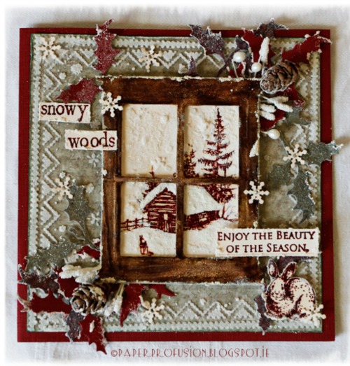
This beautiful creation really went off the grid with a winter celebration.  We certainly can enjoy the beauty of the season with this view of the snowy woods.


This wonderfully masculine piece says Tim all the way.  The great color combination and Tim's Time Travelers are a winner any day of the week.

If you haven't been around to visit the blogs of these talented ladies - wait no longer.  A simple click of the mouse on their blog name will take you there.

Thank you for traveling with us and please join our current challenge, Destinations.

Congratulations to all our winners, you will be receiving your badges soon.

Have a great weekend,
S@ndy & The Creative Guides

Monday, 6 July 2015

I’m starting out from Terminal 1!

Good morning everyone, it’s Chris from ‘My corner of Heaven’ here with you this morning.

My luggage has been stored in the boot but I have my overnight bag with me filled with lots of goodies that I cannot be without.  My fellow travellers this month have joined with me to come up with our list of ‘desert island must haves’ and they are:
  1. Product - Any ‘Classics’ stamps
  2. Technique - Shabby Chic - CC Vol 1, Page 49
  3. Colour – Antique linen
  4. Substrate – Tag
Using all of the above elements, this is what I’ve come up with…


Here’s my journey to the end destination…


I hope you’ll join in with our travels this month and take a journey of your own….?

Have a great month!

Chris xxx

Friday, 3 July 2015

Destinations

Hi everyone and welcome! Jenny here as your host for the July challenge. So many people are taking trips to far flung places or exploring locations closer to home right now. With this in mind we would love to see creations based on a destination or place of your choice. Tim has provided stamps themed around the United States, Great Britain and Paris but don't let this restrict you! Let your favourite destination inspire you.

Remember that this is a Tim Holtz inspired challenge, so when choosing our top 3 entries, we want to see Tim's influence clearly represented in your project. If you describe it in your post even better! You do not have to use Tim products, though his wonderful Distress range of course offers plenty of choice, but we do want to see that your project is inspired by one of his wonderful techniques that he so freely shares. You can make anything you want, as long as it clearly follows our challenge rules. And if you want to double check, just click HERE.

Our challenge is a monthly one and a randomly chosen winner will receive a £20 gift voucher from our very generous sponsor, Country View Crafts. We also award our Pinworthy badges to the Top 3, chosen by the Creative Guides.

And now for some inspiration from those Creative Guides who await to whisk you off around the World...


I was particularly inspired by a single strip in Tim's 'Cityscapes' stamp set and worked on recording my thoughts and feelings about the city in question in my journal. The city is of course Rome and though I've not yet visited (it's on the bucket list!) the intense heat here in the UK at the moment definitely triggered all sorts of colours and images in my mind. It also gave me a reason to play with the new Distress Micro Glaze - WOW!!!
See more on my blog HERE.


It's Tim's papers, ephemera and dies that have inspired me for this challenge. I love making albums and have every intention of filling them with photos and ephemera from holidays but I never seem to have the time to finish them. I have trialled some Travel Cards and think that might be a way for me to go to record not just big holidays but even days out so that my destination album will hopefully get filled up - keeping my fingers crossed.


Destinations, the perfect topic for July when travelling is on all our minds. My scrapbook page  "From Cactus to Coast" depicts our current journey. I have used lots of Tim goodies here including his great Compass Blueprint Stamp & Die Set and Adventure Words. Please travel on over to my blog, My "Crafty" Life on the Internet, to see more details and photos.


I have been to several places that I have loved but I always like to come home. I do love home! My simple plaque was inspired by a post I saw recently from Paula Cheney. I loved what she did, hers was a little more involved than mine but I used many of her tips. I have more details over at Addicted to Art.


I have been waiting for this challenge so that I could use my fabulous Cityscapes stamps, a gift from a wonderful friend. I chose Paris as my 'destination'. If you would like to see more please visit my blog here.


I went off the beaten path of the challenge a little bit - creating a Train Case that I will take wherever I decide to go this summer! I did some stencilling with ink and translucent embossing paste and used a lot of Tim's products putting this cute little case together - take a trip to my blog to see more!

Trace 

I love the found relatives pictures and every one has a story to tell..for this lovely young couple the destination to celebrate their love seemed to be Paris. The rest just seemed to flow using French Indsutrial paper stack, stamps and plenty more Tim goodies! All the details can be found on my blog. xx

http://www.mycornerofheaven.com/2015/07/every-bird-has-destination.html

My inspiration for this card has come, quite simply, from Tim's gorgeous stamps and dies. When I saw Tim's mini M&S aeroplane die AND these fabulous stamps depicting various destinations, I just HAD to have them. They came in handy for this challenge! If you'd like to learn more you'll find all the details on my blog. Have a wonderful July! Chris xxx


I have made a tag album using a size 10  kraft tag............as soon as I saw Jenny's challenge theme I knew I wanted to make a project mentioning San Francisco, which is my dream destination. Some of you may remember the song by Scott McKenzie......." If you're going to San Francisco.....be sure to wear some flowers in your hair", hence the flower etc. It really is a favourite of mine from my childhood. For more details pop over to my blog HERE.

Now it's over to you - where will you take us on a journey to?


Monday, 29 June 2015

Destination Inspiration - June Terminal 4

Hello all, Alison here from Words and Pictures, and I'm delighted to have arrived at Terminal 4 to share June's fourth and final Destination Inspiration project with you.

Packed in the travel bag this month we had:
Main Colour - Walnut Stain
Technique - Layering Stencil and Texture Paste
Substrate - Watercolour Paper
Product - Any Tattered Die

Three of my fellow Creative Guides have already shared their inspiration with you, keeping us all fuelled for the journey (you can see their roadmaps of inspiration again at the end of the post), and now it's my turn.  Here's what I came up with...  (I had to make this some time ago before life got busy, but I'll do my best to remember how I put it together!)


I started by cutting a large tag out of a sheet of watercolour paper, and applied texture paste through the fabulous Typo stencil before spritzing with Walnut Stain Distress Spray.  I tried to keep some whiter spaces, and places where you can really see the delicate splatter pattern from the spray.


I decided I wanted the Typo lettering to pop a little more, so I did some dry-brushing with Picket Fence Distress Paint to highlight the texture.


I'm not much of a flower-maker in the general way of things, but I know where to go when I do want to do some... my fellow Creative Guide Jennie has some amazing tutorials over at her blog Live the Dream, and I almost always go there for help when I'm using the Tattered Florals die.


I followed her Cabbage Rose design for my large flower (I've enjoyed the results in the past, and it didn't fail me this time either) and a sort of half version of the same for the smaller ones.  I did less curling of the petals on the small roses as my book pages I was using weren't really strong enough to take it.


So with all my components in place, I now had the fun of adding collage elements and embellishments to finish the whole thing off.


I used one of the brilliant Photobooth photos, and layered up paper scraps and other ephemera to frame it.


I altered my metal embellishments with alcohol ink and some Treasure Gold.  I think the clock looks pretty good peeking out from behind the roses.


I particularly like the effect on the WordBand.  I thought about applying paint to accent the lettering, but decided I rather liked how subtle the words are like this.


I like the dark Teakwood and Espresso alcohol inks contrasting with the bright gilding.


I needed something a little brighter to carry the eye on a longer journey and capture the light in places, so I grabbed some thick card off-cuts from the Frameworks Honeycomb die which were hanging around on my craft table and gave them a coat of Antique Linen Distress Paint and then one of Rock Candy Crackle Paint.


Once it was dry and cracked, I pressed the pad of my Walnut Stain Distress Stain down onto them to let the ink sink into the crackles to highlight them.


The seam binding at the top has had a close encounter with the Walnut Stain inkpad so that it tones in with the rest of the tag.


And I'm a complete spatter fiend at the moment - can't resist it!  You can see the dry-brushing and a little hint of Treasure Gold highlighting the texture here too.


So there you have it... my roadmap of inspiration to re-charge your batteries for the next stage of the journey.


 I hope you like it.

As promised, here's a recap of all the Destination Inspiration projects from this month.  I love seeing how each Creative Guide uses the same luggage from the travel bag to create such different and individual projects.


Terminal 1 - Jennie


Terminal 2 - Anne


Terminal 3 - Astrid


Terminal 4 - Alison


So there you have it - I hope your creativity is firing on all cylinders after all that.  You've still got a bit of time left to come and join in S@ndy's Celebrations challenge, so get cracking!

What will be packed in the travel bag next month?  And how will each Creative Guide use the components to fuel our onward Vintage Journey? You'll just have to come back each Monday to find out... Bon Voyage!

Alison xx