This is a unique challenge blog where we are inspired by and focus on the Vintage; shabby; mixed-media; art journaling; industrial, timeworn and steampunk genres and encompass the talent, flair, expertise and ideas of many artists that we are inspired by. We welcome all types of projects - cards, journaling, assemblage, layouts, albums, atcs, altered art in fact whatever you want to share (as long as it is in good taste).

Friday 29 April 2016

Tag Friday for April

Welcome to the fifth Friday in April and on these five Friday months we all enjoy a special post where anything goes as long as it is a tag and the Creative Guides have gone all out in their creativity and inspiration and provided an incredible line up. So let's get off and take a look.

*************


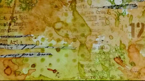
I took the opportunity of today's AVJ April Tag Friday to use my new Gadget Gears #2 die and to try out a rusting technique on them!  For more details  and photos - I invite you to stop by my blog post here!

*****


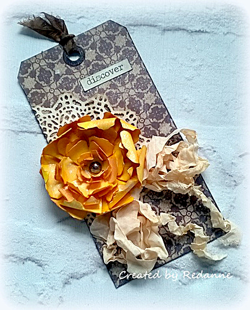
I do love a Tag Friday! and the chance to experiment. I decided to dig out some tea bag fabric sent to me by a textiles friend and which I have had for ages, wondering what to do with it. I decided to use it to encapsulate elements on my tag and then to add a 3D flower cluster on top. I am quite pleased with the ethereal look to the tag which really only needed small cluster to set it off. There are a few more details on my blog if you would like to see more.

*****


I used lots of  bright vibrant colors along with a vintage background to create my tag.  We have lots of birthday celebrations coming up next month around our house so wanted to get a head start.  Hope you will visit me at My "Crafty" Life on the Internet for more details.

*****

Deb


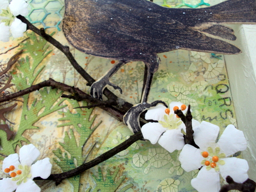
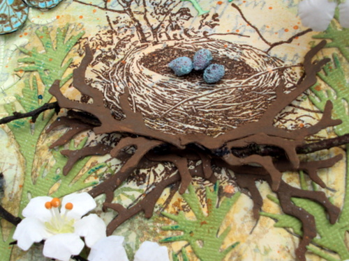
I've been working in the garden and the arrival of the butterflies and moths now that Spring is here inspired my tag for this month's Tag Friday.  I also just got some new to me embossing powders so decided to give them a test drive, stop on by my blog to see some step by step photos.

*****


I wanted to play with one of Tim's Mixed Media dies, so created a double tag. I used two size 10 tags as I wanted it for a particular purpose. If you want to see what that was, please come over to my blog and all shall be revealed...

*****

I wanted to cut into my Tim Holtz 'Dapper' papers' and use them in a more feminine way than
perhaps they were intended.  You can see more on my blog here.

*****


I took this Tag Friday opportunity to have a play with Tim Holtz New Distress crayons. If you would like to see how I used them there are more details on my blog.

*****


Having been on holiday to Lanzarote and finding some beautiful hot weather I think my mood and mind is still set with the warmth of the sun and I am sure I have been influenced by the hues of the sea too. I have to admit the butterfly was left over from a workshop session but I love the colours and didn't want to waste it and the same with the weathered board which reminded of the boardwalk and marina in Playa Blanca. Roll on summer here in the UK.

*****

Well I hope you have enjoyed the very varied line up of inspiration from the Creative Guides, we look forward to seeing you again on Monday when we have a fifth Destination Inspiration post for the month. Between now and then have a fabulous weekend.

hugs Brenda and the Team xxx


Monday 25 April 2016

Destination Inspiration - Arriving at Terminal #4

Hello Everyone
Amanda here and I'd like to welcome you to travel with me today on the penultimate leg of this months Destination Inspiration 
Here's a quick reminder of the contents of the travel bag
Product- Gesso
Technique- Crackle
Colour- Spring Green
Substrate - Kraft card   
Yes, as always there's only a few supplies but I love to travel light so lets hop on board and continue the journey.

I have chosen to make a card as its something I haven't made in a while but I can also see this card working as a piece of wall art.

I began with the background and after adhering some torn tissue tape to a piece of cream card cut to size I added colour using Tim Holtz Wrinkle Free distress technique and a few distress inks in 'Spring Green' colours - Shabby Shutters, Peeled Paint, Twisted Citron and  Brushed Corduroy
Once happy , I then blended in more colour using the blending tool and Twisted Citron distress ink 


Next came the stamping and stencilling. I used a selection of stamps and stencils, stamping in both Fern Green and Coffee Archival Ink and stencilling in Brushed Corduroy, Peeled Paint and Shabby Shutters distress ink .


I also applied Paper Artsy Grunge paste through Tim Holtz Harlequin stencil to the top left and bottom right of the background . Once the paste was dry I repositioned the stencil and using a dry brush painted the stenciling using Walnut stain distress paint . 


Now it was time to introduce the Gesso. Using my finger picking up a little white Gesso I caught the surface of the background in quite a 'free and 'loose' way ensuring I caught the textured harlequin stencilling as I worked. I do like the effect and appearance Gesso creates when applied like this.
With my much loved splatter brush I added some Gesso splats and a few Gesso circles created with bottle tops. 
I used Tim Holtz  Distress Crayons to darken the edges of the background panel and enhance the textured stencilling, smudging as and where needed. Love the shadow the smudging created around the harlequins!


I adhered the finished panel to a white and brown card stock mount before adhering to a Kraft card base. With the background finished and mounted I moved onto the elements and this is where I introduced the crackle. I die cut a circle, primed it with Gesso, painted it with Walnut Stain distress Paint snd crackled it using Finnabair's Platinum Crackle paste . Once air dried (overnight) I smudged distress crayons over the surface with my finger to enhance the cracks and give it a more grungy look .


I adhered a book plate to the cracked disc placing a word sticker in the window and adhering two green gem dots as faux fasteners. (photo to follow) .
The wood grain embossed strip is one I found in my stash that I'd coloured using distress crayons and the narrow corrugated strip again was found among my off- cuts and distress crayons used to add a touch of 'Spring Green'. 


Now it was just a matter of playing around with all the elements until I was happy with the composition and adhered them in place.


Oops nearly forgot , I added a couple of Ideology game spinners and hitch fasteners to two of the card corners


and my card is complete.


 Thank you for accompanying me on the 4th leg of Aprils Destination Inspiration. I hope I and my fellow creative guides, Debs ( terminal 1), Anne ( terminal 2) and Astrid (terminal 3)  have inspired you to go and have fun creating.  Don't forget to stop by again next Monday to see the final Destination Inspiration post this month
and our current Challenge 'Spring is in the Air'  can be found here
Hope you all have a great week 
Happy Crafting 
Amanda x


Friday 22 April 2016

Invited Guest Designer - Mo Stokes - Almo Craft

Today we welcome a wonderful crafter and lovely lady as our invited guest to share a project with us based on this month's challenge theme - Spring is in the Air. Welcome to Mo from Almo Craft.
Hi everyone, my name is Mo and I live in a beautiful part of Norfolk, England near the coast having recently moved from the North West of the country with my husband Alan who has finally retired after several years contemplating the matter, and our (cavalier king Charles/Pomeranian X) dog ‘Georgie’.

I have always enjoyed making things since I was a little girl, my brother and sister were the academic ones, I was the creative one in the family. I have always admired the work of Tim Holtz and I have been very honoured to have attended two of his amazing classes in recent years. I love learning new techniques and adding many different layers and textures to my projects, I need dimension and have great difficulty these days producing anything that is ‘flat’! My style tends to lean towards the Vintage/Shabby Chic side of things and I don't really plan my projects in advance, I just like to go with the flow and see where my imagination takes me.

I am so excited and honoured to be asked by Brenda to do a guest design piece for their latest fabulous challenge. I love all things botanical, animals, birds and the seaside - these themes tend to show up somewhere in nearly everything I create so the theme Sandy chose for this months challenge ‘Spring is in the Air’ was just perfect for me. I was inspired to make this shadow box following one of our daily walks with Georgie by Blackbirds singing away in the blossoming Hawthorn hedges.
I started by wrapping crushed tissue paper around my canvas to get some texture and when dry brushed gesso over it. I wanted the frame fairly simple so as to frame the inner detail better but I wrapped the twine around the frame and added the letters using tissue tape for added interest.
The background was created using firstly postal tissue wrap, followed by crackle texture paste through stencils, distress inks various stamping and die-cuts. The main hawthorn branch is a real one if you look hard you will see the thorns! but the flowers and flower buds are hand made using die-cut watercolour paper, a paper punch and painted stamen. Parts of the nest are also die-cut onto a real branch for dimension.

The star of the show ie the blackbird and the nest are of course from Tim's Bird Feather stamp set. The photo below shows you how I have fussy cut his claws to grip the branches. 
The eggs were also made from flower stamen, originally pink they were painted blue with tumbled glass distress paint and given a few dark speckles.
The photo below gives you a closer view of the shadow box, but for more photos and the full tutorial please visit my blog.

Thank you Mo! What a fabulously composed piece of art - your background is superb with all it's texture, the fussy cutting brilliant and all those details with the stamen! I am rather envious of your walks with Georgie in a part of the UK I haven't spent much time since a child, but I know to be gorgeous.

We do hope you have enjoyed Mo's wonderful creation and maybe feel inspired to play along with our Spring is in the Air challenge.

Many thanks for stopping by.
Nikki on behalf of the AVJ Creative Guides.
xxx

Monday 18 April 2016

Destination Inspiration - Arriving at terminal 3

Hello all and welcome to this third leg of our journey This is Astrid inviting you along for the ride to see what I have done with the content of this month's travel bag.
If this is your first time here in April, - or if you need a little reminder, these are the fun things we are unpacking for you this month:
Product: Gesso
Technique: Crackle
Colour: Spring Green
Substrate: Kraft
I decided to have fun and experiment particularly with different types of crackle mediums and altered a frame as an integrated part of a vintage mixed media piece.
I started with a simple chipboard frame purchased a while back at a craft fair and gave it 2 coats of dark brown acrylic paint.
Next I added a fairly thick coat of Decoart Americana Weathered Wood crackle medium and when it was touch dry added some light blue acrylic paint. After the crackle had done its magic it looked like this, - all I did still was add some Walnut Staid Distress crayon around the edges.
Now for the inside of the frame: I cut a piece of kraft card slightly larger than the aperture of the frame and covered it with Tim Holtz Tissue wrap.
You can just see the brown tones of the kraft through the tissue wrap. Next came another crackle experiment. I added some Finnabair translucent Crackle paste through the Tim Holtz  Crackle layering stencil  to double the crackle effect. But as I wanted it to blend in with the blue tones of the frame I added some Salty Ocean and Blue Sapphire Distress Crayons over it, blending the colours carefully with a damp baby wipe to let them seep into the cracks and then adding some more to retain the blue tones.
I also dabbed a little watered down Salty Ocean Distress paint with my finger to intensify the colour further still.
Alright, now for the decoration of the frame, and oops I had not yet used any gesso....
So here goes: I die cut the Tim Holtz Thinlets Globe die from Kraft card and covered it with Gesso and when that had dried added some Distress Crazing medium for some much more subtle crackles.
Next I used Peeled Paint and Twisted Citron Distress Crayons to achieve my Spring green, plus some Vintage Photo around the edges. I also added tiny bits of gold foil which are very hard to pick out on the photo. The crackle was very subtle, but it is there...... :o)
The arrow shows where you can hopefully just make out the crazing crackle, it looks so much better i.r.l....
Time for the finishing touches you'll be glad to hear:
I gathered a collection of die cuts and ephemera pieces, making sure to include some Spring green and Kraft card.
A larger piece created with the help of a La Blanche stamp and some heavy distressing using Vintage Photo and Ground Espresso Distress Inks.
A little bunch of die cut Spring Flowers, using Tim's wild flower dies, for this occasion I decided to give them a more realistic wild flower look with the help of Distress Markers. a tiny bit of gesso and Inktense pencils.
And finally my last crackle experiment, using Deco Art Media Crackle glaze (not very successfully, it was rather old and sticky and kept falling off, - beware this easily happens with any crackle glaze when it gets old).... To preserve the little crackle I had,  I gave both the frame and the letters a good coat of Decoart Traditions multipurpose sealer, very important if you want to keep crackled layers in place!

Some stencilling was added to the frame still and then it was all put together. I arranged most pieces around the frame and then used the bunch of flowers to kind of tie it all together:

 And finally voila the finished piece.....

There is of course a whole story behind this project, - of an Edwardian gentleman travelling the globe for some very special wild flower specimens for his loved one, - but as I have kept you long enough already, I won't bore you with that....

If you haven't done so already, make sure to visit the projects my fellow guide created with these same ingredients, you can find them here and here. I am always amazed to see, how different people can come up with such different things, using the same ingredients. Our current challenge with the theme of Spring is in the Air can be found here

Thanks so much for you visit today and don't forget to come back next week!!

Friday 15 April 2016

Pinworthy Inspiration - Welcome Katie and Esther

Today we welcome back two of our previous pinworthies as guest designers here at A Vintage Journey. Welcome Katie and Esther. For those that don't know, our 'pinworthies' each month are the projects selected by the AVJ creative guides as the most inspirational designs for each of our challenges. You can, as the name suggests, find all our pinworthies on Pinterest - do check out our pinterest boards!
Our theme this month is Spring is in the Air - let's see how our guests have interpreted this theme.

Katie
I am honoured to be a guest designer here at A Vintage Journey.
My name is Katie Kempton, aka Inky Angel in the craft world. 
I live in Vancouver, British Columbia, Canada with my family. I have been married to my college sweetheart for 27 1/2 years and we have a son who is graduating from high school this year.

I enjoy crafting all my life. I started card making with Stampin' Up in 2008 and ventured my way into the cyber world in 2012. My style is usually shabby chic but I like to challenge myself with other styles from time to time.  I love watercoloring and my favourite colouring medium is Distress Inks.  My other main interests include sewing and knitting. I carry my knitting bag with me wherever I go and always find time to keep my hands busy. 

I made a tag card for this challenge; the card measures 3 3/4" (W) x 6 3/4" (H)
The stamp image is from Dina Wakley's Scribbly Birds set.
I water colored it with Distress Ink pads.
I stenciled the pastel designer paper with TH Dot Fade stencil and texture paste.
I then added some TH tissue tapes and remnant rub-on. 
Next, I inked the raised side of a TH Wood Grain embossing folder and
ran a piece of designer paper and the folder through my Big Shot machine.
The ink made the embossed wood grain look more pronounced.
I distressed all paper edges, added some TH die cuts and chitchat words.
I finished embellishing the card with some pearls, metal charm, lace and ribbons.

Thanks so much for having me here at A Vintage Journey!
I hope my tag card inspired you to make a shabby pastel spring themed card.

Esther
Hi I'm Esther of Crafty Effusions and I was so excited to be asked to guest here on AVJ so thank you for the opportunity.
I've been crafting in one form or another my whole life and as a busy Social Worker it is my relaxation and therapy. My first love is stamping but my stencils are never far from reach either. I live in rural Suffolk with my very patient other half who tolerates my messiness and passion for all things inky that often results in the dinner being late!  

I love the soft but vibrant colours of spring and don't ever need an excuse to use a butterfly image so made a Tim inspired tag for my guest slot incorporating both these.
Distress inks provided the colours and I added a layer of glossy texture through a stencil with Ranger transparent texture paste.
The Butterflies are stamped onto acetate and Rock Candy Distress Stickles gives subtle bling.
The Butterfly panel is layered onto a stamped Kraft tag with some text stamping around the edges as I can't resist a bit of vintage even on a spring project. I coloured some seam binding with the same distress inks as used on the Butterfly panel.
A little spring banner to finish off secured with brads.
Thank you once again for letting me share my tag with you at AVJ.

*****************

Thank you both so much for sharing your creations with us here - two beautiful but very different tags! The current challenge is open until May 5th - do come and join in the fun!

We are back on Monday with our next Destination Inspiration post. In the meantime, have a lovely and maybe crafty weekend!

Nikki and the AVJ Creative Guides

Monday 11 April 2016

Destination Inspiration - Arriving at Terminal 2

Welcome aboard fellow travellers!  Anne here to welcome you to Terminal 2
of our Destination Inspiration Journey for April, here are the contents of our 
travel bag:

Product:  Gesso
Technique:  Crackle
Colour:  Spring Green
Substrate:  Kraft

I decided to create another card for my birthday box!

I started by gathering up all my supplies.
The flowers were die cut using Tim Holtz Wildflower thinlits and the
corrugated Kraft was die cut using the Mixed Media thinlits.  The card
base is Kraft card, both pieces of card were edged with Walnut Stain
Distress Ink.
I gave the wildflowers a good coat of DecoArt Gesso to give some 'tooth'
for my next layer.  I left them to dry naturally.
I painted the white card base with a mix of Distress Paint in Twisted Citron
and Picket Fence to give a 'Spring Green' colour.  Once dry, the edges were distressed.
For the 'crackled' element, I used the new Tim Holtz Collage Medium - Crazing
as I wanted quite subtle crackles on my tiny wildflowers.  I used a thin coat on
the stems and applied it much thicker on the flower parts.
Once the crackle was dry, I applied Distress Crayons in Twisted Citron and Picked
Raspberry.  I used my fingers to apply the crayon and then smoothed it out with a
nearly dry baby wipe (a tip picked up from Paula Cheney).  Having the Crazing
Collage Medium there made it so easy to apply the crayons.
I hope you can see the subtle crackles in this photo.
My final element was the ribbon, which I dyed using Distress Spray Stain in
Twisted Citron.  I scrunched it up, whilst drying it with my heat tool.
Here is the bow in place.  I really love how the Distress Paint, the Distress Spray
Stains and Crayons work beautifully together.

Thanks so much for travelling along on this leg of the journey.  I do hope you 
will come back again next Monday to see what our next Creative Guide does 
with the contents of the travel bag!

Our current challenge - Spring is in the Air, can be found here, I hope you
will find time to join in the fun.

Hugs, Anne xx