This is a unique challenge blog where we are inspired by and focus on the Vintage; shabby; mixed-media; art journaling; industrial, timeworn and steampunk genres and encompass the talent, flair, expertise and ideas of many artists that we are inspired by. We welcome all types of projects - cards, journaling, assemblage, layouts, albums, atcs, altered art in fact whatever you want to share (as long as it is in good taste).

Friday 29 July 2016

Fifth week Tag Friday

Yay we have another month with five Friday's and everyone here has had fun making a tag to share with you. I love looking at the tags that get made for Tag Friday because there are no themes, no constraints, everyone can just get on and make whatever comes into their head and of course we have a wonderful selection for you today. My huge thanks to these amazing team members for taking part.


I have quite a few mop up backgrounds in my draw from previous projects and I thought I would make use of several of those backgrounds for this tag. I added several layers to the mop up background to add further interest and included one of my favourite images from Tim. Pop by my blog for more details. 


For this episode of Tag Friday here at A Vintage Journey I dove into my folder of mop up tags and played with techniques old and new to create my Discover Yourself mixed media tag.  I've a few step by step photos on my blog, hope you can stop by to take a look!


For this month's challenge theme (Monochromatic) I shared three of the five tags I had made using distress products and scraps lying on my desk. Here are the final two. Over at Addicted to Art today you can see all five together and reminder of how they were made.


I seem to have been in a vintage mood when I was creating this tag - there's my favourite blue & brown colour combination, some stencilling and texture paste text in the background, and some collaged objects - a sort of tag-assemblage!  Do hop over to Words and Pictures if you'd like to see more details.


I've continued with this month's theme of 'Monochromatic' for my first ever Tag Friday - super excited to be able to join in! I've used a colour mop up tag for my base and gelli print scraps for all the die cut pieces and stamped images. I finally got some gorgeous Teesha Moore stamps to use too - love these so much.For further details about the processes I used, just click here.


I do not do monochromatic very often but I had this beautiful seahorse left over from
another project so he was my starting point.  I used lots of other Tim Holtz items


to make the tag, you can see more here.


With summer in full swing in Massachusetts - I was in the mood to create a summertime tag and what better theme then the seaside!
You will find more photos and details showing how I made my tag on my blog post here.

****************


I hope you feel inspired by these fabulous makes and of course we hoe you will pop over to everyone's blog to share some love.

We all wish you a happy weekend.

hugs Brenda and the Creative Guides. xxx

Monday 25 July 2016

Destination Inspiration - Arriving At Terminal 4

Hello travellers, welcome aboard to Terminal 4. This is Tracy Evans here to share the fourth leg of our Destination Inspiration journey for the month of July. You can view Nikki's Destination Inspiration, Terminal three HERE.


So what do we have in our bag to inspire you:
Product: Ephemera Collage Elements
Technique: Use A Brayer
Colour: Teal or Turquoise Shades
Substrate: Card
I opted for a masculine mixed media card with many layers to add to the card a real tactile element.
 1 Apply a thin layer of Gesso to a piece of kraft card; applying the Gesso with a palette knife to give a more random feel and then dry with a heat tool.
2 Add a small amount of Peacock Feathers Distress Paint to a non-stick craft sheet and then roll the brayer through the paint. Roll the brayer over the sheet to remove some of the paint.
3 Brayer the paint lightly over the background of the card.
4 With any remaining paint dip a wet paintbrush into the paint and then add delicate splatters to the background and then dry with a heat tool.
1 Place the Ringer Layering Stencil uppermost onto a flat surface and then apply Evergreen Bough Distress Ink directly to the stencil.
2 Spritz the stencil lightly with water.
3 Place the stencil ink side down onto the background of the card and then dab with a piece of kitchen towel.
4 Remove the stencil and then dry with a heat tool. Repeat this process to add more random circles to the background.
1 Cut out one of the images from Tim Holtz Found Relatives pack and distress the edges of the cut out with the edges of a pair of scissors, to add further to the aged feel.
2 Colour the edges of the cut out with Vintage Photo Distress Ink.
3 Add random torn book pages to the bottom of the card.
4 Add the cut out image to the background of the card. Apply Peacock Feathers Distress Paint to the edges of a container and then press the container onto the background. This adds a painty circle to the image, acting as a spotlight. Dry the paint with a heat tool.
I added a 'friendship' Chitchat Sticker which I thought was perfect for this image. I also added shading to the edges of the Sticker so that it coordinated with the overall feel of the card.
I also added Remnant Rubs for a further layer of interest.
To complete the design I added delicate splatters of white paint to the background.

Thank you for travelling along with me, I hope you enjoyed the journey! Please pop back next Monday to see the next creative step along our journey from our next Creative Guide.

Please check out our current challenge (link in the side bar) and of course there will be more inspiration for you over the next couple of weeks.


xxxx


Friday 22 July 2016

Our very talented Friday Guest Designer is En Vogue down at the ranch!!

Oh my gosh you have the most amazing treat in-store today here at A Vintage Journey and this lovely lady needs no more introduction as she has done that for me, but I am sure you are going to be WOWed with what you see and read .....

***********


HOWDY, from Joi at the Ranch, to my creative family.... 
you ARE - you know - like family to me!

For someone that just two years ago never dared to dream...
here I am watching another dream come true. 


Never would I have believed I would be a guest designer on A Vintage Journey. Thank you all soooooo much. 

I love hats! I wear one most every day - seriously I do :) 

So when I told a friend about this challenge she said - do a vintage hat project. Great idea! In my search for inspiration, I saw an umbrella girl on a 1950's Vogue Magazine and decided to recreate her. Nope - no hat but the umbrella seemed perfect to cover her head from the 100 degree summer sun here in Texas!

And in keeping with the "hat" theme - here I am in one of mine a few year ago (gray hair has arrived now)!!!

As most of you know, I live on a ranch/retreat in Texas. I have "crafted" all my life but I didn't start painting until a few years ago. Now mixed media painting is just what I do and who I am.

I do commissions, gallery work and donate to a lot of fund raisers.

Stop by and see me on my blog: Joi at the Ranch.

And I love sharing with you - my sweet friends. So here we go...

I began with a sketch on an 8 x 10 canvas board. My monochromatic color was hues of orange (my fav color!).


Ranger Adirondack Inks began the process.


Blending and spreading for a fun beginning. I used the end of my brush to scrap out the white lines through the ink.


Then I added some speckles to the background with a Tim Holtz Stampers Anonymous Stencil and Ranger Burnished Brass Distress Stain. Of course, in the end - it didn't stay this way. Just getting started! In the end - the speckles were much lighter.


The background of my dress was Ranger Antique Linen Distress Paint. Heheheh - maybe it was really Linen fabric when it was designed in the 50's!!!


The skin tone was done with Ranger Distress Inks. I just kept adding and playing until it looked right. 


The stripes of the dress began with Ranger Mustard Seed Distress Paint and a tiny brush. But there were actually layers of colors added before it was finished!


I worked on the face a bit with my liner brush and that's about the time hubby came by and said... what's up with those pouty lips??? What???!!! Ugh! I like her new lips much better, in the end!

And that's when everything changed - I didn't like the lips, the umbrella, the bow, her collar, the back of her dress - nothing was right. Guess what? Out came the gesso!!!! 

And just so you know... that's par for the course for me. I always come to a place where I don't like what I am doing. But wise mentors have taught me - don't give up. Once you get past the ugly stage, things begin to look up. It's soooo true. 


First - the umbrella which began by adding Ranger Distress Paints and Stain. Ahh - better. Not there yet - but better.


Next, the bow. Some Ranger Spiced Marmalade Distress Stain on my brush - it doesn't take much! To be honest, I was afraid to try a big bow in the beginning. However I realized that my little tiny excuse of a bow was not at all like the design intended for the dress so... I got brave and tackled it. It's far from perfect but I'm glad it's bigger and more like the original. 

I also used Ranger Distress Markers to highlight the bow.


So here is how it looked after the gesso came out and the changes were made! Not done yet though!!! 


Time for some stamping - don't you think?! 

I am not an expert stamper by any means so I am thankful to have a "Misti" Stamp Tool to help me along. I used Tim Holtz Stampers Anonymous Worn Text for my words. Preparing to stamp...


Closing Misti to stamp on tissue paper with Ranger Distress Ink


Out came the DecoArt Media Matte Medium to put the words in place. Here you see one done and one not done.


If you know me - you know I adore glitz and shimmer. When the Ranger Stickles came out - I began to feel satisfied that my Chic Gal was going to be ok in the end! Stickles on the umbrella.


Ranger Stickles on the dress and bow. YUMMY!!!


However, it still just didn't feel glamorous enough so I shuffled through my lace and ribbon and added a border.


And here she is... visiting YOU on you journey. 


And Wow did I use a lot of products, most of which can be purchased at The Funkie Junkie Boutique. 

Don't forget that if you enter this July Monochromatic Challenge - you could win a $25 gift to purchase great items from The Funkie Junkie!

Again, thanks bunches to A Vintage Journey for the opportunity to be a guest designer. And thanks bunches to all of you for spending time with me and for your sweet comments! Big Hugs. joi


*******************

See what I mean? Isn't this most wonderful work of art and I'm sure you learned something along the way through, I certainly did.

Thank you Joi for sharing your most amazing talent and creative processes here at A Vintage Journey, it has been wonderful seeing your thought processes through this beautiful post and I am totally inspired to just paint. I love how you used all the products together, you certainly mixed the media and oh boy didn't they mix well. I shall certainly hope to find some time soon and go back over your post again with paints in front of me.

*************

As Joi says the monochromatic challenge is still on and as it is a five week month you still have a bit of time to join in. I just popped over to have a look and we have some fabulous entries, so why don't you join in and share your monochromatic designs with us.

See you Monday with a new Destination Inspiration post.

have a great weekend.

hugs Brenda, Joi and the Creative Guides Team xxxx

Monday 18 July 2016

Destination Inspiration - Arriving at Terminal 3

Hi everyone and I hope you had a wonderful weekend. We are arriving today at our third stop on this month's Destination Inspiration where our travel bag includes:
Product : Ephemera / Collage Elements
Technique : Use a Brayer
Colour : Teal or Turquoise
Substrate : Card

I seem to have interpreted the Ephemera / Collage Elements slightly differently to my teamies and have used deli paper to create my collage.

I started with some white card, my brayer and a some PaperArtsy Fresco paints.
I built up the layers until I was happy with the result.
I then added a little background stamping.
Next I took some stamps (these are PaperArtsy Lin Brown - ELB26) and stamped with archival ink on deli paper.
I cut my flowers out and created an arrangement before gluing to the card base. 
Once dry I went back to my paints and spent a happy half an hour painting my flowers and adding some outlines and highlights with pens.
Finally I stamped my greeting on some of the brayered card stock.
Thanks for stopping by today. 
Nikki

Friday 15 July 2016

Pinworthy Guest Designers

Hi everyone and welcome to our monthly guest designer post featuring designers who were our pinworthies from a previous challenge. Today we welcome Branka, Sara Emily and Maura who were chosen by the Vintage Journey team for their wonderful creations for our Spring is in the Air Challenge.
Today they have created their designs for our current theme - Monochromatic.

Welcome everyone!
Hi, I am Branka (aka Vintage Handmade) and I come from Croatia.  I am a mother of two amazing children and a wife of a wonderful husband. 
I have been crafting  since my childhood and after a lot of experimenting I fell into mixed media art and art journaling. My style is rather eclectic, trying to express myself in different styles, playing with different mediums, techniques and materials.  

I am delighted to be invited to guest design on the AVJ blog for their current challenge hosted by amazing and lovely Tracy and this is what I came up with, inspired by her awesome Monochromatic theme!
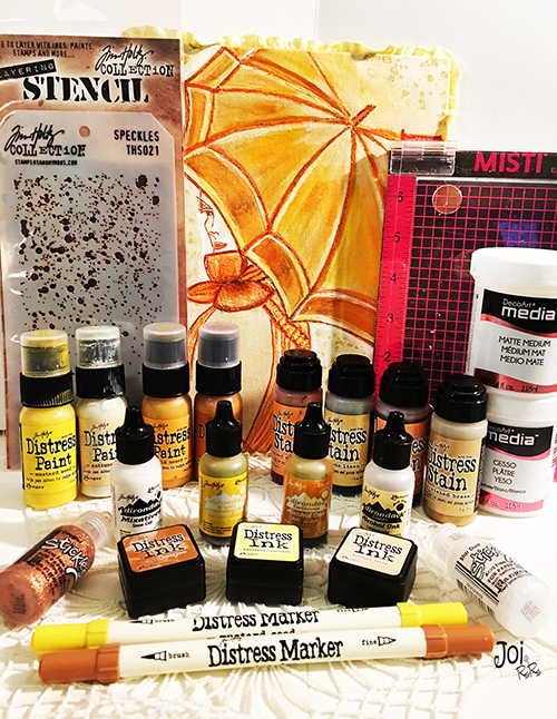
I decided to go with a vintage style and to use brown tones.  Since I adore rust I added a vintage tin baking mold rusted by using Decoart chalk finish paints in brown tones. I sprinkled some cinnamon in a few spots to achieve a more realistic rusted look.
Here is a close up of the rusted mold. Also, I stamped an image using one of my LaBlanche stamps on a piece of an old book paper, applied a coat of Tim Holtz's Distress Vintage medium and used my bees wax on top. I cut the image and glued down in the center of my rusted mold.
I like to create rich textures so I used a piece of lace on my background, some of my Distress spray stains in brown tones and then I used my Golden crackle paste and one of the Tim Holtz's stencils on top.
I also added some burlap, a piece of gauze, some lace trims and some cotton and burlap twines to create more textures. Then I used my Distress spray stains again on top of it.
That Prima metal trinket with the word Inspired is a gift from my lovely blog friend and a wonderful teamie.

I like to wave lately so I decided to create a monochromatic woven piece in brown tones. I used some small nails to attach the piece to my canvas. I like how this turned out.
I hope I have inspired you to create your monochromatic mixed media piece and to join in AVJ's wonderful challenge this month.
If you would like to see how I created my piece you can visit my blog.
Thank you AVJ for such an amazing opportunity to share my monochromatic creation here today! I am truly honored!
Happy crafting!

Maura
Hi, I'm Maura Hibbitts and I am delighted to be a guest designer here at AVJ! I recently retired from teaching science (left brain) and have jumped into the deep end of my right brain with mixed media and crafting. I have been a crafter since I was a little kid: drawing, making sculptures out of natural finds, holiday ornaments...and have been playing and creating ever since.  I love learning new techniques and playing with new materials. One of my favorite genres to work in is steampunk, which is where I headed with my project. I would love for you to stop by my blog for a visit!

Ok, now on to my project inspired by the lovely and talented Tracy and her monochromatic theme! 
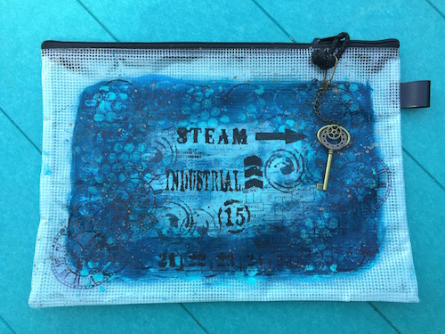
Working in one color is a personal challenge, as I love colors! How do you decide on just one? Well, I looked through my stash and found a lot of paint in the blue hues, so blue it is. It all started with a mesh art bag, and I wondered if I could personalize it in my own style?  I laid down a layer of gesso and got to work.
I have quite a collection of ordinary objects that I love to use for mark making, like bubble wrap, bottle caps, straws, corks...once you start doing this, believe me, you don't look at those little throwaways the same anymore! I spread some paint out, dipped them in and started making marks.
Usually when I start layering, I build some areas up vertically, but with a bag, I had to treat this differently in order to keep it useable. So, instead I created layers with different colors of paints, stencils, marks and stamps. I really liked how this abstract pattern turned out!
But, I have to keep this monochromatic which is easy enough with just a few more layers of blue hues, and some bubble wrap stamping. Then I went in and smudged some areas to create a more muted background for some of my steampunk stamping and stenciling and to create a focal area on the bag.
I had to add a fun charm to open my bag, and the key and gears add the right touch. If you look closely, you'll see I couldn't resist adding a bit of metallic splatters to the bag, after all in my mind steampunk needs to have some metal.
Now I have an industrial steampunk art bag in beautiful blue hues to use. 
I hope you have enjoyed my project and if you would like to see the step by step details and products I used, you can find that here
Thank you AVJ for this wonderful opportunity to share one of my creations, I am truly honored!

Hello! My name is Sara Emily, and I live on the middle eastern coast of the United States. I am married and have twins, and by the time this goes to post they will have celebrated their 18th birthday! (yikes!) I have been a crafter for a very long time.  I can't say I have a particular style, but I will try anything once! Lately, I have been bouncing back and forth between vintage grunge and shabby chic, so for today's project I chose to make a shabby monochromatic canvas. I chose shades of turquoise because it makes me feel cool on these hot summer days!
I chose a stretched 6 x 6 canvas, and began by adding my newest Tim Holtz Thinlits Mixed Media #2 die at the bottom and used the corresponding stencil with Golden Crackle paste at the top. I've been having a bit of a time with this particular (new) jar not crackling, but when I added paint and hit it with the heat gun, voila! Cracks! I think it must be the air conditioning, or perhaps I'm not holding my mouth just right! 
Many steps later, I finally got the background to look like this. Unfortunately, due to having to add gesso back on top of my paint layer, the cracks got lost!  I used Distress paint, water, alcohol and guache to achieve my end result--oh--and some gesso scraped over the Distress paint, because at first it was too bold for my liking.
I got to use my new Tammy Tutterow Shabby Posies die to make my flowers, and also some old Tim Holtz standby's--Tattered Florals and Tattered Flower Garland--for good measure. I chose a few embellishments from my stash--some of them very old--perhaps you recognize a few from your own stash if you're a hoarder like me!
If you would like to see close ups and a few step by step photos, please drop by my blog. I hope you will be inspired to link up with Tracy's awesome "Monochromatic" challenge this month.  I would like to thank Nikki and all of the Creative Guides for inviting me to join them as Guest Designer today! You ladies rock!
Hugs and Blessings! Sara Emily

--------------------------------------------------

What a stunning set of projects! Thank you all so much for creating these for us. I hope this inspires you to try a little monochromatic crafting too - do join us for our current challenge which runs until August 4th.

Nikki and the AVJ Creative Guides
xxx