This is a unique challenge blog where we are inspired by and focus on the Vintage; shabby; mixed-media; art journaling; industrial, timeworn and steampunk genres and encompass the talent, flair, expertise and ideas of many artists that we are inspired by. We welcome all types of projects - cards, journaling, assemblage, layouts, albums, atcs, altered art in fact whatever you want to share (as long as it is in good taste).

Monday 30 June 2014

Destination Inspriation - Distress Paint Marbling

Hi everyone, S@ndy here, I'm happy to be with you today to share a few tips about Tim’s paint marbling techniques for backgrounds.  We have had requests here at A Vintage Journey from our readers for this Destination Inspiration—so this one is for you!!  I hope you find it helpful. 

First thing I want to say is that this technique does take some (very little) practice so don’t give up, practice does make perfect, or as close as you can get. 

I like to use three or four colors and there really isn’t any special way to put them down on your craft sheet.  It can be straight lines of paint or squiggly lines.   Here are a couple ways I prefer and have had good results.

I suggest that you have a stack of tags ready to use while doing this technique.  There is always paint left on the mat when you're done with the first tag and although we all seem to have enough supplies to last a life time we never like to waste.
 

For the this demonstration I am going to use the same three colors so you can see the difference in the technique.  This is one of my favorite color combinations since I'm very fond of orange.  I have used Peeled Paint, Rusty Hinge and Mustard Seed.
I always have water handy & I like the Mini Misters from Ranger because the spray is even and not too heavy.  You can place the colors next to each other or leave some space as I have done. 
 

Here you can see that I have spritzed the paint with water and it's good to go.  The photo below shows how the paint reacts to more water and both are good, it is a simple mater of personal preference.  


I like to place the tag straight down on the paint and move my fingers around the tag, much as you would do with a stamp to get equal pressure on the ink.  The difference is that if the tag moves it's ok - that's even better.


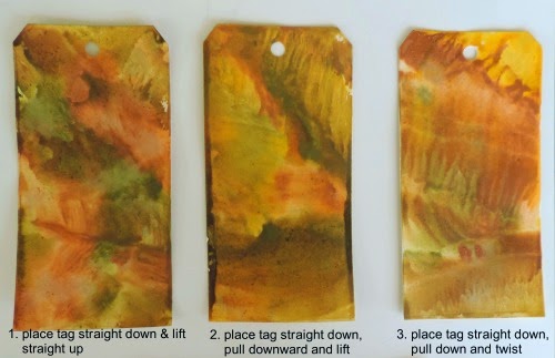
 Here are three examples of  how the paint will look different depending on how you treat it. 

#1 on the far left -  place the tag straight down on the paint walking your fingers around the tag and then lift straight up.  You can see how the colors are smooshed (technical term).

#2 in the center - place the tag straight down on the paint, walk your fingers around, then pull downward (just a little) and lift straight up.  You can see how the colors move together.

#3 on the far right -place the tag straight down on the paint, walk your fingers around and pull downward a little more than in example 2 and lift straight up.  More of a marble effect.
         

#4 shown above - (my personal favorite) I took sample #3 from above while it was still wet - spritzed it with lots of water.  The spritzing makes the paint move around and some even runs off the tag.  The colors are still separate but much more subtle. The thing I love about these paints is that they never become muddy.  The colors blend but hold true to their original color.

If you like more movement in your paint, you can always swipe it through the paint or even twist it before you pick it up.  If you don't get complete coverage with the first application, simply put the tag back in the paint.


#5 This tag was placed on the paint and then twisted before lifting

#6  This tag was placed next to the paint and then pulled through it.

You are never going to get the same results twice - so "embrace imperfection" and go for it.  By the time you add Distress Ink and maybe some water splats, you'll be happy with your tag.


You can let the tags air dry of course but I have found that if your paper is very wet it tends to curve upward in the center. This makes the paint puddle on the edges and you  get a dark line of paint on both sides.  You can see that in example 2 above.  The best way to minimize this is to use the heat gun and dry it right away.

Another thing to remember is that once the paint has dried, it is there to stay, it will not react again no matter how much water you put on it.  You can add paint on top of the surface as shown below.

I'm going to switch colors on you now - I made this tag but was not happy with so much red and pink.  I wanted to add some blue so when the tag was completely dry I added some Broken China.


Much better!!
 
Unlike DI which is translucent, these backgrounds are going to be opaque.  When dry they will no longer react with water so you can add to them without changing the paint surface.
 
So there you have the basics of Distress Paint backgrounds but if you care to stay awhile longer I will show you some other ways of using them.  You can certainly use them as they are and they will be beautiful but below are a few samples of the same tags after some small additions.
 
Below are the before and after of the same three tags shown above.  I will do my best to tell you exactly what I did with them.  As you will see, even if you are not thrilled with your tag at first, you can turn it into something useful.


I intentionally tried to change the colors so you would see that any tag can be saved.  Even though Distress Ink was added, the paint maintained it's original opacity.
 
#1 I used Peacock Feathers DI over the entire surface and then edged with some Mowed Lawn.  I left this one as is but you will be seeing it in a future challenge.
 
#2  I stenciled with the Ruler Stencil and the Honeycomb Stencil both in Black Soot DI.  Then I added some Dusty Concord DI around the edge, next came a sprinkle of water.  When that was dry I added some white Distress Paint in random splats.
 
#3  I stamped this one with two stamps from Tim's stamp sets Time Traveler and Remnants.  I stamped in black and embossed with clear embossing powder.  I dry embossed the top part of the tag with Tim's Clock Texture Fade and then edged with Evergreen Bough DI and finally stenciled with the clock stencil.
 
I hope that you have picked up some good information and that you will give this technique a try.  I am going to end with a tag made by "the man" himself.  Tim gave me this signed tag at CHA in 2013 after he demonstrated the very same technique. Nothing like learning from the master.


 So now I hope you will get busy and smear some paint on a tag. 
 Relax, have fun and get creative. 
 
 
All products mentioned above can be found at  Country View Crafts,
our generous sponsor 


Friday 27 June 2014

Challenge 9 - Use every stamp in a set

Hi everyone, Nikki here from A2A - Addicted to Art and I have the pleasure of hosting our latest challenge. The theme for the next fortnight is to 'Use every stamp in a set’. It sounds quite challenging but although we would like to see each stamp in a particular set used, it could be a full or partial image of each of them. 

At A Vintage Journey, our challenges focus on the inspiration of Tim Holtz and we ask that you tell us in your blog how you have been influenced in your creation. Please take a look at the Travelling Instructions for clarification and the guide on interpreting the styles at A Vintage Journey. Don’t forget to provide the name of our current challenge theme and a direct link to that challenge in your blog post. For this challenge please also tell us the stamp set you have used. (It doesn't need to be a Tim set - just tell us how he has influenced you.)

The Creative Guides have made some amazing pieces to provide some inspiration. Do pop over to our personal blogs where you will find more detail on each of the projects. Of course there is plenty more inspiration to be found on Tim Holtz’s blog too!

Our lovely sponsors, Country View Crafts are, once again, offering a £10 gift voucher to spend, to one winner who will be chosen by the team.

Nikki
I have used one of Tim's Visual Artistry collections to make this card, there are 6 stamps in the set. I have incorporated  lots of layering ( I love how Tim works with layers), distressing and some crackle paint to embellish.
Based upon one of Tim's earliest stamp sets, Fancy flourish, my card is almost a total homage to him! His dies, inks, remnant rubs and other Idea-ology have all been used together with his stamps and techniques. Full details of what and how are on my own blog.
Using Tim's Artful Tools Stamp Set - I made a small tool box to keep on my work table.  No problem making a Tim inspired project when these stamps, papers and inks make everything so easy.  Hopefully I will be able to spend more time working and less time looking for things.  To see how I made it - stop by my blog.

I thought this challenge was a great chance to go back to my first love and just plain stamp!  
I used the Urban Tapestry set and of course there had to be Distress Inks involved.  
There's some glossy embossing that you can't see here - you'll have to pop over to Words and Pictures for the full effect.

A Vintage Dress for A Vintage Journey
This Challenge was the perfect opportunity for me to use my favourite Tim Holtz Urban Chic Stamps
I loved layering the stamps together to create an all over pattern
then colouring with the rich Dylusion inks
Please pop over to my blog to see how I constructed my Couture Creation

Annie 

I used the Tim Holtz Stamper's Anonymous Set Oddities CMSO83
and as you can see I had a great time using the stamps, stencils, Idea-ology and TH Sizzix dies as well as some splatting here and there with Distress Stains. You can view the process over on my blog by clicking my name above.

Jenny

I'm loving using Artist Trading Blocks as boxes for storage purposes in my craft room (what's that saying, "Have nothing in your house that you do not know to be useful, or believe to be beautiful." William Morris) There's a bit of a collection building now and this is the latest, using every stamp from the SA 'Classics #3' set. There are six sides to this so head on over to my blog and take a look.

Brenda
I loved this challenge as it really made me think about how I use my stamps. I chose to use Tim's Paris Memoir set and made a hanging. I added some stamps from his Papillon set and used texture fades and dies too, but for the background I used Fresco Finish paints.


Some fabulous projects to inspire you and we look forward to seeing how you use Every Stamp in a Set. Please remember it does not need to be a Tim Holtz set but please do tell us how you have been inspired by Tim in order to be eligible to win.

Have fun!
Nikki
xx


Monday 23 June 2014

Creative Guides... a little extra!

Hi everyone, Jenny here with a little something vintage/retro for you today. Having previously taken Tim Holtz 'Treats Blueprints' stamp set down a distinctly 1950's route HERE there were lots more possibilities buzzing around in this head of mine, and this is one of those...


Two things in particular drove the design for this card. The first of those was the need to add more dimension to the stamped elements. It's not hard to achieve with this set of images if you cut/colour two of everything and layer them. By scoring down the corner line of the popcorn box it became easy to put a fold in that and I even pushed an embossing tool into the 'dimples' on the ice-cream cone. You'll notice the ice-cream and popcorn have a semi-gloss finish to them. This came from deliberately overheating some Frosted embossing powder rather than opting for the regular clear version.


I was desperate to see what the pop bottle would look like with Studio 490 Wendy Vecchi Clearly for Art because it is so mould-able and hey presto, with a little Espresso alcohol ink added on the reverse it worked a treat! The frame was embossed using Shelly Hickox's faux tarnished metal technique and backed with an embossed panel and stencilled/brayered stains background.


If this card puts you in mind of the Art Deco period that's down to the second driver behind this design. Whilst my Grandad was the projectionist at one of the cinemas in Sunderland in the 1920's my Nana played the piano, a traditional accompaniment for the silent pictures of the time. I can only imagine the magic that surrounded a trip to the pictures back then with the glitz and glamour of these magnificent buildings providing a chance for escapism from the daily challenges of inter-war life.


There you have it for today, a trip back in time. I hope you have a lovely week with lots of creative time and do make sure you enter our latest challenge 'Wings & Things' to be in with a chance of appearing here yourselves.

Take care of yourselves, Jenny xxx

Friday 20 June 2014

Winner's Post and new Creative Guide

Yay it’s Friday and time to announce the new winners and Jenny, with the help of the Creative Guides, has chosen the winner and Pinworthy Mentions for her fabulous challenge ‘Get Some Texture’

Jennie says - I've chosen #29 Karen Garrard as my winner for her phenomenal Titanic memorial folio.
Slide22a
Karen has packed so many 'Tim' tricks and techniques into this incredible project and has definitely gone the extra mile to include lots of researched ephemera and altered trinkets. I loved her attention to detail and the quality of her workmanship, and would definitely want to see this in person given half a chance.

And the Pinworthies are (in numerical order);

Well Jennie, I think you have made some excellent choices there. Thanks Karen for sharing your amazing project with us and for taking the time to make it specific to the challenge and congratulations on winning our Winner’s Badge. You will soon receive notification of your prize which is a £10 voucher to spend in-store at Country View Crafts and your project will be pinned on our Winners Pinterest Board. We hope you will join us soon as a Guest Designer and tell us a bit about yourself and your crafting talents.

Congratulations also go to Kath, Tocoart and Mo for their fabulous contributions too and your projects will be pinned to our special Pinworthy Mentions Board on Pinterest in the very near future (and may well be there already). Your blog badges will be with you very soon too.

Thanks to all of you for sharing part of the vintage journey with us.

............................

We have some fabulous news to share with you too today and I am really excited to introduce

Jools from Creative Journey

as a new addition to the Creative Guides team. If you haven’t seen her work I really urge you to pop over to her blog to see her amazing creations. You will see her first project here as a Creative Guide on Friday 27th June when the next new challenge gets announced. Looking forward to seeing you then.

In the meantime have a great weekend.

hugs Brenda xx

“The road of life twists and turns and no two directions are ever the same. Yet our lessons come from the journey, not the destination.”

Don Williams


Monday 16 June 2014

Destination Inspiration - Sewing Room Shadow Box


Hello Everyone! Jennie here from Live the Dream and it is my pleasure to be sharing a project with you  today at the Destination Inspiration Booth - the place for Creative Guides to share with you techniques and ideas which will motivate YOUR creative experience.

One of my most used dies is the Sewing Room die. I just love the dress form and use it in so many ways on tags, cards, books and in my scrapbooking.  I thought I would share with you today my absolute favourite way of using it - so very effective but VERY easy to achieve! 


I hope you are ready for this as it is quite photo heavy! So here we go …………


 To start you need to die cut the dress form from some reasonable weight board - I have used coaster board here but any mount board or grey board will do. Cut two and leave one complete but cut the other one in half - right down the middle.


Blend a little Vintage Photo around the edges.


Using a good quality glue which you can run along the outside edge of the piece you cut in half, glue this to the middle of the complete dress form piece. You might have to hold it in place for a while until it dries, but if you use a good glue this should feel quite solid once it is set. Two segments have now been created which can be filled with the paper leaves.


And now for the dress - cut ten "dresses" from book paper. I know many of you don't like ripping up old books, but for this project I have used a modern paperback bought from the local charity shop. You could of course stamp your own papers with a text stamp.


Again blend Vintage Photo  Distress Ink around the edges of the cut dresses - both sides - and fold them in half.


Again using a good quality glue run a little glue along the folded edge and glue five pieces into each of the two segments. Start from the outside edges and move inwards so that the last piece you glue is in the middle of the others.


I like to put a little bit of lace around the middle and a strategically placed flower at the top hides some of my uneven glueing! 

And now to make a box to showcase our lovely dress form.


The base of the shadow box is the Postage Stamp Die. Again I have used Coaster Board and covered it in the lovely sewing paper from the Wallflower stack.  I cut four strips of Coaster Board 1/2 inch wide and cut these to fit along the top and sides. Vintage Photo Distress Ink was blended around the edges before I stuck them down. (The Postage Stamp Die actually has a crease line which runs around the inside edges and I glue my box strips along this line.)


I cut another piece for the top of the shadow box using the Postage Stamp Die and cut an aperture using a rectangle die. This top piece was inked with Vintage Photo Distress Ink and once dry I used Paper Artsy Crackle Glaze to give it an "older" texture.


I filled the inside of the box with some stamped sewing embellishments before glueing the top in place.


This photograph shows how shallow the shadow box actually is. 


Once the top was in place I added a few more embellishments, including a handmade flower and the fabulous brass scissors.


Finally I glued the dress form onto the right hand side of the box.

If you are still with me well done! I hope this tutorial inspires you to try this effect and you can find other dies to make something similar.


A simple circle die can also be very effective!

Have fun!

Jennie x


Footnote: Unfortunately the Dress Form Die is not now available at Country View Crafts, however, the Mini Dress Form Die is still available  and would make a good replacement.  Jennie