This is a unique challenge blog where we are inspired by and focus on the Vintage; shabby; mixed-media; art journaling; industrial, timeworn and steampunk genres and encompass the talent, flair, expertise and ideas of many artists that we are inspired by. We welcome all types of projects - cards, journaling, assemblage, layouts, albums, atcs, altered art in fact whatever you want to share (as long as it is in good taste).

Monday 28 November 2016

Destination Inspiration Arriving at Terminal 4

Hello all, lovely to have you visiting A Vintage Journey today. This is Astrid to share with you the last of the Destination Inspiration projects for November
Here is a little reminder of what we have in our travel bags this month:
Product: Patterned Paper
Technique: Altered Paper Techniques
Colour: Orange/Rust
Substrate: Notebook or Journal Cover
I decided to create a little mini journal using the Eileen Hull minibook die. I used it for both my cover and the inside pages, but will just show you the cover for today.
I started by covering a piece of mat board (or mount board as we call it in the UK) with my chosen paper and cut it with the die.
I covered the entire piece with clear gesso and when that was dry took a deep breath and started to spray on colour with a mix of Rusty Hinge Distress Spray and a copper coloured Lindy's Stampgang Spray. When still wet I sprinkled on some Infusions in the colour Sunburst. This was hard, as orange is not normally a colour I go to, so I knew at this point already, some rusty stuff would have to come into play too.
I chose some metal embellishments and covered them in white gesso. I rather liked the frosty white colour on my branches and leaves, so it was at this point I decided to call my journal "Transitions", as I wanted to depict the transition from autumn into winter, a theme that easily can be carried through for the inside pages too.
So instead of making them all rusty, I just used the same sprays on them and I rather like the effect.....
Still, it needed something to tone it all down a bit, so this flower came to the rescue. I made it using Clearly for Art and the Tim Holtz Poinsettia die. I glued some tissue wrap to one side of the Clearly for Art, die cut it and then added some colour using some Alcohol Inks in a mix of Espresso and Gold Mixative. When heated the Clearly for Art becomes pliable, so it was easy to shape the flower. I added some very dark red berries from my stash, using hot glue, and while the glue was still liquid very quickly sprinkled on some Antique Platinum glitter.
To add a bit more texture to it all, I dyed some cheese cloth, again using my Distress Sprays, I also added some Prima Art Stones, and darkened everything with a little carefully sprayed Ground Espresso spray. The word Transitions was computer generated.
A few splatters with watered down white paint finished it all off.

Now I did want to add a bit of something rusty as well still, so decided to alter this little die cut angel for the back cover.
The angel was cut from mat board again. I coloured it with Rusty Hinge spray and then rusted it with good old Crafty Notions rusting powder. When the rust had formed I highlighted some bits with Copper Treasure Gold.
Here you can see it on the back cover. The album closes with the little tab that comes with the die. I glued it to the back and for the front used some velcro dots.

Finally here is one of the inside pages still
You'll be able to see further pages on my own blog in the weeks to come.

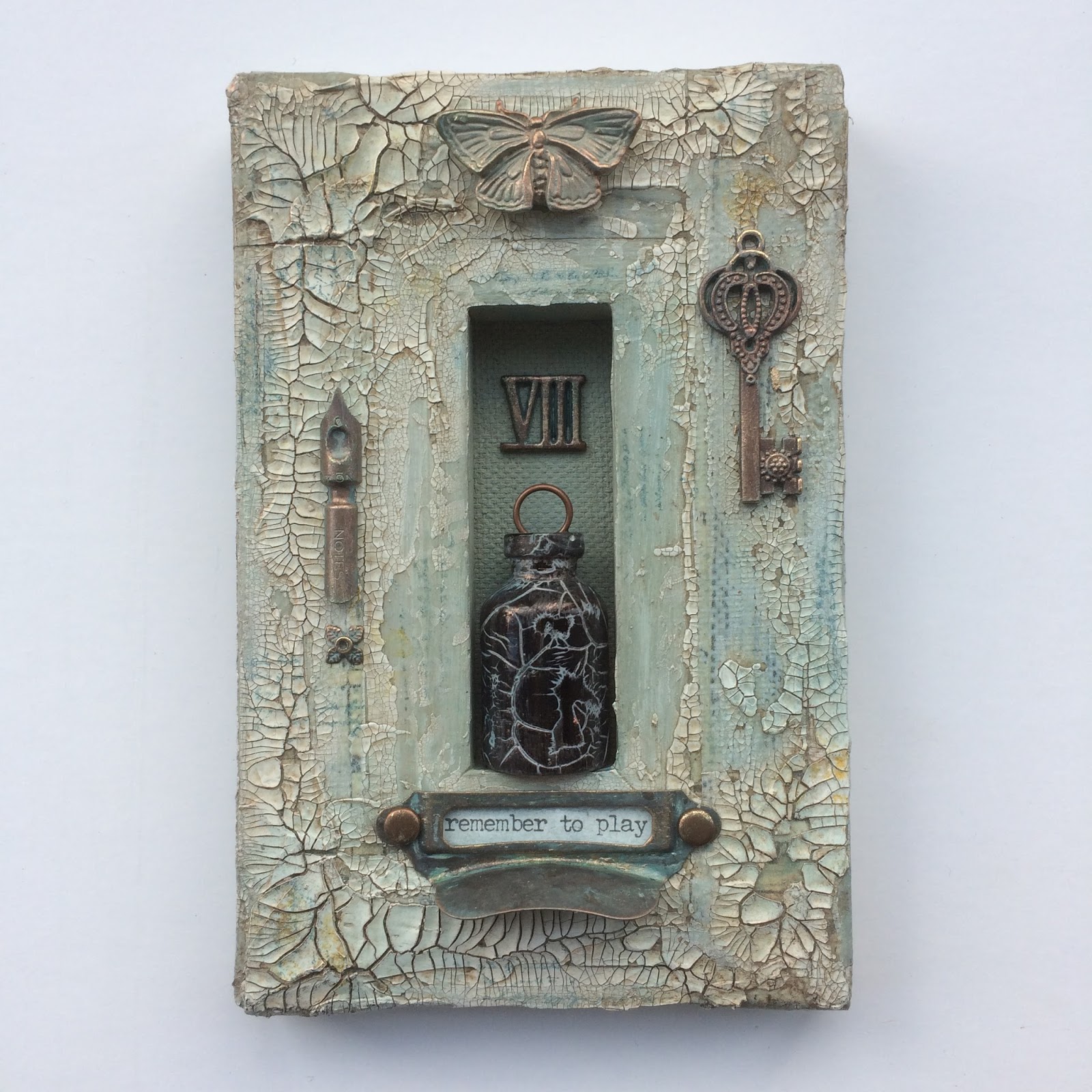
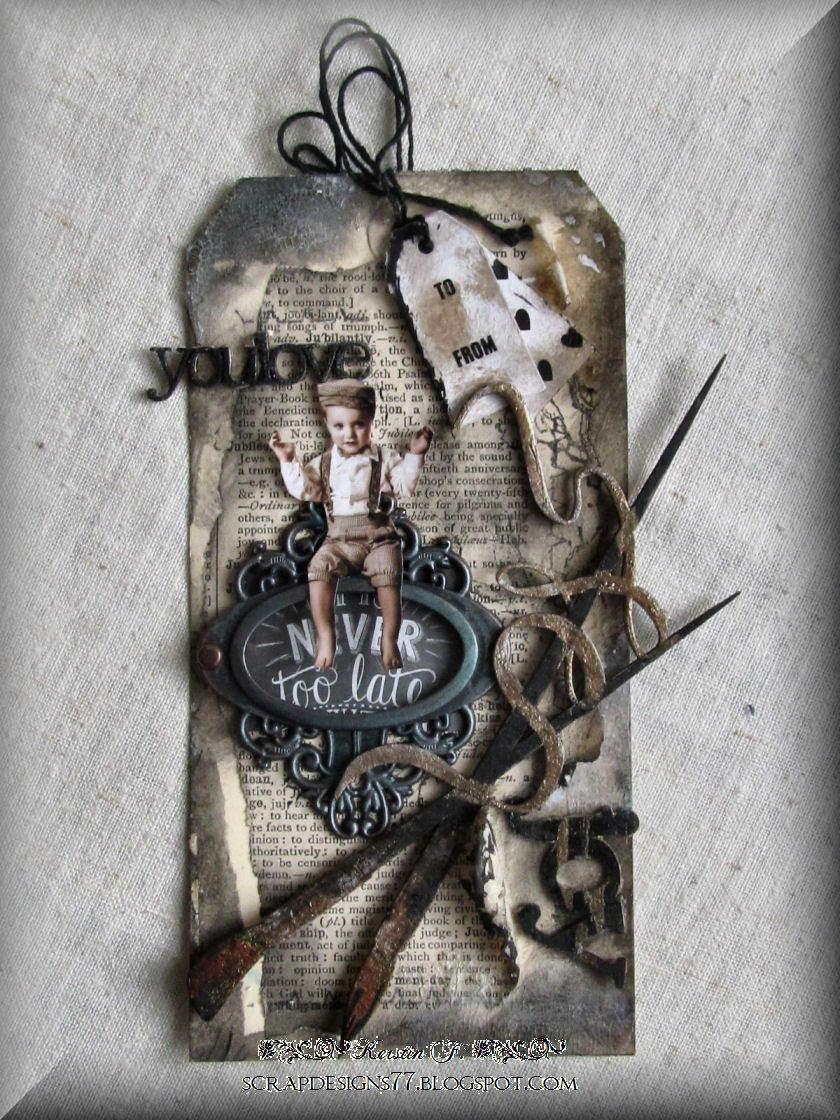
Well that's it for today, but before I end, here is a second look at the superb projects my team mates created for the previous DIs this month:
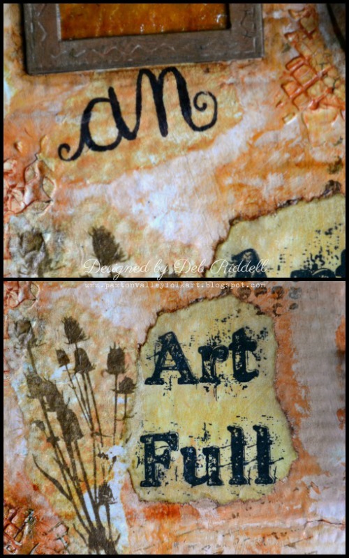

Deb
Well, there you have it, 4 very different projects, all using the same basic ingredients.... Here's hoping we have given you some inspiration this month, and don't forget to come back on Friday for the beginning of our new challenge.


Looking forward to seeing you then and thank you for your visit,
Astrid

Friday 25 November 2016

Friday's Guest is ................

Hi Everyone, it's Friday and special guest day and we have the lovely lady who is sponsoring our challenge this month with a decorated version of the kit she is offering as the winning prize, it shows you how it can look once painted and altered. I'll leave it up to her to introduce herself.

**********************

Hi I'm Di Oliver and I co-own Tando Creative Limited with my husband Tony.  I was so excited to be asked to be a guest designer on A Vintage Journey, I rarely craft these days and it gave me an ideal opportunity to sit down and get painty.


We have recently released a new Art Journal Starter Kit which includes all the elements needed to sew your own journal together so it is truly handmade.  I decided to put together one of these kits myself and I had loads of fun decorating the covers.


I have used supplies from the DecoArt media line, firstly using the crackle paste liberally through a stencil over the cover and also just applying with a palette knife around the edges.  The Crackle Paste gives really lovely deep crackles if it is applied thickly.

For the spine covering I glued screwed up tissue paper and left it all to dry.

Using a combination of Prussian Blue Hue, Primary Magenta and Burnt Umber I applied various washes to the covers.  I then decorated one of the Tando grids and a word Create by simply painting white and stamping with a crackle stamp.  I then applied washes to the Butterfly and stamped with a brown archival ink pad.

I finished off with ribbons and glued the journal together.


**************************

Wow Di, that looks so special with all the texture and embellishing, I'm sure our lucky winner this month will be over the moon with their prize and it's great to see some wonderful inspiration for them in your post. Thank you so much for sharing this fabulous journal and taking time out of your extremely busy schedule to create this for us, I know it's been a very hectic few months for you.

For those of you who do not know Di or Tando Creative she produces the amazing substrates from greyboard and MDF which are all available on her website (see link above), if you're looking for project substrates or embellishments her shop is well worth a visit and we are so lucky that she is sponsoring us this month.


***********************

So I'm sure this beauty will inspire you to getting 'cracking' and enter a project for the challenge that the fabulous Alison is hosting this month and if you're one of the gorgeous entries already submitted thanks so much for joining us.

Have a wonderful weekend.

hugs Brenda, Di and the Creative Guides. xxx


Sunday 20 November 2016

Destination Inspiration - Arriving at Terminal 3

Hello everyone and thank you for stopping by, it's Deb here today with the third stop on our Destination Inspiration journey for November.  If you recall our travel bags are packed with the following contents:

Product: Patterned Paper
Technique: Altered Paper Techniques
Colour: Orange/Rust
Substrate: Notebook or Journal Cover

and you can check out what Tracy and Alison already created for us this month by clicking here and here.

For my Destination Inspiration project I decided to make a cover for my current art journal.  I had to deconstruct my journal as it was getting very chunky and I needed a cover so I could bind the completed pages back together again.


I added a secret interactive element to my journal cover as well, the butterfly lifts up to reveal the completed sentiment that I wrote.


I started out with a piece of corrugated cardboard packaging cut slightly larger than my art journal pages.  I tore a bit of the backing paper off of one side to reveal the corrugations below for some texture (and my apologies for the glare in these photos!).


To incorporate the patterned paper and altered paper technique, I took some Tim Holtz papers and Melange tissue wrap and coated them with resin, sprinkling on some Distress Glitter as it dried.  The brown paper at the top of the photo was the unbleached paper towel that I used to clean up and I loved it's translucency so decided to use it as well.  I had some extra resin left over so filled a couple of jewelry bezels with seed beads and resin to be used on some future project.

The corrugated cardboard cover was painted with gesso and then dragged through a puddle of Rusty Hinge and Antique Linen Distress stains on my craft sheet to satisfy the orange/rust colour component of the travel bag.


A variety of patterned papers were then torn into pieces and adhered here and there onto the journal cover.

I loved that wonderful resin butterfly image and decided to frame it with some copper wire.  I then started to contemplate how I could make it into an interactive component that could be moved or opened to reveal a secret.  Could I make a wire hinge that would allow the framed butterfly to be lifted up?  Well, yes I could!  I cut two short lengths of copper wire and curled them around a bamboo skewer.


I then twisted more wire together to make a frame for the resin butterfly image and attached one of the curled hinges to the frame.  The other curled hinge was meshed together with the hinge on the frame and short piece of copper wire was threaded down the center of the two hinges to join them together.

The resin butterfly was then adhered onto the copper frame with E6000 glue and set aside to dry thoroughly.  Once dry, the assembly was adhered to the journal cover and the hinge covered up with some strips of patterned paper.


More texture was added to the journal cover by applying some Wendy Vecchi Crackled texture paste here and there through Tim Holtz's mini layering stencils Burlap and Nordic.


The texture paste was coloured with Distress crayon in Rusty Hinge and Vintage Photo once dry and then the cover was stamped randomly with Vintage Photo Archival ink and stamps from Tim Holtz's MM101 Clear Stamp set.

The translucent resin paper towel reminded me of amber glass and to enhance that illusion, I coloured it with some Butterscotch alcohol ink, adding and subtracting the ink with Alcohol Blending solution.


And then in my usual style, I got on a roll and forgot to take any more in process pictures, apologies yet again!  Three small frames were die cut with Tim Holtz's Stitched Rectangle die from kraft cardstock, the centers were cut out and the faux amber glass paper was sandwiched in between to make a window.  The word 'seek' was stamped onto tissue paper and adhered to the journal cover and the faux amber glass window was positioned over top.

I wrote the word 'an' on tissue paper with a Zig brush marker and adhered it with Distress Matte collage medium.  My brush lettering skills are suspect at best and I was worried I'd muck it up if I tried to write it directly onto the cover.


'Art Full' was printed out onto copy paper (the font is called Old Printing Press), the edges were torn around the sentiment and it was adhered underneath the resin butterfly interactive element.  Some wildflowers were stamped onto tissue paper and adhered with matte medium here and there on the cover.

And to complete the sentiment, 'Life' was stamped onto tissue paper with Tim Holtz's Worn Text stamp set and adhered to the bottom of the journal cover.  The edges of the cover were coloured with Walnut Stain Distress paint, some glue stick was lightly applied over top of the dried paint and gold Deco Foil was pressed into the wet glue for a random gilded edging to the journal cover.


And finally, a small manila tag was clear embossed with this great stamp from Tim Holtz's Phrases 2 Clear Stamp set, the tag coloured with Vintage Photo and Ground Espresso Distress inks and then fastened in place with a Custom Fastener.

Thanks so much for stopping by today and I hope that you have enjoyed seeing how I used the contents of our November Destination Inspiration travel bag.  We have one more stop in our journey this month so be sure to stop by next Monday when Astrid will be here to bring our travels to a close.  And there is still time for you to join in our Cracked Up November challenge so break out those crackle mediums, stencils and stamps and get cracking!  Happy creating,

Deb xo

Friday 18 November 2016

Pinworthy Inspiration Day

Today I am pleased to be able to introduce three of our previous Pinworthies as Guest Creative Guides to share a project with us on our current theme - Cracking Up. We welcome - Ruth, Kerstin and Dot. Keep scrolling - you are in for a treat!

Hi everyone, Ruth here from 'a love to create' I've been dabbling in craft for as long as I can remember, and when not working retreat to my craft room to 'play'. I love anything inky and painty but throw in some stamps, fabric and thread and you won't see me for hours. I love experimenting and trying lots of styles but I always return to vintage.
I was so pleased to be asked to join you as a guest for this month's challenge and even more delighted when I realised it was all about luscious crackle, so I've created a reverse canvas niche and step by steps are on my blog.
Having created different grades of crackle I really didn't want to cover it up but having washed over with paint and antiquing creams, set about altering some embellishments in the same way.
Having aged them, a little stamping and touch of gilding just lifts and highlights all the nooks and crannies.
I've had this gorgeous dark vial in my stash for ages and it just fitted perfectly, so gave it the crackle treatment. The quote seemed apt as I believe you should sometimes do things just for pure fun with no end in sight because that's when the magic happens. Thanks for letting me play with you today. Ruth xx 

*******************

Hi everyone!
I was so pleased and honoured to be asked once again to join you all as a Guest Creative Guide here at A Vintage Journey. My name is Kerstin -Inga Peters, aka Kerstin F..
I have been creating for many years now, always in search of new techniques and yet unexplored territory, because I love to try out, products and ideas and share inspirations, because it's always an adventure, a discovery tour, which I like to take my friends and all the other crafty people with me.

My favourites are colours and textures with a view to the small things, details and a big foible for 3D projects or elements. With Scrapbooking, Home decoration, Art Journaling in combination with Mixed Media Style I have found 'my' perfect favourite genres . My creations are always a little bit magical, romantic, sometimes funny, but always made with heart and mind.

This month the challenge theme is "Cracking up". I decided to make a tag in Altered Art, industrial style, for a friend which has just discovered her joy at painting.
I used crackle glaze on the edges for an altered, weathered look.....
..together with old book pages, a crackle stamp in the background and suitable chipboards, painted with black and metallic acrylic paints. The aged effect is mainly based on Walnut Stain Distress ink.
If you would like to know more about my creative world just pop over to my blog at: Scrapbook Dreams. I would love to see you there!
Many thanks for stopping by!
Happy crafting! Kerstin

***************

Hi, I'm Dot, aka Ink Art Designs, and I live by the sea, down the bottom of Australia.
This is my first time as a Guest Designer Guide here at A Vintage Journey...and I am super excited about it. I'm an aide at a secondary school most days and craft when I can. I have two grown up boys who are off making their own way in life. That leaves me with more free time to craft!!!

My passion is getting messy with inks. I love to experiment and play with different techniques and just seeing where it all leads me. My favourite products have always been the distress inks but the distress crayons are so exciting to play with at the moment too. I love how you can mix all the products up anyway you want to...I guess that is what mixed media is all about after all.

My favourite techniques? - lol, there are too many to list.
This is the completed piece. After I was satisfied with the background, had the main panel sorted, it was a matter of layering everything up. I had some nice paper from Prima (I think) which I've used behind the main panel, added some cotton and some TH washi tape. I love how using a humble crackle stamp can add so much atmosphere.
This background was heaps of fun to make! I've used Distress Crayons in blues and browns to lay some colour down, removed some of it with a baby wipe through a rectangle stencil and added some stamping with crackle, TH words and some rain drops. To make the rectangles 'pop' a little more I've also touched them up with my water colour pencils.
For the main panel I've used a stamp from the Sideshow collection from Stampers Anonymous. After stamping the umbrella man I thought that he needed something under his umbrella - enter the dog! A little crackle stamping around the edges (for a more 'vintagey' effect), some light blending of inks and a little water colouring using my distress inks around the feet, and it was finished.

*********************

Ahhhh crackle heaven! Thank you all so much for sharing these wonderful projects - so much to see from the wonderful backgrounds and layers to the fabulous embellishments.

Do join us again on Monday for the next stop on our Destination Inspiration journey. Our current challenge - Cracking Up - continues until the end of the month - we would love you to join us.

Have a great weekend.
Nikki

Monday 14 November 2016

Destination Inspiration - Arriving at Terminal 2

Hello all, it's Alison here, arriving at Destination Inspiration.  I hope you saw Tracy's fantastic creation at Terminal 1, and now's your chance to see what I got up to with the contents of this month's luggage.  Just to remind you, here's what's in the travel bag:

Substrate - Journal/Notebook cover
Product - Patterned Paper
Technique - Altered paper techniques
Colour - Orange/Rust

Well, regulars at Words and Pictures will guess that I went for the rusty end of that colour spectrum.  I did some basic paper tearing and distressing for my altered papers, and here's what I ended up with...


It started out as one of those basic black notebooks you can pick up almost anywhere.


I used one of my favourite Andy Skinner techniques to get the rusted look - spritzes of the DecoArt white Media Mister with Quinacridone Gold over it.  It's part way through the process here.


Quin Gold was probably my most-missed product while I was away, so I had to use it for this first project back in the craft room.  I love the variegated look of decay you get with its translucence.


I generally add a darker wash over the top for a grungier edge to the rusty look.


As I said, I kept my paper altering on a fairly simple level.  They're all Tim Holtz papers, and all from the subtler end of the colour spectrum.


I tore and inked the edges, and then ruffled them up at the edges once they were stuck down.


I also added the lovely thorny stamp in Sepia (as close to orange as I'm generally willing to go with my stamping).


I used Quinacridone Gold again, with some Paynes Grey in layers, on my Idea-ology Quote Band, and secured it in place with some rusty wire.


The leaves were actually a bit of an afterthought, but I'm very glad my brain went on thinking, as I really like the result.


They're Calico Craft Parts, and they've just had a touch of the Quin Gold for that burnished autumnal look.


The notebook is rusted on the other side too, but otherwise unadorned on the reverse.  You have to be able to use the thing, after all!


And that's my altered notebook cover for you.  Thirteen photos - unlucky for some, but hopefully not for us on our Vintage Journey!


Thanks so much for dropping in today.  Do come back on Friday to see our fabulous Pinworthy guests, and next Monday another Creative Guide will be stopping at Destination Inspiration.  In the meantime, why not come and play along with my Cracking Up challenge - we'd love to see you there too!

Happy Crafting all!
Alison x