This is a unique challenge blog where we are inspired by and focus on the Vintage; shabby; mixed-media; art journaling; industrial, timeworn and steampunk genres and encompass the talent, flair, expertise and ideas of many artists that we are inspired by. We welcome all types of projects - cards, journaling, assemblage, layouts, albums, atcs, altered art in fact whatever you want to share (as long as it is in good taste).

Friday, 6 March 2020

CELEBRATION TIME COME ON!

YAY, let's celebrate our 6th Birthday. Is it really 6 years since we started this challenge blog?

Do you remember the words from the Kool and the Gang song? It reached #1 in February 1981.

There's a party goin' on right here
A celebration to last throughout the years
So bring your good times and your laughter too
We gonna celebrate your party with you.
Come on now (Celebration) Let's all celebrate and have a good time
(Celebration) We gonna' celebrate and have a good time

To get you into the mood we started our celebrations early and have some fabulous inspirational projects to hopefully whet your appetite.

Brenda

For our special sixth birthday party I am celebrating all things vintage shabby as well as my family. I have used an Ikea frame but turned it back to front to create a shadowbox and used some collage paper, crackle paste and a special heart I made for my daughter's wedding the year before last.
If you'd like to see more details there is always a warm welcome at Bumblebees and Butterflies.


Happy birthday A Vintage Journey, I can't believe it's been 6 years already, time flies when you are having fun!  To celebrate our 6th birthday I made a tag journal from windowed junk mail envelopes and recycled file folders to celebrate my love of making art journals and recycling/upcycling.  Hope you can pop by my blog for the how to and a quick flip through video of the finished journal and can't wait to see what our wonderful followers are celebrating in their art!


I decided to celebrate my absolute LoVE of mixed media assemblage for our sixth birthday celebration. I never tire of this wonderful mixed media art form. Do please join me over on my blog for more details of how this canvas came together.


Happy candle-blowing, wish-making, cake-eating day! I have a very special card to share with you today that I created for our 6th birthday celebration. I hope you can pop on over to my blog to see how it came together.


I'm so excited about our Birthday Celebration this month; I hope you'll join us! I was enjoying the party atmosphere whilst art journaling using Tim Holtz products to create this Happy 6th Birthday page. Please find how it all came together over at my blog Let's Art Journal.


Mixed Media birthday card with Tim Holtz Tattered Butterfly die

I thought I would combine our anniversary celebration with a birthday card for a lovely craft friend. So here's to celebrating crafty friends! For more details on my textured, layered card please pop over to Addicted to Art.


Alison

Six years... unbelievable!  After a long absence owing to work, I'm celebrating this milestone simply by being back at the craft desk and playing with some of my favourite things - tiny houses, crackle, rusty wire and, of course, some lovely words to go with it all.  Do come over to Words and Pictures to see all the details.


Astrid
I recently had a crafty day with our lovely teamie Annie and her mum Rita. The project I am sharing here was inspired by that get together. To see more detail of what was involved, just hop over to my blog


I have long admired collages such as the one I've created today, but never had the courage to actually sit down and create one.   So I am celebrating moving into unknown territory in my art journey with my canvas for AVJ's 6th birthday!   Please stop by my blog here to see how I created my mixed media project!


I am really happy to take part in AVJ's sixth birthday as a Creative Guide and celebrate this date with all of you!
I dedicated my project to AVJ and I chose the sentiment "Happy together" because I believe that this is exactly what keeps the blog alive: the link between all the Creative Guides and you who follow us! Happy Birthday, AVJ! If you are interested in seeing the details closely and reading how I made the project check out my Blog Yayascrap & more.


Toni

Happy 6th Birthday AVJ! In order to celebrate the birthday of this fabulous blog. I've returned to the beginning of my paper crafting journey and made this tag, influenced by the wonderful Tim Holtz. If I hadn't stumbled upon his Twelve Tags challenges, all those years ago, I wouldn't, be part of this great team !


Amanda 

When AVJ started out 6 years ago it focused on the style, techniques, products and ideas of Tim Holtz and as it was my discovery of Tims distress inks that got me back creating after a long time away I thought I would celebrate AVJ's roots and indeed my own creative blogging roots with a 'Tim Holtz' inspired project. To find out more just hop on over to my blog ink-a-pink where the birthday celebrations are in full swing! 

********************************************

Ok ... so over to you to show us what you are celebrating in your art and craft work at the moment. Don't forget to link us into your blog post and if it's not really obvious share with us how your project relates to the challenge theme. Just remember to create your project in one of our preferred styles: vintage, shabby, mixed media, art journaling, industrial, timeworn or steampunk.

Before we go we'd just like to share that Sara Emily and Autumn are leaving the team to give themselves more time to other commitments that they have both in the crafting and real world. As life changes for us there are times when we need to concentrate on new horizons and time for family and so these two amazing ladies are going to be greatly missed in our monthly line-ups and creative posts. We wish them the very best for the future and every success in whatever they have planned and thank them both for sharing their talents, ideas and fantastic projects with everyone.

Thanks also to you for sharing your wonderful art with us, we always look forward to see the wonderfully creative and gorgeous ideas you have when creating and making.

Good luck in the challenge, don't forget the Creative Guides choose their Top 3 for our Pinterest Board where your post will be linked to if you're successful.
So come on join the party and have fun.

hugs Brenda and the Creative Guides xxx

You are invited to the Inlinkz link party!
Click here to enter

Friday, 28 February 2020

Creative Card Making with Amanda

Hi Everyone and Welcome

Amanda (ink-a-pink) here with you today sharing a card I have created for our Monthly Creative Cardmaking post

We began these posts back in March 2018 when we restructured our monthly timetable. The general idea is that each of the Creative Guides will take their turn throughout the year to share some ideas for creating a card in keeping with our preferred genres- vintage, shabby, mixed media, art journaling, industrial , timeworn or steampunk.

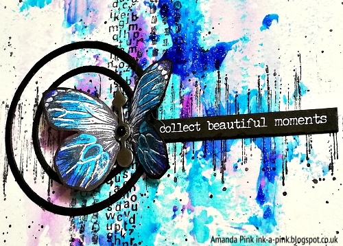
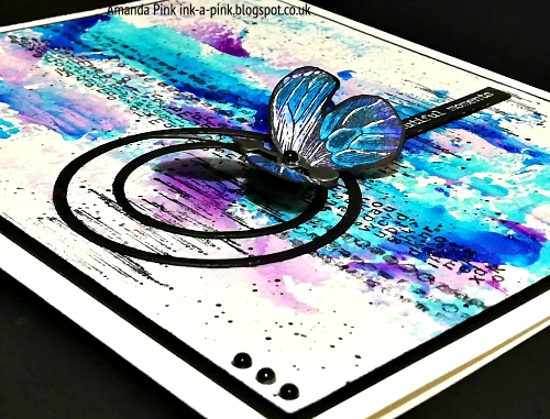
In contrast to the card I created and shared last year (Jan 2019) which was 'industrial, monochrome I have a much more colourful card to share with you today. I feel it has a mixed media, art journaling vibe going on so is inkeeping with a couple of our preferred genres. 


Whether creating my own cards or buying them from a high street store I can never resist a butterfly and meaningful words.


Now, I have to hold my hands up and say that I neglected to take any process shots but I will spotlight some of the main features of the finished card. 

I was very fortunate recently to add some of Seth Apters line of Izink 'Ice' from Aladine to my stash of art mediums. A belated Christmas treat! Good ol' Santa. 
Being keen to try them out was pretty much where the creativity all started as the card background is one of my first 'Ice' 'test' pieces.
In brief: Ice is a translucent gel that creates a wonderful coloured 'Ice effect' It also gives your art a glossy finish.
( more info about the product can be found here and here)

Let me show you with a few close ups


The 'Coloured 'Ice' effect.... 


.... so cool!


That glowing sheen..... Pretty special, don't you think?


I didn't want to cover or hide such fabulous colours and effects so I created the rest of my card design with this in mind.

I added some stamping down the vertical of the background. I used a couple of Seth's Impression Obsession stamps for this.


Another of Seth stamps provided a touch of stamped detail across the horizontal too.
This helped create a foundation line for the placement of the focal feature: a few circular die cuts, a watercolored butterfly and a meaningful quote.


The thorax of the butterfly was embellished with a black beaded Ideology game spinner.


A few black gem beads saw there way to two of the opposing top and bottom corners of the card aswell. 


I  really enjoyed creating this card and am very happy with the result.

I hope you have enjoyed your time here with me today and that maybe I have offered some 'Creative Card Making' inspiration. 
Thanks for taking the time to stop by and for any comments you may wish to leave. Both are appreciated. 
Our current challenge 'Against the Grain' remains 'live' for one more week so you still have time to join us and submit an entry. Out new Challenge starts next Friday ( 6th March) so be sure to pop back then to find out all about it. 

Wishing you all a lovely weekend 
Creative Warm Wishes 
Amanda 
x

Friday, 21 February 2020

Against the Grain Framed Collage Tutorial

Hello! It's Sara Emily here, and as promised, I have a step by step tutorial for you on how my framed collage for our current challenge, Against the Grain, came together. There's still plenty of time to create something with wood or  faux wood grain effects and play along.  We've already got some great projects showing up in our gallery! Hopefully one of these easy techniques I'm sharing today will tease you to join us on A Vintage Journey this month.


There are lots of close ups at sarascloset, so I'll get straight to the how-to. (All products are Tim Holtz unless otherwise specified.)

I start with choosing a frame from my stash. I bought a set of three of these 8 x 10 frames at a sale a while back, and I've used one so far for my vintage garden collage using resist techniques HERE.  I wanted a similar finish ton my frame, but changed it just a bit to go with my colors on this piece.

 I remove the frame backing/artwork and give the frame a coat of DecoArt crackle medium. Allow it to dry.


Once completely dry, brush on DecoArt chalky paint. Avoid overlapping the paint, as this takes away from the crackle effect.

In the end, I decide to dry brush with Ground Espresso paint to compliment my background and elements. It's very subtle, but helps to take the frame from shabby to more vintage.


Now it's time to make the background. I cut watercolor paper to fit the frame and spray it with Antique Linen and Frayed Burlap Distress Oxide sprays and splashes of water.  I dry with a heat tool and add more color in blue oxide sprays.

Here's a little secret I use with my oxide sprays and stretch my supplies: I line my spray box with waxy palette paper for each color group of sprays I use. The spray doesn't soak into the waxy surface (in fact, it remains tacky), and this allows me to use up that over spray at a later date. I just activate it with the tiniest bit of water and dip my paper into the puddle. I blend the ink further on my panel with another spritz from my water bottle. This allows me to add just a bit of color in a more controlled way.


After drying my panel, it was time to do some background stamping. I use three archival inks (Faded Jeans was cut out of the photo when I made the collage), tapping the ink pad on various areas of the Fragments stamp. I stamp off the first impression onto a scrap and then make the second impression onto my panel.

Using a School Desk stamp, I do more background stamping this time using just Hickory Smoke archival ink, first generation.


I move onto my collage elements. I prepare a couple more panels using my over spray palette paper from the background panel, and choose one to emboss with an old Compass embossing folder. The other will be stashed for another project.


To bring out the design, I lightly blend with Oxide ink and a blending tool. I spray very lightly with water to soften.

I tear the two side edges. To get a nice straight tear line, I just draw a line of water using my wet finger where I wish to tear the paper, allow it to soak the paper and gently tear. When the panel is dry, I blend with Frayed Burlap ink and Faded Jeans Oxide ink.


I decided I needed more wood grain on my project, so I apply crackle medium and chalky paint to a kraft panel using the steps I did on the frame. I seal the panel with Vintage collage medium, and when dry, emboss with the 3D Lumber folder.

To bring out the grain, I blend with Distress Crayons. Not shown, I cut the top and bottom edges and blend with Ground Espresso crayon.


I die cut the Destinations globe two times from bristol board and blend with Vintage Photo ink.

I apply Stampendous embossing fluid to the land masses with a paint brush and heat emboss with Emerald Creek Fractured Ice powder, leaving it with a nice rusty appearance.


I pick a pair of good friends from my Paper Dolls pack and color with crayons and edge with Oxide ink.


I stamp a couple tickets from the Ticket Booth set onto a panel from my stash. (I believe I used the same oxide sprays I used on previous mentioned panels, but this time blended with Vintage Photo ink.) Because I want a nice crisp impression (unlike the background stamping), I use my stamp platform to stamp these several times in archival ink.

Using the corresponding Framelits dies, I cut them out and blend them with Frayed Burlap ink.


The final step was to add some words to my collage. I altered a pair of Quote Chips by gluing card scraps to them.

I cut letters using the newer Alphanumeric Tiny Type Upper set, glued them to the chip and gave them a second coat of collage medium to be sure they didn't go anywhere. I know these little die cuts can be fussy to glue. To make it easier, I just scoop out a tiny bit of collage medium on my mat and using my tweezers, dip them one by one into the medium and place them on the chip. You need to work fast as this adhesive dries quickly.

Finally, I blend the edges of the altered chips and another Quote Chip straight from the package with Vintage Photo ink.


All that is left to do is to adhere the background panel to the frame backing, reinsert it and assemble my collage elements. Not shown, I use waste card board of different thicknesses between the layers to give the collage dimension.


I hope you have enjoyed seeing the steps I took to make this framed collage, and that it might inspire you to try your hand as some 'wood working' of your own and share your wood or faux wood grain effect project with us this month at A Vintage Journey.

And if you're still in need of more inspiration for the challenge,  I have another woody project HERE, inspired by fellow Creative Guide, Toni. Thanks for the inspiration, Toni!

Thank you for stopping by today!
Happy crafting!

Sara Emily


Friday, 14 February 2020

We're All Getting Older Pinworthy Winners

Hello all, and a huge thank you for sharing your aged, weathered, distressed, antiqued projects in last month's We're All Getting Older challenge.

The Creative Guides had a great time visiting all your new-made-old creations and it was really hard to whittle the selection down to three Pinworthies.  It was a very close run thing!  But a team's gotta do what a team's gotta do, so here, without more ado and in no particular order, are our Pinworthy choices.


What a great mixed media technique to create that background, which looks like aged, mottled mercury glass - like a mirror which Marie Antoinette herself might have looked in!  And the gilding is perfect for the historical period look too.  You can see how it was done over at the Empire of the Cat blog.


A real labour of love this one - there's such attention to detail with the parchment scrolls, each of the glass bottles and jars aged and weathered in different ways, and every individual label distressed for an antique look.  There are lots of close-ups at Henriette's blog... it's well worth a visit to see all the effects.


Again, there are so many ageing effects and techniques here, but we particularly liked the scratched "metal" lettering and the crackled edging added to so many elements, really making them look as though they're being eaten away by time.  See how it was done over at Susanne's blog.

________________________________


Congratulations to all three Pinworthies.  You'll be receiving your badges shortly, and your projects will appear on our Pinterest board.

We're so grateful for all the amazing entries... honestly, there were so many which were entirely worthy of pinning, and I'm sure more than one of us has pinned them independently!  Thank you to everyone who played along.

We hope you'll be inspired to come and join us on the Vintage Journey again this month, with Sara Emily's Against The Grain theme.  Check out all the inspiration from the Creative Guides, and then let the woody creativity begin.  Happy crafting all!

Alison and the Creative Guides xx

Friday, 7 February 2020

Against the Grain February Challenge

Hello friends and visitors! It's Sara Emily here to start us off on our new February challenge, which we are calling 'Against the Grain'.

Most of us love the look of wood and there are a lot of art/craft products out there that help us achieve beautiful wood grain, including stamps, stencils, embossing folders, paper and mixed media products. We would love to see how you add a touch of wood texture or appearance to your vintage, shabby, mixed media, art journaling, industrial, timeworn or steampunk projects. 


To get you started the Creative Guides have been busy putting together some wonderful wood grain inspiration for you. Have a look at how we're going against the grain...


This being my last project as a Creative Guide, I wanted to make something special to remember my time with this lovely and talented group of girls. You can visit my blog to see some close-ups and a few words about this make, but I'll be back here in a couple of weeks with a full tutorial of this project and how I made my faux wood.


With Valentine's Day on the horizon I decided to make a Valentine inspired mixed media plaque incorporating a few different faux wood techniques for Sara's February challenge.  Pop on over to my blog for the details and happy Valentine's Day to everyone!


My weathered wood plank background for Sara Emily's great challenge hosts a collection of golden timepieces to bring to life the quote from one of my new word stamp sets.  Come over to Words and Pictures to spend some golden minutes (it won't take hours, I promise!) finding out how I made my planks.

Jo


I experimented with a fun technique using Distress Ink and gel medium to create a wooden plank background for my art journal page. This provided the perfect backdrop for the pretty flowers and my Tim Holtz "metal" hearts and quotes. To see how it came together please pop over to my blog Let's Art Journal.


At this moment I am slightly obsessed with Tim Holtz's Heartbeat Thinlits Die. Valentine's Day is around the corner so it's the right time to use it. I created a background with the Woodgrain Paper, Distress oxides and Distress Crayons. For the heart faux wood, I used Lumberjack stamp set by Tim Holtz. To see the details and read how I made my card, take a look at my blog Yayascrap & more.


Amanda


Having been M.I.A for the last few challenges I am happy to be back today contributing to Sara Emily's challenge.
I have used woodgrain cardstock, a woodgrain embossing folder, wood chips and a wood panel to create a mini 'Art Plaque'. And what could be more ideal nestled amongst all that 'woodgrain than some of natures beautiful butterflies! If you would like to find out more you are welcome to  pop by my blog, ink-a-pink.


I love a good challenge that helps me to use up some of my hoarded stash! If you'd like to see how I've used some lovely, real wood veneer, on this Passport Book, hop over to my blog with this link and I'll show you a step by step. Thank you Sara Emily ! x


I'm sure you will agree that the Creative Guides have shared a wonderful variety of creative wood grain projects and techniques.

We're looking forward to seeing how YOU will use wood texture or appearance on your  vintage, shabby, mixed media, art journaling, industrial, timeworn or steampunk projects.  We hope you have fun in this creative journey, and as always, we'll be selecting some of our favorites as Pinworthies to go on our Vintage Journey Pinterest boards.  Thanks so much for stopping by today and happy crafting!

Sara Emily and the Creative Guides

You are invited to the Inlinkz link party!
Click here to enter