This is a unique challenge blog where we are inspired by and focus on the Vintage; shabby; mixed-media; art journaling; industrial, timeworn and steampunk genres and encompass the talent, flair, expertise and ideas of many artists that we are inspired by. We welcome all types of projects - cards, journaling, assemblage, layouts, albums, atcs, altered art in fact whatever you want to share (as long as it is in good taste).

Monday, 16 June 2014

Destination Inspiration - Sewing Room Shadow Box


Hello Everyone! Jennie here from Live the Dream and it is my pleasure to be sharing a project with you  today at the Destination Inspiration Booth - the place for Creative Guides to share with you techniques and ideas which will motivate YOUR creative experience.

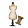
One of my most used dies is the Sewing Room die. I just love the dress form and use it in so many ways on tags, cards, books and in my scrapbooking.  I thought I would share with you today my absolute favourite way of using it - so very effective but VERY easy to achieve! 


I hope you are ready for this as it is quite photo heavy! So here we go …………


 To start you need to die cut the dress form from some reasonable weight board - I have used coaster board here but any mount board or grey board will do. Cut two and leave one complete but cut the other one in half - right down the middle.


Blend a little Vintage Photo around the edges.


Using a good quality glue which you can run along the outside edge of the piece you cut in half, glue this to the middle of the complete dress form piece. You might have to hold it in place for a while until it dries, but if you use a good glue this should feel quite solid once it is set. Two segments have now been created which can be filled with the paper leaves.


And now for the dress - cut ten "dresses" from book paper. I know many of you don't like ripping up old books, but for this project I have used a modern paperback bought from the local charity shop. You could of course stamp your own papers with a text stamp.


Again blend Vintage Photo  Distress Ink around the edges of the cut dresses - both sides - and fold them in half.


Again using a good quality glue run a little glue along the folded edge and glue five pieces into each of the two segments. Start from the outside edges and move inwards so that the last piece you glue is in the middle of the others.


I like to put a little bit of lace around the middle and a strategically placed flower at the top hides some of my uneven glueing! 

And now to make a box to showcase our lovely dress form.


The base of the shadow box is the Postage Stamp Die. Again I have used Coaster Board and covered it in the lovely sewing paper from the Wallflower stack.  I cut four strips of Coaster Board 1/2 inch wide and cut these to fit along the top and sides. Vintage Photo Distress Ink was blended around the edges before I stuck them down. (The Postage Stamp Die actually has a crease line which runs around the inside edges and I glue my box strips along this line.)
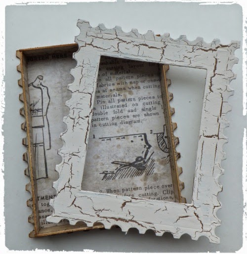

I cut another piece for the top of the shadow box using the Postage Stamp Die and cut an aperture using a rectangle die. This top piece was inked with Vintage Photo Distress Ink and once dry I used Paper Artsy Crackle Glaze to give it an "older" texture.


I filled the inside of the box with some stamped sewing embellishments before glueing the top in place.


This photograph shows how shallow the shadow box actually is. 


Once the top was in place I added a few more embellishments, including a handmade flower and the fabulous brass scissors.


Finally I glued the dress form onto the right hand side of the box.

If you are still with me well done! I hope this tutorial inspires you to try this effect and you can find other dies to make something similar.


A simple circle die can also be very effective!

Have fun!

Jennie x


Footnote: Unfortunately the Dress Form Die is not now available at Country View Crafts, however, the Mini Dress Form Die is still available  and would make a good replacement.  Jennie 


Friday, 13 June 2014

Challenge 8 - Wings & Things

Hi Everyone and welcome.  S@ndy here - I'm so happy to be with you this fortnight as your host for another leg of our journey.  This time we are thinking about Wings & Things, birds, bees, butterflies & dragonflies.  Those delightful little creatures who come to visit our gardens in spring and summer.  Please join us by making a card, tag or project being sure you show any one or all of these critters. 

Our challenges are inspired by the products and techniques of Tim Holtz so don’t forget to let us know how your project was inspired by Tim.  Take a minute to look over the Traveling Instructions and don’t forget, that all important, link to the Vintage Journey blog in your post.

I'm sure you will feel inspired when you see the lovely projects shared by our Creative Guides.  So without further ado, let’s have a look. 


I have a Tim Holtz inspired candlestick to share with you today.  This is one of a set of three that best shows the theme for this challenge.  From the Remnant Rub Music Notes to the lovely Birdcage, you can’t miss Tim’s influence. Stop by my blog to see the entire set.


Small (4") canvasses comprise my project this time, all painted, stained and distressed Tim style. Although not every product used is either designed by Tim, nor necessarily antique looking, I've brought them together using his techniques to make them vintage and shabby in style. You can find the details of what I used and how in a step x step on my own blog.


Nikki


I decided to alter a canvas and create some wall art. Tim's fabulous papers form the background in the frame and also on the chipboard covered elements, I have included lots of remnant rubs. some stamps, tissue tape, adage tickets and word bands. Pop over to my blog to see how I converted a plain canvass into this vintage frame and for all the other details - Addicted to Art.


I made these mini burlap panels for a workshop I taught for Country View Crafts who are our fabulous sponsor here at AVJ. There were four in total but these two best fit the theme that S@ndy has chosen today. I love nature and particularly butterflies so these and the dragonfly were great to design, if you look closely you will see that the wings are made from acetate.


I decided to combine my all time favourite Tim stamp with my growing love of ATB's and made a box to keep the growing stash of butterflies and dragonflies I stamp and cut out and which never make it to the project. I used Tim's watercolour painting technique to create the panels and had a lot of fun decorating the top of the box.  There are more details and links to Tim's tutorial on my blog.


Astrid
I made the cover of a new file folder album I creating in which I want to keep all my Tim inspired pieces. I used the butterflies from the Classics 17 set and look forward to having a place to keep all my many creations inspired by Tim Holtz.


Alison

I had a lovely time with S@ndy's theme - playing with a medium burlap panel, some of the new Motif Resist paper, image transfer, texture paste and (of course) many many butterflies!  Do hop over to Words and Pictures to see the details, and that background before it got all covered up.


Let your imagination soar with the Wings & Things challenge.  We look forward to seeing your creations.  Don't forget, you must include a bird, butterfly, dragonfly or bee.  Who knows, you may be the lucky winner of the gift voucher from our sponsor, Country View Crafts.


Monday, 9 June 2014

Welcome Anita Houston as Guest Creative Guide


It’s wonderful to have Anita travelling along as a Guest Creative Guide today and we welcome her along for this leg of our journey.

head shot

I'm Anita Houston from Texas. In addition to being a craft blogger since October of 2011, I love to design projects as well as teach classes. I love everything about art, but mostly dabble in Mixed Media, Paper Crafting, and Painting. I love everything Tim Holtz and Ranger, and in 2012 I was fortunate enough to be accepted into Ranger U, and a membership into the CHA Designer section shortly followed. I've been on the road ever since, teaching and demoing in the Texas area. I truly love what I do, and get such a sense of fulfillment when participants in my classes radiate with the joy of creating something. You can see more about me on my website artfulmaven.net. I'd like to thank Brenda and the ladies on the team for inviting me to guest design for you all today!!!

Here are some photos of Anita’s project that she has mmade for us today.
Full details of how she made it can be found at her blog ‘The Artful Maven Haven’.

Flying Pig 2

Flying Pig 4 (1)

Flying Pig 5

Project: Pigs Can Fly 9x11 Inch Wood Panel
Inspired by Tim for texture using Texture Fades and Dies, Embossing Paste and Layering Stencils, as well as Glossy Accents to add depth and shine.

Well I for one want to pop over to Anita’s blog to see how she made this fabulous panel and explore more of her work. I hope you too will take a visit and leave her some love.

Thank you Anita for sharing this project and some information about yourself, it sounds as though you are a very busy lady and I am not surprised with the fabulous projects you make.

Wishing everyone a lovely week and lots of creative time. We will see you again on Friday with the start of another new challenge and this time it is the lovely Sandy who is the host.

Take care.

hugs Brenda xx

Friday, 6 June 2014

Tag Friday inspiration and the next Winners

Hello to you all and welcome to our next winner’s post. Usually we begin with a project from the winner of the previous challenge but unfortunately Yvonne isn’t able to join us but some of the Creative Guides have been extra busy and jumped in with some inspiration for another TAG Friday to help keep your creative juices flowing. Please scroll down to see the winners from Anne’s fabulous ‘All About Him’ challenge.

P1170123
I love to revisit Tim’s videos and as I am doing more journalling these days I wanted to remind myself of the layers he went through. I haven’t added any texture paste on this one but there is some distress paint resist as I was also inspired by Alison’s Destination Inspiration post this week.

A shabby resist techniques tag using Tim's stamps, DIs, tissue tape and remnant rubs. A list of what products have been used together with a step x step are shown on my own blog.
 
Another little tag from my textured tag series! For this one I used texture paste through one of Tim's stencils, some die cut cogs from my stash (embossed for added texture) and some Tim stamps and embellishments.
For a closer look please hop over to my blog.
 
Travel seems to be on everyone's mind so I decided to join in with my Road Trip tag.
Tim makes it easy to play along - I used his Road Trip Stamp Set and went with my tag upside down so I could hang some gears.
 
With this being the month in which many countries celebrate Father's day,I made a masculine tag and incorporated some texture with one of Tim's Texture Fades. The gent always reminds me of my lovely grandpa, who always showed some understanding, hence the sentiment....
 
If you ever need a quick and easy tag, this is an example of how you can do one, using Tim's fabulous Wallflower and Menagerie papers, a bit of texture on a die cut and some Remnant Rubs.  For more details please pop over to my blog.
 
I decided to use one of the backgrounds created for my Destination Inspiration tutorial earlier this week.  I added some stamping, die-cuts, and a dimensional "glass" bottle of ink.  And the extra inking really brings out the Distress Paint resist around the edges.  Come and see more over at Words and Pictures.


So having had a dose of inspiration let’s see who Anne, with the help of the Creative Guides, has chosen as her winner and Pinworthy mentions.

The winner for ‘All About Him’ is ……………….. (drumroll) …………………

Anne says – “Mary Elizabeth has created the most wonderful tag as a tribute to her Dad, who served in the Navy during the Korean war, it is a very personal tag with a lot of Tim's style and  inspiration in evidence.  Not that it is necessarily a consideration, but Tim also pinned this beautiful tag”.

Thanks Mary Elizabeth for sharing this beautiful tag and the family story behind it. It certainly is a stunner and a wonderful example of how Tim inspires us through his 12 tags, we don’t have to copy his exactly or use his products but take the inspiration and let our creativity fly. You certainly did that.
Your voucher and badge will soon be on their way.

Onto our Pinworthy mentions and in no particular order the three projects that will get pinned to our Pinterest board are -


Beautiful projects ladies we can see real Tim inspiration in each of them. Thanks for joining us and your badges will also be with you soon.


A big thank you to everyone else who joined us for this leg of the journey, as always it is such a pleasure to come and visit your blogs and look at your art work in more detail. Don’t forget you have one more week to join in Jenny’s ‘Get some Texture’ challenge and we look forward to seeing you hop aboard and have some fun. Just as a reminder we are not expecting to see Tim or Ranger products in abundance we just want you to tell us what it was of Tim’s ideas, projects or products that inspired your make.

Have a great weekend and we will see you Monday with the next in our line up of fabulous Guests.

Take care.

hugs Brenda and the Creative Guides.


Monday, 2 June 2014

Destination Inspiration - Distress Inks and Paints

Hello all!  Alison here, from Words and Pictures, ready to get messy with Distress Inks and Distress Paints.

One of my favourite things is to play with the contrast between the translucent inks and opaque paints, so I'm sharing a technique I love.  It also uses stencils, so it follows on quite nicely from Jenny's great tutorial last time out.  Click on any of the product links if you feel the urge to go shopping over at our generous sponsor, Country View Crafts.


I tried out a couple of different ways of applying the paint, and you'll see that each has its pros and cons.  Another thing I like is that you always get a pair of backgrounds out of this technique (at least), so you've got twice the play area once you're done.  Obviously, you can use any colours you like - I've gone for my blues and greens today.


First up, I get both manila tags ready next to one another on the craft mat.  Then I lay down whichever stencil I want to work with - today it's one of Tim Holtz's Layering Stencils, Latticework.


For the first go, I applied my Distress Paints direct from the dabber.  That gets you quite a lot of paint in play, so with a stencil this fine, you won't get a precise, orderly effect.  If you work with a more solid stencil, that won't be such an issue.


As soon as you've got the tag covered, flip the stencil over onto the second tag, painty side down, and use a cloth or paper towel to press it down onto the tag.


Then let them dry, or use a heat tool if you're impatient!


I love the effect of that heavy amount of paint on the first tag, but there's not a lot of clear space for inking, so I decided to start up a second pair of tags straight away.  This time, I splodged the Distress Paint on to the craft mat, and then applied it with Cut-n-Dry Foam.  You get much less paint on the surface of the tag, so the stencilling is more precise (still with imperfections to be embraced - but that's what I love).


But that means there's also less paint on the stencil, so you have to flip it fast and press down to get it onto the second tag.  Look what a cool outline effect I got this time from having so little paint on the reverse flip!


Once Distress Paint is dry, it's completely permanent, so now you can play over the top, knowing it's going nowhere.  It will have a resist effect as you apply ink over it.  So, I applied the same colours of Distress Ink over both tags using a blending tool...


... building up areas of colour gradually on all four tags.


And here you start to see the fun of the contrast between the opaque paints and the translucent inks.


Even though they're the same shades, the effect is quite different, and light plays off them differently.


So on the very first tag, there's a lot of opacity and just hints of ink, all the way through to the last tag which is basically translucent with hints of opaque resist from the paint.


The final step in this little game is to do some spritzing and flicking with water. Let the droplets sit there for a moment and then use paper towel to lift them off, and dry again with a heat tool.


As Tim himself has shown, you get a great effect: the paint stays put underneath but the ink, being water-reactive, will shift and lift, so you get a great layered textured look.


So I now have four tag backgrounds to play with - each with different amounts of opacity and translucence.  I think my favourites are the middle two - with a fairly even balance between paints and inks (one from the first pair, one from the second), but all of them have possibilities.


So it's always worth trying different ways of applying your paints and inks... there's no right or wrong, there's just playing and exploring.  Now I can do some more layering with stencils, following Jenny's guidance from the last Destination Inspiration, or go straight to stamping over the top, or add die-cuts or embellishments, or go anywhere really...

I hope that offers some inspiration for the fun to be had with the opaque Distress Paints and translucent Distress Inks.  Remember, even when it goes "wrong", you can embrace that imperfection, even if only as a lesson to try it differently next time!

Have fun on the journey...
Alison xx