This is a unique challenge blog where we are inspired by and focus on the Vintage; shabby; mixed-media; art journaling; industrial, timeworn and steampunk genres and encompass the talent, flair, expertise and ideas of many artists that we are inspired by. We welcome all types of projects - cards, journaling, assemblage, layouts, albums, atcs, altered art in fact whatever you want to share (as long as it is in good taste).

Showing posts with label Distress Sprays. Show all posts

Friday, 24 May 2019

Creative Card Making with Alison

Hello all, it's Alison here with this month's Creative Card Making post.  Regulars over at Words and Pictures will know I almost never make cards.  For some reason I find them very difficult to get going with.  But a Creative Card Making post requires a card, so here it is...


For this, I borrowed my inspiration from a tag I made in which I borrowed inspiration from one of my fellow Creative Guides, the lovely Jennie of Live the Dream.  And at three removes of inspiration, I found that it wasn't so hard to make a card after all!


I started with a pre-cut kraft card and envelope, 6x6 inches, and gave it a rough coat of gesso as a base.


Over that, I added some Idea-ology Tissue Tape and Design Tape strips and then smeared some DecoArt Crackle Paint in places.  (I know I took photos as I was going, but my camera seems to be playing up, and decided not to keep them.)


Over the dried crackle, I added dribbles of Distress Stain in Weathered Wood and Stormy Sky...


... and I smeared some Peeled Paint DI and Shabby Shutters DOxide onto my craft mat, spritzed with water, and added that to the mix too.


I chose those colours to go with the tag I cut the Tim Holtz flower out of.


This one is from the Wildflower Stems #2 set.


I'd done some wrinkle-free distressing with those colours onto the tag, and had just enough to be able to cut the strips of paper lace too.


This is one of the two designs from the Lace Thinlits set released a couple of years ago.


Most of my butterfly Design Tape had become invisible under the crackle, so I added some more of that...


... as well as some actual lace from Tim's Idea-ology Lace Trimmings.


There's a bit of script stamping done in Stormy Sky Oxide.


And I used the leftover blobs from cutting the lace to add some extra detailing.


A few ivory sequins dotted around catch the light rather nicely.


And the Idea-ology Quote Chip gives me the necessary words to finish things off.


In the end, I really like this mixed-media card.  And it's flat enough to go through the post without extra charges!


I hope that's given you some card-making inspiration.  Thanks so much for pausing in your journey with me today.  There's still plenty of time to join in with our current Book It! challenge so do come and join us.  Have fun on your crafting travels.

Alison x

Friday, 18 May 2018

A little extra musical inspiration...

Hello all!  It's Alison here, your tuneful host of this month's Words and Music challenge.  Our new itinerary means that in the third week of our challenge month we stop off for a while with the host for some extra inspiration.  It might be a tutorial for their challenge project, or a whole new creation.

I pretty much shot the bolt with my step-by-step for Under the Greenwood Tree over at Words and Pictures, so I'm here with a fresh bit of musical inspiration for you... a quick tag full of melodies and musical thoughts.


For my main project - Under the Greenwood Tree - I went for some song lyrics as the inspiration, so this time I've taken the other approach to the theme and used both music paper and some words about music on my tag.


I started by gluing down some vintage music paper onto a standard #8 tag.


I applied Versamark ink through the Tim Holtz Harlequin stencil and then a couple of coats of Seth Apter's fabulous Vintage Beeswax powder.  Just look at that glossy dimension, and the warm honey-coloured tone.  It's lovely.


I spritzed some Pumice Stone Distress Spray, followed by Broken China, and then flicked water droplets over the top, and sanded the edges for a more distressed look.


I added a wash of white paint, wiped back, and then splattered tiny droplets, and used a lid to add some circle shapes in a couple of places.


These Sizzix Coffee Marks die-cuts had been hanging around on the table for a while after being rejected from some other project, but I decided their time had come.


I stamped the quote from my PaperArtsy EAB03 Music and Silence stamp set, cut it into sections, and doodled around the edges with a fine black pen.


The wonderful Paper Doll dancer was also asking to come and dance amidst the music.


And just down by her feet, you find out who wrote those words.


I mounted the tag on some white card, just to echo all the white accents going on, and doodled some more fine black lines around the edges of the tag.


The whole thing is topped off with some Distress Ink-dyed crinkle ribbon and curly paper string.


I don't use black very much, but it was already there in the printed music, so I went with it - but to me this doesn't look very "me"... what do you think?  It's always good to experiment though, right?


I hope this has given you an extra nudge to come and get musical with us this month at A Vintage Journey.  Check out the details of the Words and Music challenge as well as the fabulous inspiration from my fellow Creative Guides and then come and join us on the journey.  We'd love to see you there.

Thanks so much for stopping by today.

Alison xx

Monday, 29 June 2015

Destination Inspiration - June Terminal 4

Hello all, Alison here from Words and Pictures, and I'm delighted to have arrived at Terminal 4 to share June's fourth and final Destination Inspiration project with you.

Packed in the travel bag this month we had:
Main Colour - Walnut Stain
Technique - Layering Stencil and Texture Paste
Substrate - Watercolour Paper
Product - Any Tattered Die

Three of my fellow Creative Guides have already shared their inspiration with you, keeping us all fuelled for the journey (you can see their roadmaps of inspiration again at the end of the post), and now it's my turn.  Here's what I came up with...  (I had to make this some time ago before life got busy, but I'll do my best to remember how I put it together!)


I started by cutting a large tag out of a sheet of watercolour paper, and applied texture paste through the fabulous Typo stencil before spritzing with Walnut Stain Distress Spray.  I tried to keep some whiter spaces, and places where you can really see the delicate splatter pattern from the spray.


I decided I wanted the Typo lettering to pop a little more, so I did some dry-brushing with Picket Fence Distress Paint to highlight the texture.


I'm not much of a flower-maker in the general way of things, but I know where to go when I do want to do some... my fellow Creative Guide Jennie has some amazing tutorials over at her blog Live the Dream, and I almost always go there for help when I'm using the Tattered Florals die.


I followed her Cabbage Rose design for my large flower (I've enjoyed the results in the past, and it didn't fail me this time either) and a sort of half version of the same for the smaller ones.  I did less curling of the petals on the small roses as my book pages I was using weren't really strong enough to take it.


So with all my components in place, I now had the fun of adding collage elements and embellishments to finish the whole thing off.


I used one of the brilliant Photobooth photos, and layered up paper scraps and other ephemera to frame it.


I altered my metal embellishments with alcohol ink and some Treasure Gold.  I think the clock looks pretty good peeking out from behind the roses.


I particularly like the effect on the WordBand.  I thought about applying paint to accent the lettering, but decided I rather liked how subtle the words are like this.


I like the dark Teakwood and Espresso alcohol inks contrasting with the bright gilding.


I needed something a little brighter to carry the eye on a longer journey and capture the light in places, so I grabbed some thick card off-cuts from the Frameworks Honeycomb die which were hanging around on my craft table and gave them a coat of Antique Linen Distress Paint and then one of Rock Candy Crackle Paint.


Once it was dry and cracked, I pressed the pad of my Walnut Stain Distress Stain down onto them to let the ink sink into the crackles to highlight them.


The seam binding at the top has had a close encounter with the Walnut Stain inkpad so that it tones in with the rest of the tag.


And I'm a complete spatter fiend at the moment - can't resist it!  You can see the dry-brushing and a little hint of Treasure Gold highlighting the texture here too.


So there you have it... my roadmap of inspiration to re-charge your batteries for the next stage of the journey.


 I hope you like it.

As promised, here's a recap of all the Destination Inspiration projects from this month.  I love seeing how each Creative Guide uses the same luggage from the travel bag to create such different and individual projects.


Terminal 1 - Jennie


Terminal 2 - Anne


Terminal 3 - Astrid


Terminal 4 - Alison


So there you have it - I hope your creativity is firing on all cylinders after all that.  You've still got a bit of time left to come and join in S@ndy's Celebrations challenge, so get cracking!

What will be packed in the travel bag next month?  And how will each Creative Guide use the components to fuel our onward Vintage Journey? You'll just have to come back each Monday to find out... Bon Voyage!

Alison xx

Monday, 15 December 2014

Destination Inspiration - Let there be light!

Hello all, Alison (butterfly) here with you at Destination Inspiration today.  And, as befits a staging post on the journey, it's a chance to pause and put your feet up with a cup of coffee.  But before we get started, let me just remind you about our very special Secret Santa Bonus post from yesterday.  There are some fantastic prizes to be won in our Christmas Giveaway - so don't miss it!

Back to today, and I hope you'll find my offering inspiring somewhere along the line... either from the basic simple idea at the root or from the festive experimenting that went on from there.  It's not really so much a lightbulb moment as the gentle glow of candlelight, spreading its beams on a wintry night!


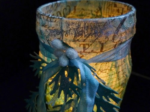
I've ended up with three new additions to the candlelight fiesta we celebrate with round our way (we always have many, many candles lit at Christmas), each one with a slightly different finish and texture if you look closely.


So that's where I ended up, but I started with the simple idea of covering jam jars with Idea-ology Tissue Wrap.  I love the tissue wrap but often, when I use it at least, it ends up under layers of other things, not really getting to strut its stuff.  So I started from wanting to put it front and centre and, what's more, give it an inner glow.


I took various jars from the hoard I've collected, cut pieces of tissue wrap approximately to size, and used slightly watered down multi-medium to glue them to the jars.  (The added moisture just helped with moulding the wrap.)


At the bottom I left enough tissue wrap to spare...


... so that I could fold it inwards.  It pretty much took care of that nice neat pleated effect by itself as I pressed it down.


And at the top I left another spare centimetre (ish) so that I could fold it down into the jar rim for a nice neat finish.


I tied twine tightly around the top while the glue was drying, just to hold it all in place.


For all that my crafty creations are layered and textured, my tastes in home decor are fairly simple and minimal so - for my money - that's pretty much a done deal.


I love how the tea light candles glow, lighting up the tissue wrap, and the twine gives a rustic finish.  A really easy, decorative candle holder.

But it's nearly Christmas, and I felt I should pop a bit more inspiration into your stockings!  So I decided to experiment with zhuzhing them up a bit.

Jar 1 got a coat of Rock Candy Crackle Paint to start with, quite a thin layer in places so that the crackle would be quite subtle.  I left that to dry and set off into the next experiment.  (No picture for now, as that would quite literally be watching paint dry!)

Jar 2 got another coat of multi-medium over the top of the tissue wrap, and then I poured Rock Candy Dry Glitter all over it.


And again, as far as I'm concerned, you could stop right there if you wanted to!


Jar 3 got the Ranger Texture Paste option, applied through the wonderful Holly Bough Layering Stencil.  I used some tissue tape just to secure the stencil while I did it, though I also held on quite firmly at the same time (oh, for a third hand...).


Since it didn't quite meet all the way round the circumference of my jar, I had to wait for that first application to dry before filling in the gap.


So far so good... now for some colour.  I grabbed some of my new Distress Spray Stains (how happy I am they exist!).  Evergreen Bough, Iced Spruce, Tumbled Glass, Broken China and the fabulous Brushed Pewter all play a part here (as well as a not-pizza box from a crafty delivery!).


Since tissue wrap has a pretty non-porous coating, you sometimes have to help it along when applying colour.

I was expecting a sort of Cracked Stains (Tim's technique) effect with the crackle paint.  After all, these are Distress Stains, just being applied differently.  And it was great fun letting the inks run and blend into and over the cracks.


Gotta love the sheen of that Brushed Pewter...


The Dry Glitter was also fine.  It takes colour well itself and, with the coat of multi-medium holding it in place, the sprays took really well.  In fact, they sank in really quickly - you don't get much drippage/blending play.


But for Jar 3, I knew I might need to give the tissue wrap a bit of extra tooth before spritzing, so I coated the whole thing - texture paste and all - with Clear Gesso before applying the colour.  I didn't try without the Clear Gesso, so I can't tell you what that would have done - but having it there certainly seemed to do the trick.


Again there was lots of drippage and blending play as I applied the layers of colour and of course the Ranger Texture Paste is specifically designed to play nicely with Distress Inks, so that was fine.


Of course with all that spritzing and dripping there was quite a lot of leftover ink going spare so I quickly grabbed a few Manila Tags and did some mopping up, as you saw in the not-pizza box photo.  So now I have some ready-to-play backgrounds awaiting more attention, though I knew I had a use for the really inky three.  With all that co-ordinating colour and beautiful silvery sheen, these had to play a part here.


I ran them through the BigShot with the fabulous Holiday Greens Thinlits - so in love with the delicate fir fronds.


I used some of the wax paper kindly sent me by Marci from the States - before they started stocking it around the place over here.  It definitely helps make it easier to get delicate die-cuts out of the dies.  But of course you also end up with really gorgeous additional die-cuts - very delicate, deliciously frosted - and so they also got pressed into service!


I tied the bunches of greenery onto my jars with Crinkle Ribbon, and did a bit of gentle additional spritzing (adding Bundled Sage into the mix this time).


I didn't want too much colour on the ribbons - a touch of white never hurts at Christmas - and the sprays also gave the greenery a bit of extra texture too.


The final touch was to add a few frosted berries, clustered around the ribbon knot, and I decided I was done.


I'm very happy with the results (even though I will definitely be making myself a few more of the very simple first versions for use throughout the year!)...

The crackle is subtle, but pretty cool I think...


The shimmer of the Dry Glitter delights me far more than I expected, not being a glittery type in the general way of things!


And I just love that Holly Bough texture - such a great stencil, and the texture really benefits from a little extra dusting of Silver Treasure Gold wax.


It's not easy to capture the effect of candlelight on camera.
You always get a really intense light from the candle flame, rather than the diffuse glow filling the whole of the jars that you get in real life, but this gets pretty close.


I've tried to share a little of the effect you get with these, whether through the crackle...


Or candlelight on glitter...


Or through the texture...


And always with the lovely text and images of the tissue wrap coming through from underneath.


They also look great lit by candlelight from the outside, so I gave a little spritz of Brushed Pewter to an already teal-green coloured nightlight holder, and added that to the collection for a really festive look.


I hope that's given you lots of ideas to play with, and that you'll have candlelight glowing in your homes this festive season.  However you celebrate, we hope you'll come and play along with Nikki's lovely Let's Celebrate challenge this fortnight.

Check out all the details, rules and lots more inspiration from my fabulous DT colleagues, and come and celebrate with us.  You could become one of our Pinworthies, or win a gift voucher from our generous sponsors Country View Crafts - and that's definitely worth celebrating!

*****And don't forget to check out our very special Secret Santa Bonus post from yesterday.  If you hop around and leave some love with each of the DT, you could be in with a chance to win some very special prizes.  Check out all the details here and get hopping!*****

Thanks so much for stopping by today, and I'll see you again soon on this Vintage Journey.

Alison xx

Ingredients available from our generous sponsors, Country View Crafts:
From my stash: jars, frosted berries