This is a unique challenge blog where we are inspired by and focus on the Vintage; shabby; mixed-media; art journaling; industrial, timeworn and steampunk genres and encompass the talent, flair, expertise and ideas of many artists that we are inspired by. We welcome all types of projects - cards, journaling, assemblage, layouts, albums, atcs, altered art in fact whatever you want to share (as long as it is in good taste).

Monday, 2 October 2017

September Destination Inspiration - Arriving At Terminal #5

Hello Everyone and Welcome

Amanda here today to greet you at Terminal #5, the final leg of this months Destination Inspiration. As September is a 5 week month we not only have a tag Friday but we have 5 Terminals to call at on our Inspiration Journey so I hope you will join me and enjoy our extra stop today.
Lets begin with a quick recap of the contents of the travel bag
Product: Gesso
Technique:  Any form of Resist
            Colour: Olive Green
Substrate: Chipboard
      
Limited supplies maybe, but if you have been journeying with us this month Jennie (Terminal #1), Tracy (Terminal #2), Autumn (Terminal #3), and Sara Emily (Terminal #4) have not let the lack of supplies limit their creativity. If you have been delayed and are just arriving be sure to check out their projects and all the details by clicking on the relevant links provided. 

Here's the project I have made - it wasn't pre-designed or pre-planned, it just developed throughout the creative process. I'm calling it an Art Scroll 


One of my favourite resist techniques is 'Gesso' resist and given that the product in my travel bag is gesso it seemed the ideal resist technique to use.
I used Tim Holtz distress inks throughout my project.
  

Using a piece of cut and dry foam I applied gesso to my stamp of choice - one of the stamps from Seth Apters Impression Obsession 'Border lines'stamp set


and stamped it repeatedly to cover a piece of mixed media paper - not so easy to see the stamping when working white on white . 


Once dry I applied Tim Holtz Distress ink over the gesso stamping using a blending tool, Crushed Olive being the first application - now the gesso stamping is clearer to see


Though I do like this Olive tone I had a deeper, darker Olive hue in mind so continued building up the colour with Distress inks. Once happy with the colour I used a damp wet wipe to reveal the gesso stamping. I always love seeing how the gesso resists the ink. I distressed the edges of the panel with both Gathered Twigs and Black Soot distress inks..With a black Micron pen I added some drop shadows to the stamp pattern and mounted the panel onto black cardstock 


At this point I gathered up a few of my chipboard pieces and played around with them to get some idea of how to move forward with my project .... A quick fast forward and I had a finished design in mind .
I adhered old book pages to the back and front of a chipboard ATC using collage medium


distressing the edges lightly with distress ink and a touch of gilding wax when dry. The gesso resist panel was then adhered on top of this.


I punched two holes along the bottom and top edges of the resist panel ,and fixed eyelets over the holes. These would hold the loop pins which in turn would hold the two pieces of remnant rubbed dowel .


Now for the focal feature....
I used two of the wood chips from Seth Apters 'Wood Chips'- the circle and the square frame. 


To alter the circle I experimented with a wax resist technique. 
I grated wax crayons to create wax shavings, sprinkled the shavings (only a light sprinkling) onto the wood chip circle


 and covered with a piece of wax paper. I placed a hot iron onto the wax paper and held still for a few seconds to melt the wax shavings. 


I then removed the iron and wax paper to reveal a wonderful amalgamation of colour. I blended Crushed Olive distress ink over the waxed wood chip surface- the wax resisted the ink. Unfortunately I was so caught up in the creative process that I failed to capture a shot of this but I did repeat the process using mixed media paper as my substrate to show you. To the left is a photo of the melted wax crayon shavings, to the right is a photo of the wax resisting the ink . 


Back to the circle wood chip ... I applied gesso to another Seth Apter stamp, this one is from Seth's Pathways IO stamp set and stamped it onto the waxed resist circle 


before adhering in place inside the crackled wood chip square frame.


I embellished the circle with a few pieces of metal - 2 Ideology gears, an old foreign coin and a Tim Holtz Ideology hitch fastener


-to give some dimension


and to finish off my Art Scroll Project


Thank you for your company today. I hope you have enjoyed your time here at Terminal #5 and leave with some inspiration.
 Pop back on Monday when a fellow Creative Guide will be picking up a whole new travel bag of ingredients ready to embark on our October Destination Inspiration Journey. 

There are just a few days left if you fancy joining in our current challenge 'Altered Art'. It is open until Thursday this week and details of the challenge can be found here  
We always love to see what you create and appreciate each and every one of your entries . 

Wishing you all a great week
Take Care 
Amanda
x

Friday, 29 September 2017

Tag Friday!

Welcome to Tag Friday! A few times a year we have 5 Fridays in a month meaning we get to hold our Anything Goes Tag Friday. It is always popular with the Creative Guides - we do love our tags, and it's always fun to see the different directions we all go in when there's no strict route to follow.  Let's take a look at what everyone has created...


I decided to make some Christmas themed tags (I have started early this year!) and make them into Christmas cards - you can find all the details over at Addicted to Art today.


At this time of year when most people's thoughts turn to beautiful autumnal colours - mine turn to Halloween! I was inspired by a card by Richele Christensen... you can see more detail on my BLOG.


I'm getting ahead of myself with a wintry pair of tags... that's what comes of having to create samples for winter word stamp sets in September! Not that I'm complaining - I'm thrilled to have some new quote sets out, and there's one of them involved here. Do come and check out the details over at Words and Pictures.


I simply love the colors of Fall and this tag uses all of my favorites. I could not pass up a chance to use oranges, browns and greens. ENJOY.


I was inspired to depict an end of summer feel on my tag, with withering greens and grasses fading. See more of the process and closeups on my blog, SewPaperPaint.


I was demonstrating PaperArtsy Infusions at the weekend and so have some lovely base tags to play with. I decided to use my favourite Sleight Blue to create this little tag with a fabulous quote from Alison's latest stamp release. If you would like to see more details and in particular how the background developed then please do join me on my blog.


I had fun just enjoying the process of creating this piece, decorating one of Tim Holtz Etcetera Tags. If you would like to see more close up detail and explore this journey further with me, please pop by my BLOG.


September and October find me very busy but I wanted to join in with this Tag Friday line up and managed to get this completed in under the wire (just!) to contribute along side the other fabulous contributions from my very talented teamies. To complete this in almost record time I have limited myself to just a few supplies and a tag background from my bits box. There are a few more photos over at Bumblebees and Butterflies if you find you have a little time to pop over.

_____________________


Well, there you have it... what a fantastic variety of tags, though you can see that we're all leaving summer behind, by the look of things.  I hope that's given you a little burst of inspiration fuel for the last few days of this month's challenge.  There's still a week left to join us with an Altered Art project, and we'd love to have your company.  Our sponsor this month is Simon Says Stamp and our random winner will receive a $25 gift voucher for their store.


Not only that, but you could be selected as one of our Pinworthy projects and be invited to join us as a Guest Creative Guide... so off you go and get altering!  Have a great weekend, everybody.

Alison and the Creative Guides x

Monday, 25 September 2017

September Destination Inspiration - Arriving at Terminal 4

Hello friends and visitors! Welcome to the 4th Destination Inspiration for September. It's Sara Emily here with you today to guide you through the 4th leg of this month's creative journey. Each Creative Guide is using the same four items in our travel bag. To review, we are using the following ingredients:

Product : Gesso
Technique : Any form of Resist
Colour : Olive Green
Substrate : Chipboard

I was pretty excited to find some 'trash' at an estate sale and from my stash that I could turn to 'treasure' for this project.


Substrate and color:


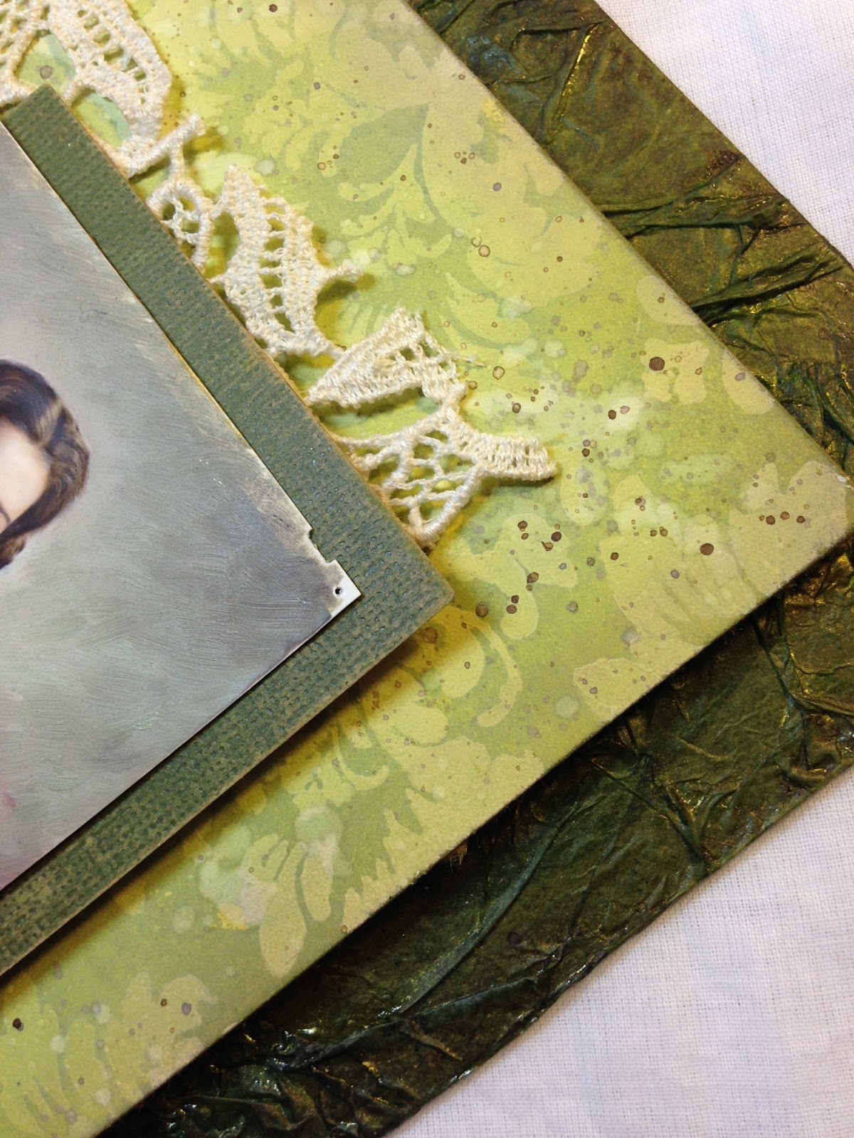
I started with my substrate--a piece of sturdy chipboard from the back of an old art paper pad (it's under the pile of other collected goodies). They sure don't make them like they used to. This is almost like plywood! I found these olive green glassine papers in my stash that once wrapped those really good pears you get from Harry and David. Although I didn't have a plan at this point, I glued them to the chipboard, wrinkling the paper as I glued.


Once dry I used a foam brayer to add Glossy Mod Podge to the raised areas and allowed that to thoroughly dry.


 Out came the sprays--Distress spray stain in Twisted Citron and Heidi Swapp Color Shine in Gold. The glossy Mod Podge acts as a resist, and I wiped the sprays from the raised areas with a dampened cloth.


 I allowed this to dry and later blended Walnut Stain ink around the edges and gave it a coat of DecoArt Ultra Matte Varnish. Unfortunately, this blended my colors and took away some of that resist I was going for, but it's still pretty cool to see the colors puddling between the ridges here and there.


Product, technique and more color:

I tried another resist technique, this time using gesso as my resist medium.This smaller panel is also chipboard, the thin stuff that separates the layers of cans in my cat's canned  food box. These are mighty handy and are a perfect size.  


 I glued card stock to the chipboard and sponged some gesso through a flimsy stencil from Recollections. I started with thick gesso, but it kept pulling up the stencil, so I switched to a thin pourable gesso.


I dried the gesso and blended over it with  a heavy layer of Peeled Paint DOX. I splashed it with water and dried.


The photo below shows the panel before splashing with water and removing the color from the gesso.


 I carefully wiped the gessoed design with a damp cloth. The gesso acts as a resist to the DOX and looks great combined with the chalky inks. I edged with Frayed Burlap and splattered on Walnut Stain inks.


Finishing up...


The bow is twisted up using some vintage pre-colored seam binding--just perfect for our color ingredient, as is the dress on this beautiful woman. I spritzed it with Ranger Perfect Pearl in gold. I found this framed photograph, and removed the photo, intending to use the gorgeous frame for another purpose. I couldn't throw out this lovely photo, and thankfully it fit our color ingredient. The lace behind is from that same estate sale.


I chose the Quote Chip which so accurately describes my recent estate sale finds and framed it with a doily die cut with it's center removed and colored with more DOX.


 I hope you've been inspired to get out your chipboard and gesso and maybe try a resist technique. In case you missed the first three stops on our Inspiration Journey, you can visit them now, by seeing Jennie's beautiful fall tag HERE, Tracy's show stopping card HERE, and Autumn's stunning altered journal HERE.

Our inspiring challenge this month is Altered Art hosted by Alison. I do hope you get some time to play along!  The Creative Guides have created some wonderful pieces to inspire you this month!

Please pop back next Monday when another Creative Guide will be taking you through yet another creative journey using the travel bag contents.

Thank you for traveling along with me today!

Friday, 22 September 2017

Introducing a very (very) special guest - Seth Apter

Hi everyone, Nikki here with our monthly invited Guest Designer post. It is my great pleasure to welcome and introduce

  Seth Apter

 I am sure he doesn't need much introduction as his style of mixed media art has captured so many of us over the last few years. I have had the pleasure to meet Seth a couple of times and attend his workshops in the UK and not only is he an amazing tutor but fun, charming and genuine.

Seth is a designer for PaperArtsy (stamps and paint), Spellbinders (dies), Stencil Girl (stencils) and Impression Obsession (stamps). His artwork is frequently displayed in exhibitions and he also published author.

Seth is a master of layers, texture and paint. His mixed media style often incorporates found objects - so who better to provide a masterclass on Altered Art - our current challenge theme at A Vintage Journey.

***********

Hi everybody. Seth Apter here. I am thrilled to be a Guest Creative Guide at A Vintage Journey. I have always loved the work shown here and am now happy to be a part of the family.
I am a mixed media artist from New York City with a passion for found object art. I love giving new life to old things. In addition to making art, I spend my time teaching mixed media workshops and designing art and craft products with a number of different companies. My work has been seen in multiple exhibitions, books and magazines. You can learn more about me at my website or my blog.

One of my main activities is searching for supplies to use in my mixed media art. Although anything goes, I tend to favor older, distressed objects. I feel that they already have a history, which automatically becomes part of my artwork. So many people (myself included) work to create a vintage look on new items but there is truly nothing like the look and feel of actual vintage.

COLORS FOR CHINA
Seth Apter 'Colors for China' -  Guest Creative Guide - A Vintage Journey
This piece, Colors for China, began like most of my work - with an object. Or in this case three objects. I have been hoarding holding on to a grouping of very old test tubes filled with paint made for china. 
These became the focal point that I built the entire piece around. I knew I wanted to add an actual frame around the tubes as a way to highlight these beauties and symbolically turn these vintage objects into art. I added one copper and one wooden frame, both vintage. 
Nearly all the materials in this piece, with the exception of the wood panel and a few metal embellishments, are salvaged. Some have been in my studio drawers for years, patiently waiting their turn to be used in the right artwork.
To me, creating found object art is like completing a puzzle. While many wrong answers are tried along the way, you ultimately have to find the right pieces, many of which are not meant to work together, and place them in such a way as to make one seamless creation.

**********

Amazing! What a fantastic creation full of history, detail and texture. I count seven layers that Seth has taken and salvaged or altered in some way and then worked his magic to generate this perfect composition. 
You can see more of Seth's artwork on his website - The Altered Page

Seth - thank you so much for being our guest this month! 

We are back again on Monday with the next Destination Inspiration stopover. There are a couple of weeks left to join in our Altered Art challenge - with your chance to win a Simon Says Stamp voucher or to be selected as one of our Pinworthies.

Have a great (and hopefully crafty) weekend
Nikki and The AVJ Creative Guides
xxx


Monday, 18 September 2017

September Destination Inspiration - Arriving At Terminal 3

Hello and welcome to the third Destination Inspiration for September.  Autumn with you today to guide you along the journey with the contents of our travel bag.

Our bag this month is filled with goodness:

Product : Gesso
Technique : Any form of Resist
Colour : Olive Green
Substrate : Chipboard


I decided to play along with our current challenge, Altered Art.  At my job we were all given these lime green journals as gifts from a recent conference.  I thought it would be fun to grunge it up and give it a face lift.  


I painted my cover with clear gesso, then layered a couple of olive green paints over it.  I sanded the edges to let a little of the original color show through, then stenciled a pattern with Archival Ink and a sponge.  


Next, I cut a watercolor panel and embossed this amazing image from the new PaperArtsy Lynne Perrella Collection.  I partially stamped and embossed the script from the stamp below (also LPC) randomly on the perimeter of my panel.  I blended Distress Inks around the face.  In the end, I was unhappy with the embossed face, so I restamped in Versamark Sepia onto tissue paper and carefully adhered over the first image, sponging the edges to coordinate.  The sentiment is by 7Dots.


I embossed this gorgeous chipboard from Gypsy Soul Laser Cuts in copper.  I used Distress Glaze to seal my stamped panel, then applied crackle paste along the edges of the adhered panel.  I wanted to use permanent inks since this will be handled, so I used ColorBox Chalk ink directly to the crackle once it had set.


The ribbon bookmark and elastic closure were both so bright!  I mixed Infusions with water and carefully painted them.  


Here's a little closeup of the textures and embossing resist...


And the finished product, simple, but filled with pattern and texture.  I hope you like it and are inspired to play in our Altered Art challenge.  Join us next Monday for Terminal 4...

Thank you for visiting today!